Notifications
Notifications are triggered when users perform the following actions
Completion of an erwin Import
Use Mention action within a Comment (on objects, diagrams or views)
Adding a member to a community
Adding a user as a Collaborator (on objects, diagrams or views)
When a notification is triggered, the user will be sent both an email and an in-tool notification to alert them that either something has completed or that someone is aking them to do something
The in tool notification(s) will be highlighted by a number icon on the notification menu in the toolbar. THis numebr represents the number of unseen messages
When this is selected, the user will see all unseen messages in a drop down pane - Clicking on the notification may cause an action to occur, depending on what the notification is in relation to e.g. clicking on a 'You've been mentioned in' notification will take the user to the object, daigram or view in question.
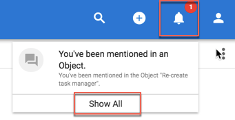
Selecting Show All will allow the user to see their complete list of notifications - these are still selectable

Role Applicable to: Client Administrator
Views allow administrators to select a data-set, containing one or many object types, based on chosen criteria, and visualize it in different ways, quickly and easily.
What is the benefit?
Your data in Agile EA quickly builds up. Eventually, it becomes hard to manage even for the EA expert, and impossible to navigate for everyone else. You can use views to present only ‘slices’ of the complete set of EA data for different roles or communities.
To the EA expert, it is now easier than ever to filter, manage and focus on your EA information. It simply is a better way to interact with your data.
For the non EA experts – you can give them simpler access, where they see less and can zero in on what they should work with.
With views, you can easily navigate to e.g.:
“My Applications”, and see those applications you are responsible for updating or for adding to diagrams.
“Top 10 Risks” for a given business unit and its processes.
“Pending Interfaces” to show those that we need to finalise and justify in EA work.
“My business unit capabilities” – show me those Business Capabilities relevant for my department.
“�Add anything�” – you can virtually in minutes design your own for ANY object type and with ANY set of rules in the system.
You can ensure that each role that you define, see relevant, actionable EA data on their Homepage via the dashboards.
Views allow users to create a dynamic data-set, that fit a given criteria, doing away with a static data-set that users continually need to add to when new objects are created. Views also remove the need for each visualization data-set to be defined individually within each module of the platform, as a single data-set can be used with multiple visualizations.
The visualizations within the view are set with the attribute values that will be available for the users.
Users can turn these on or off for the end visualization, making it easier for the user to display only needed information.
Current visualizations supported in the view manager are:
Tables
Lists
Kanbans
Roadmaps
Closer look at the visualizations;

Views are created by administrators and are controlled by the communities that they are assigned to. Only members of an associated community can see and access the view.
Communities can have access to a number of views. Because different users have access to different views, through community permissions, view menus can appear different for users.
Users still need to have permission to access the data shown within a view or one of its visualizations – this is controlled at Object level, not by the view itself.
If the user does not have access to the data, it will not appear within the visualization for them.
Further filtering of views with Smart Queries
An accompanying feature to defining views is that the user can use a smart query to select/filter objects of interest within a view (also outside of it). Using smart queries can help with the admin overhead of needing to create lots of individual views. Smart queries can make a view fit multiple uses for many users.
Criteria are used to filter out which objects will be displayed when the query is applied to the view. By using smart queries each user can configure their own selection of objects and also then decide which attributes should be visible at the view level.
View and Workspaces
|
|
IMPORTANT: Views are independent of workspaces - Visualizations created within views will show the dataset from the workspace that you are currently in - if you change your current workspace, then the visualization will change to display the new dataset for the view query. This saves users having to define views for each workspace. If you use views on the dashboard, then the workspace that the dataset is being seen from can be changed using the drop down at the top of the visualization. |
Make views available to other users
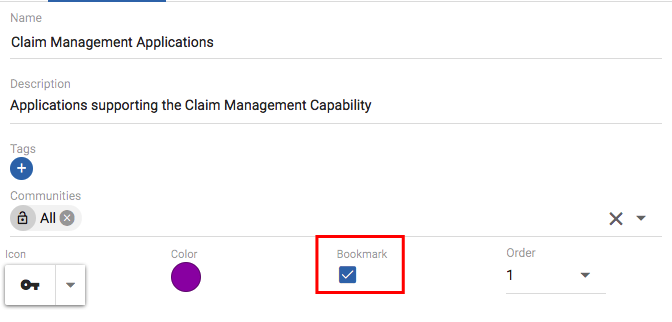
Views can be displayed client wide on the left hand menu by administrators. They can do this using the 'In Menu' checkbox within the View Manager configuration.
Any views on the menu, will be available for all users within the client area, that belong to the assigned communities.
Views on the menu can also be ordered here for importance.
Use Views on the dashboards
Views now replace the current dashboard - This will no longer be in use. The dashboard 'Mine' now allows users to add existing views (or views that they are allowed to see) from a personal perspective.
Currently, the dashboard will display the first visualization from a view (if there are multiple).
Administrators can make views available on the 'Corporate' dashboard also. All users in the client area can then see these views, but cannot edit them. This gives admins the opportunity to define the criteria and the attributes to show to all users.
Creating a View and selecting data
Select the Views in the left menu.
Select the Add button to create a new, empty View.
Fill in the view details on the CONFIGURE page - example below;
Name: Important Applications
Description: Application with high value and business criticality
Icon: Select an appropriate icon (this will be seen on the menu if chosen)
Bookmark: Check the checkbox if you would like the menu item to appear for users that have the correct permissions
Order: What position would you like the menu item to appear
Select the dataset that will be used within the views...
Data - here we build the rules/criteria to narrow down the data set that we want - we can choose single or multiple object types and then dive deeper into criteria that the model has about the instances of the types
Object type: Select an object type (or multiple - using the Add Object Type button) - example below uses Application component
Criteria Type: Select a criteria - current choices are 'Name', 'Attribute', 'Relationship', 'Has Tag', 'Created Date' and 'Created by User' - example below uses Attribute
Criteria options: Select the criteria options that relate to your chosen criteria type - example below is to select specific values that must be met for 2 attribute arrays, using the AND to select a 2nd attribute criteria type.
We have now created a view that will pull out all of the Application components that have "High: 100" Organization Value, and "High: 100" Business Criticality. We now need to decide how we would like to visualize this data and what information we would like to pull out and display to users.
Table Visualization
On the right side Visualization tab, we can see the two currently supported visualizations, Table and List. (Kanbans and Roadmaps have been introduced more recently.)
Select Table from the visualization choice.
To add mutliple visualizations, select the + button in the top right hand corner - more VISUALIZATION 'N' tabs will appear.
In the Configuration section;
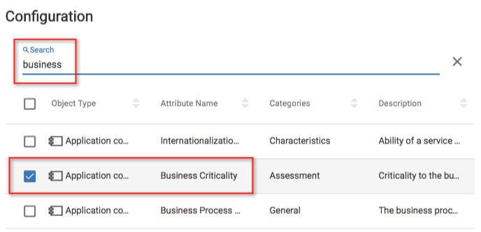
Use the search button to type and look for attributes that you want to appear on the table visualization. You can search using the attribute category name also. Select the check box to the left for the attributes you would like to use.
Example below chooses to display Business Criticality, Initial Live Date and Organizatonal Value attributes. So although our data-set was based on meeting 2 criteria, we can display any data attributes that we want to from this data-set, to the end user. These can be deemed visible or not by the end user when using the visualization.
Use the Preview button to see what the output will look like.
Save the View.
|
|
If you choose the list attribute, there are no attribute options to be chosen, it is displayed in standard list format, similar to what you see when you select the Objects menu. |
Once saved, the view will appear in the View Manager list and can be edited from there (by admins). The view can be accessed from the menu (by users), if the check box was selected. The view is also selectable on a dashboard, if the user has permission to see it.
Kanban Visualization
In addition to Tables and Lists, there are also Kanbans and Roadmaps.
Kanban boards are the visual storyboard for a process or workflow. They represent the journey, and the objects within that journey. Objects are represented as cards on the board. Objects may be moved from one stage to another by dragging. For more information on using a kanban click here.
To Create a kanban from an existing view, we simply select to create another visualization on the chosen dataset (we could create a whole new View if we wanted to and there were different data needs).
In the View Manager, select a view from the list
Select to add a new Visualization, using the '+' symbol in the top right of the right pane
Select the new type to be Kanban
Replace Visualization 2 title with a title for the kanban
In the Configuration section, we select the object type that can be added to the kanban, and then the attribute within that object type that we would like to use to define the stages we will see in our kanban. Currently kanbans are limited to a single object type from our dataset and an attribute that defines the stages must be of type Array or List (users can create their own custom Array and List attributes for defining kanban stages).
The object type will be set to Application component (because this is the only type in our dataset)
Select the Stage Attribute to be Lifecycle Status
You can then select the attributes you might like to display on the kanban board - select the below
oAction Cost Savings
oNumber of Users
oActive Users
oInitial live date
Save the new Visualization
Select the View from the left hand menu
Once in the view, select the APPLICATIONS KANBAN tab to enter the kanban.
We can see that this is a very simple kanban board, allowing us to track progress of objects, based on a certain attribute - we can see that the applications are all in either the Live or the Phasing Out stages. This will map to the attribute that is set within them.
Here you can see a kanban in the view, each stage title is one of the available values for the attribute that was chosen.
The chosen display attributes are visible on each card and also display any colours/icons applied to them where appropriate. If you choose to display minimal attributes here, only the colours/icons will be displayed and you will need to hover over them to see the values.
Moving an object to a different stage will update the attribute value, and updating the attribute value will change the stage of an object.
Roadmap Visualization
Roadmaps provide a mechanism to show any object over a time period. Most Enterprise Architecture (EA) objects will have a time dimension. Where objects don't have a time attribute, you can add them through the customization capabilities.
Roadmaps are now a visualization with the View that we created earlier, on our pre-defined dataset. To create a roadmap from our existing view, we simply select to add another visualization on the chosen dataset (we could create a whole new View if we wanted to and there were different data needs).
Select the View window and select the CONFIGURE tab
Add a new Visualization, using the '+' symbol in the top right of the right pane
Select the new type to be Roadmap
Replace Visualization X title with a title for the view
Choose a color - this will determine the color of the roadmap bars as seen in the view
Select the roadmap attribute to be Lifecycle - Live (must be a date/date-range attribute)
|
|
If we had more than 1 object type in our dataset, we could select an attribute from each object type, to get them to display in separate lanes on the roadmap. |
You can use the preview if you wish.
Save the new Visualization
Select the View from the left hand menu
Once in the view, select the APPLICATIONS ROADMAP tab to enter the roadmap
This roadmap shows us the time frames that the Application components are in, for the Live lifecycle status phase - clicking the arrows at the end of the colored blocks will open the object details.
The date scale can be changed from within the roadmap by 'pinching' the touchpad on a laptop, or by using a scroll wheel on a mouse.
|
|
Only the objects that have a value in the selected attribute will show up on the roadmap. |
|
|
You can drag the bars, to change the date and the date-range within the attribute of the chosen object - to do this, select the object (click anywhere on it, other than the arrow), the object will appear to sink slightly, then either select the object and drag (date), or select the desired end and drag (date-range). |
Workspaces
Enterprise architecture often begins with modelling the enterprise model in an 'as-is' state (or sometimes just a target state). From a current state, you can model using an iterative process, where you capture the model at various moments in time (potential 'to-be' states), allowing the flexibility to try out different change scenarios and analysis, taking different work streams and project down different routes from the common 'as-is' root. Agile EA enables you to perform this modelling using Workspaces, within a client area, which you can use to suggest scenarios, dedicated team areas or projects.
Important information about workspaces include the following:
There is only one default Workspace for a client area.
All workspaces in the client area, share the same underlying metamodel.
Users can only work in one workspace at a time.
Teams can collaborate on the same Workspace.
Workspaces can be assigned to Communities, for access control
Workspaces are blank after creation
Model Data can be moved between workspace via export/import
Agile EA Concepts
Client Area
A client area is the unique client area available to you as a client.
A client area contains diagrams (views), objects and relationships. By default, each client area has a default workspace which is a namespace for all views and objects.
Workspace
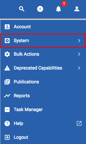
Client areas support workspaces. Workspaces may be set up by an administrator using the User Menu > System > Workspaces option.
Workspaces are extremely useful for modelling architectures within specific bounds and for modelling current and future states.
Workspaces are created in a flat structure and the tool allows users to navigate between workspaces at ease.
Whilst working within a workspace, users can select the drop down in the toolbar and select a different workspace to work in.
If you are within a module (i.e. Object list), you will stay wthin that module and be presented with the data that exists within the chosen workspace.
Showing workspace content in a dashboard
View manager can be used to construct object views which can then be shown in the dashboard. The dashboard segregates views by workspace.
This is useful for showing current v future state rollups and views across workspaces.
Extensions to ArchiMate to support workspaces
In order to make ArchiMate pragmatic for roadmapping, we have extended the core metamodel to include both workspaces and work package milestones.
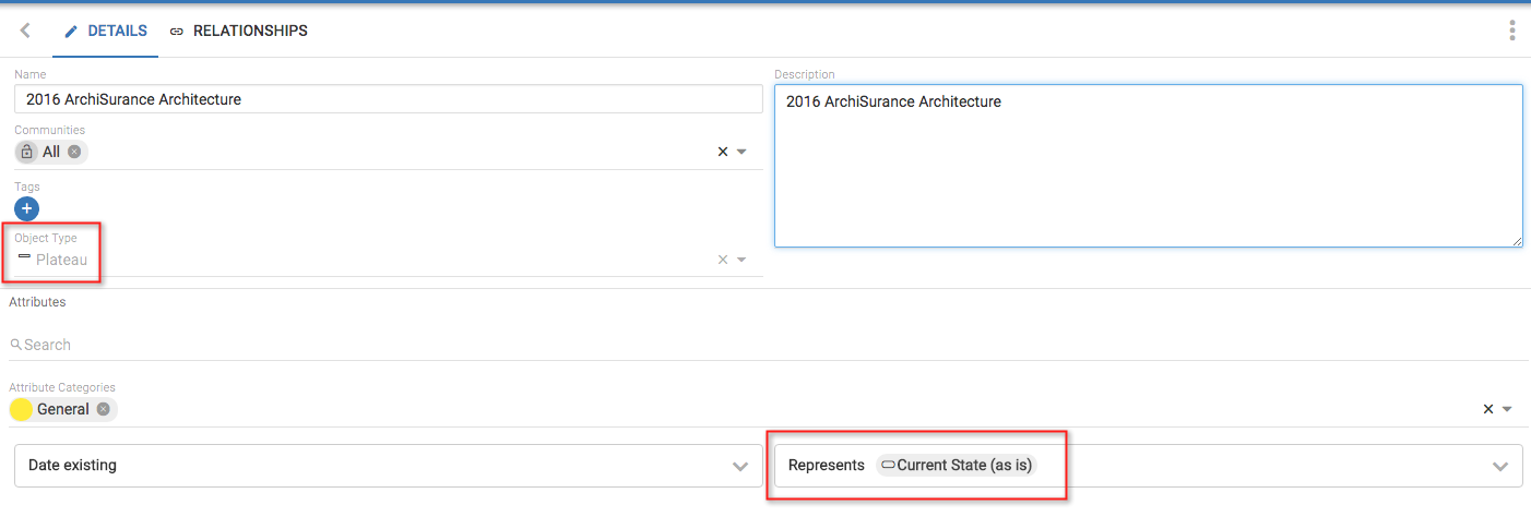
A Plateau is mapped to a Workspace object which itself represents a workspace. A 'Workspace' model object will be created/removed when a workspace is created/removed - this gives users the ability to model their workspace architecture.
Plateaus can be connected using the 'Represents' relationship list, which creates a relationship to the workspace object that it is 'representing' - This will also populate the return view, creating a relationship from the workspace object to the Plateau, using the 'represented by' relationship.
Current v Future State Architectures
With the additional Object types introduced, we can build a view of our architecture using plateaus and gaps.
In erwin Agile EA, we use an ArchiMate Implementation & Migration diagram to represent the view.
|
|
TIP: It is good practice to create a separate workspace that contains overall transition plan models. |
In the example above, we can see that the plateau ‘2017 ArchiSurance Architecture’ is triggered by ‘2016 ArchiSurance Architecture’. The Gap between these two plateaus is 2016-2017 Pet Insurance.
Roll-ups
Roll-ups are an attribute type that allow data to be pulled in from related object attributes, and 'rolled-up' into aggregated values.
Roll-up attributes can be dates, date-ranges or numeric value. These values can be combined with scorecards to perform complex calculations.
Our example uses work packages. We would like in our parent work package to be able to tell;
1.If we have enough resource availability to be able to complete this parent work package and the child work packages utilised within
2.The overall timeframe for the parent work package
In this example we will use work packages to pull through values (resource requirements and durations) from other sub work packages, related using the comprises relationship. Our roll-up attributes will be 'overall resource requirements' and 'overall duration'. Once we have our overall resource requirements, we can use a scorecard to work out if this number is within the resource capacity we have for the parent work package, or if we are in deficit and this needs to be looked into.
We can then roadmap our work packages and use smart queries to visually identify parent work packages that do not have the needed resource capacity to be able to complete the package.
Our example uses
Base attributes (created within work package object type)
Resource Required (Integer)
Capacity (Man Days) (Integer)
Duration (Date-Range)
Roll-up attributes
Overall Duration (Date Rollup)
Overall Resource Requirements (Numeric Rollup)
Scorecard Attributes
Availability (Scorecard)
Define a Roll-up attribute
Within an object type, create a new attribute and select for it to be of type Numeric Rollup or Date Rollup
Name the new Attribute and provide a description
Select the relationship type that you would like to use, to traverse the model into the objects that you would like to pull values from (single relationship type)
Select the object type that you would like to pull values from (single object type - the list is filtered to only those valid for the chosen relationship type)
Select the attribute within the object type that the value you want resides in
Select the aggregator - what you would like to do with values - for Numeric, options are Sum, Max, and Min, for Date, options are Max and Min, and for Date-Range, Range
Ensure that the objects at the end of the relationship have values within their attributes (to be rolled-up).
The roll-up attributes will then pull values from any object that fits the relationship and type specified - in our example it will pull the 'Resource Required' attribute values from all work packages comprised from our parent work package, and SUM them.
Below are the 3 sub work packages that fit our relationship.
The date roll-up will gather the earliest and latest dates from the sub work packages that fit the relationship criteria specified.
Once we have these roll-up values, we can combine them with a scorecard to perform more complex functions - in our example we will take our 'Overall resource requirements' value away from the capacity value that has been set for the work package - we will then have a + or - value that will identify if the work package can be completed.
In our example
Create a new scorecard with 2 simple metrics and the formula <1>-<2>
Create a new attribute that uses the scorecard and uses existing attributes - set them as <1> being 'Capacity' attribute and <2> being the 'Overall resource requirements' roll-up attribute
We can then see the resource availability for the parent work package shown by a smart query on a roadmap (where resource availability scorecard attribute is < 0), that shows the overall duration of the smart query and also the individual durations of the sub work packages that are 'part of' the parent work package.
|
|
Extending the earliest date or the latest date of the sub work packages, will cause the roll-up attribute to be re-calculated and may change the overall duration dates on the fly. |