Submitting forms on the support site are temporary unavailable for schedule maintenance. If you need immediate assistance please contact technical support. We apologize for the inconvenience.
Percent Completed. Summarizes the number of successful completions of the sequence as a percentage of total sequences initiated. The graph presents the same data.
•
Health History Bar. The color-coded bar represents the alarm state of the monitored component over the time range selected in the SOC. The color of the bar changes depending on the alarm state. Red indicates a Fatal state, orange indicates Critical, yellow means Warning, and green is the Normal state.
•
Inbound. The number of hits on the first event in the sequence.
•
Completed. The number of successfully completed sequences.
•
Most Exits. The event in the sequence with the largest number of exits. Both the name of the event and the number of exits out of the total hits are displayed.
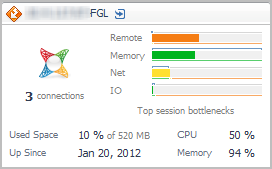
Connections. The current average number of active connections.
•
Top Session Bottlenecks. A breakdown of the potential session bottleneck points. The four top used resources from the list below are displayed on the tile.
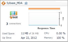
Connections. The current average number of active connections.
•
Health History Bar. The color-coded bar represents the alarm state of the monitored component over the time range selected in the SOC. The color of the bar changes depending on the alarm state. Red indicates a Fatal state, orange indicates Critical, yellow means Warning, and green is the Normal state.
•
Response Time. The time elapsed during database access, plotted over time.
•
Used Space. The amount of database storage space used, expressed as a percentage of the total available.
•
Up Since. The date the database was last restarted.
•
CPU. The average CPU usage for all Sybase® agents.
•
Memory. The average memory usage for all Sybase agents.