|
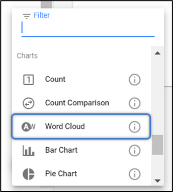
Count
Count View helps to display the data by highlighting a specific piece of information or metric in a card.
To create a Count View:
Count Views are best to apply along with the layout.
E.g., with the combination of Row and Column Layout.
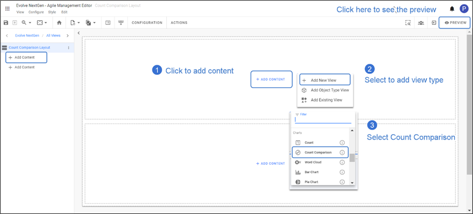
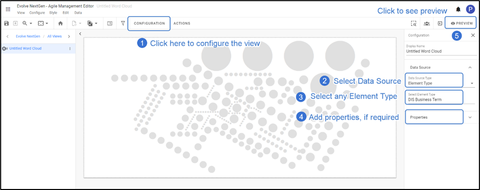
1.Click on All Views in the editor and then click on  icon placed at the bottom of the list of views. icon placed at the bottom of the list of views.
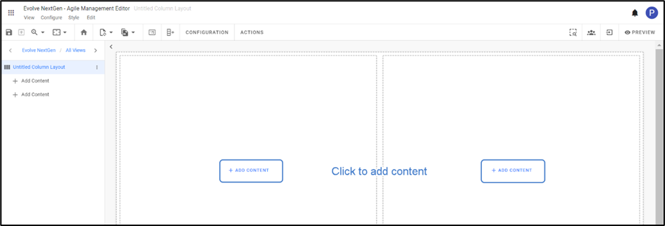
2.Choose the preferred layout. For instance, choose a Column Layout.
By default, a layout with two columns will appear. Click on + Add Content.
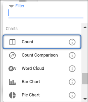
Select Count from the list.
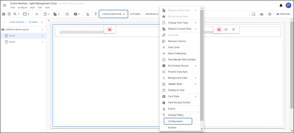
3. To configure the view, click on Configuration on the toolbar or right-click on the view to see the list and then select.
After configuration of your own element type choice, the preview of the view looks like as shown in the picture below.

|

|
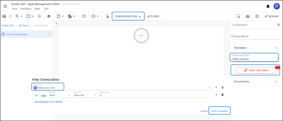
You can create custom data sources to return specific queries using Filters.
E.g., How many element types have an attribute set to true. |
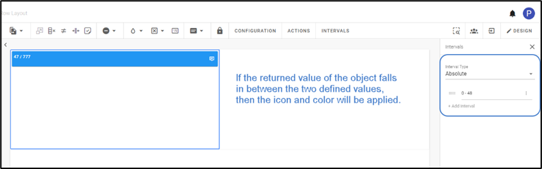
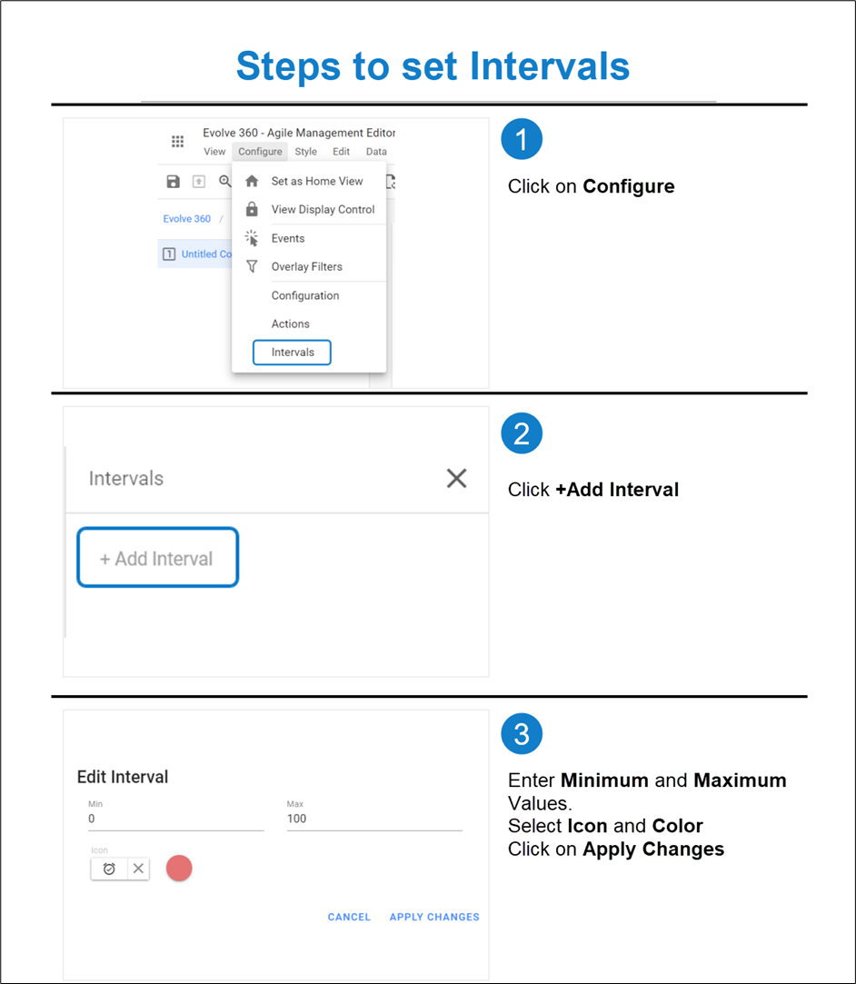
4. You can set the Intervals to change the color of the count. An icon will be displayed, once the returned metric hits a user-defined number.
To set an Interval,
Go to Configure on the toolbar and then select Intervals or by right-clicking on the view.
Click on Add Interval from a section that appears on the right side of the screen.
Enter Minimum and Maximum Values of the Interval.
Select the Icon and Color.
Click on Apply Changes.
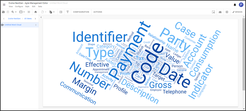
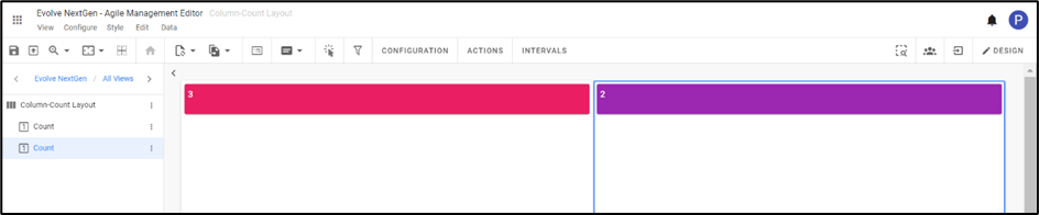
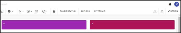
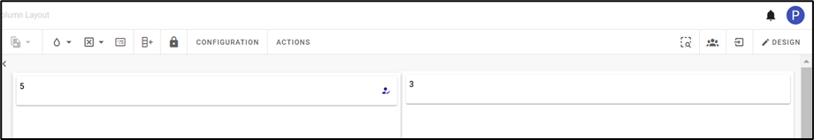
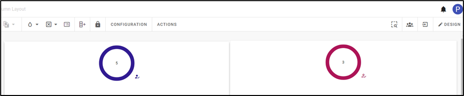
Count Views looks as shown in the figure below.
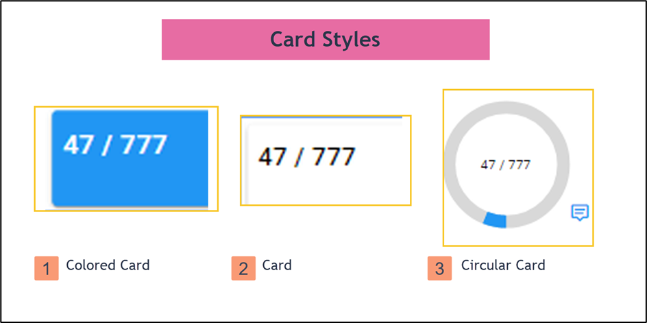
The appearance of Count View can be customized in three ways with the help of Card Style.
To apply the style, click on the Card Style icon on the toolbar or right-click on the view, you wish to apply.
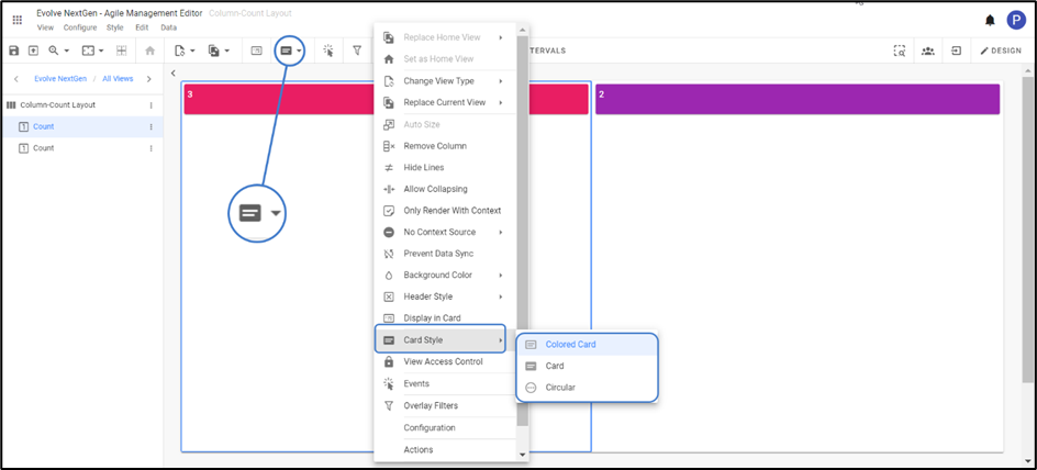
Colored Card – displays with a different choice of colors.
Card – is a simple card type with transparent background.
Circular – is a Card Style displayed in the colored annulus.
|