Converse agora com nosso suporte
Chat com o suporte

erwin Evolve 360 Current - User Guide

Charts


Navigation: erwin Evolve 360 User Help Guide >

Charts


Charts

Chart Views works with data analysis to condense a large amount of data into an advanced visualization. The choice of Chart type depends upon the metrics and the properties of the Object.

The Charts available to handle the data visualization are:

1.Count

2.Count Comparison

3.Word Cloud

4.Bar Chart

5.Pie Chart

6.Line Chart

7.Radar Chart

8.Scatter Chart

9.Pivot Table


Count


Navigation: erwin Evolve 360 User Help Guide > Charts >

Count


Count

Count View helps to display the data by highlighting a specific piece of information or metric in a card.

To create a Count View:

Count Views are best to apply along with the layout.

E.g., with the combination of Row and Column Layout.

1.Click on All Views in the editor and then click on  icon placed at the bottom of the list of views.

2.Choose the preferred layout. For instance, choose a Column Layout.

By default, a layout with two columns will appear. Click on + Add Content.
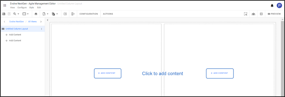
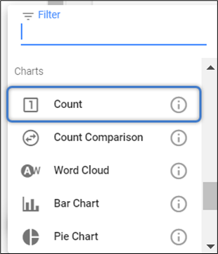
Select Count from the list.
 

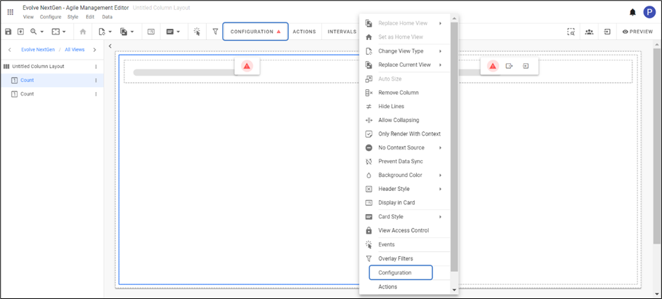
          3. To configure the view, click on Configuration on the toolbar or right-click on the view to see the list and then select.
After configuration of your own element type choice, the preview of the view looks like as shown in the picture below.

You can create custom data sources to return specific queries using Filters.

E.g., How many element types have an attribute set to true.


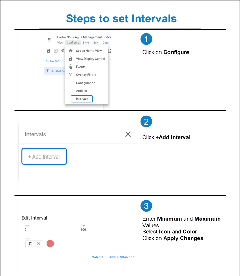
          4. You can set the Intervals to change the color of the count. An icon will be displayed, once the returned metric hits a user-defined number.

To set an Interval,

Go to Configure on the toolbar and then select Intervals or by right-clicking on the view.

Click on Add Interval from a section that appears on the right side of the screen.

Enter Minimum and Maximum Values of the Interval.

Select the Icon and Color.

Click on Apply Changes.
Count Views looks as shown in the figure below.

                    The appearance of Count View can be customized in three ways with the help of Card Style.

                    To apply the style, click on the Card Style icon on the toolbar or right-click on the view, you wish to apply.
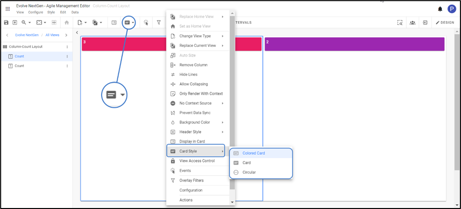
                    

Colored Card – displays with a different choice of colors.

Card – is a simple card type with transparent background.

Circular – is a Card Style displayed in the colored annulus.


Count Comparison


Navigation: erwin Evolve 360 User Help Guide > Charts >

Count Comparison


Count Comparison

Count Comparison View helps to display the count compared to the set of results of two different queries which often displays one value out of another.

Configuration of Count Comparison is much like the Count View which is always displayed as an absolute value. It is during the configuration of color change on intervals that will be triggered as an Absolute value or Percentage.

To create a Count Comparison View:

Count Comparison Views are best to apply along with the layout.

E.g., with the combination of Row and Column Layout.

1.Click on All Views in the editor and then click on  icon placed at the bottom of the list of views.

2.Choose the preferred layout. Click on + Add Content > + Add New View > Select Count Comparison from the list.

          3. To configure the view,

Click on Configuration on the toolbar or right-click on the view.

Select Data Source, either Element Type for a new one or select Filter, for both Numerator and Denominator.

For Instance, select filter for the Numerator and the element for the Denominator.


          4. You can set the Intervals to change the color of the count and to display an icon.

To set an Interval,

Go to Configure on the toolbar and then select Intervals or right-click on the view to select.

Select Absolute if the returned Numerator value falls between the two values.

Select Percentage if the Numerator value falls between the two portions of the overall denominator percent.

Click on Add Interval from a section that appears on the right side of the screen.

Enter Minimum and Maximum Values of the Interval.

Select the Icon and Color.

Click on Apply Changes.

          5. To apply the style, click on the Card Style icon on the toolbar or right-click on the view, you wish to apply. You can choose the preferred style either in Card or Circular as shown in the figure below.


Word Cloud


Navigation: erwin Evolve 360 User Help Guide > Charts >

Word Cloud


Word Cloud

Word Cloud is a visualization format that highlights the important and specific words of the Element.

Word Cloud is not only for the specific element type, but a query can also be defined or can select the list stored in the application.

To create a Word Cloud View:

1.Click on All Views in the editor and then click on  icon placed at the bottom of the list of views.

2.Select Word Cloud from the list of charts.

          3. To configure the view,

Click on Configuration on the toolbar or right-click on the view.

Select Data Source, either Element Type for a new one or Filter.

Click Preview to see the result.

          4. By default, the Property is set with Name. Thus, Preview displays the names of the selected Element Type as shown in the picture below.


Documentos relacionados

The document was helpful.

Selecione a classificação

I easily found the information I needed.

Selecione a classificação