To plot a bar graph, you must, at a minimum, select fields for the following:
The following are general rules that apply when you create a bar graph:
The following guidelines apply when creating pie charts and multi-pie charts using the Graph Wizard.
To create a pie chart, you must, at a minimum, select fields for the following:
The following are general rules that apply when you create a pie chart:
|
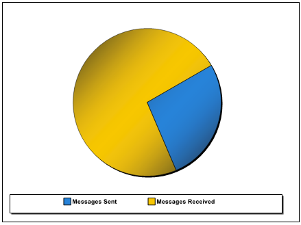
Each field provides data for a pie wedge. The value of the data labels determine the color of the wedge, and the legend label. The following data source and fields (values) were used: Datasource: Data Values: |
| |
|
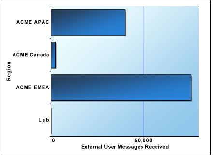
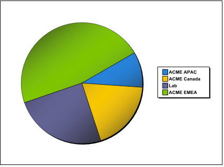
The following data source and fields (values) were used: Datasource: Data Values: Series Labels: |
| |
|
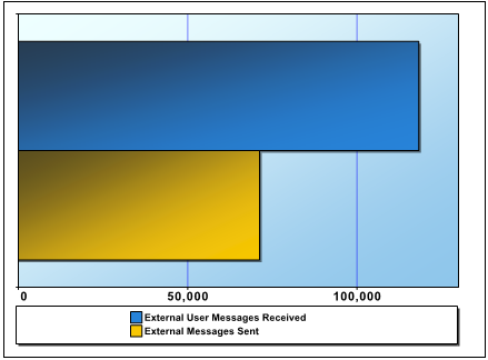
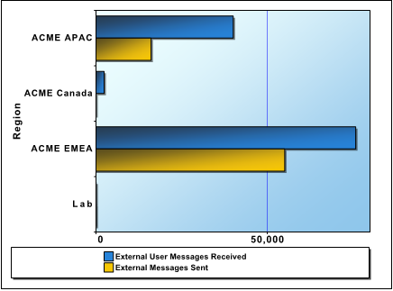
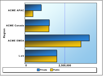
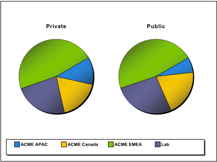
The following data source and fields (values) were used: Datasource: Data Values: Series Labels: |
| |
|
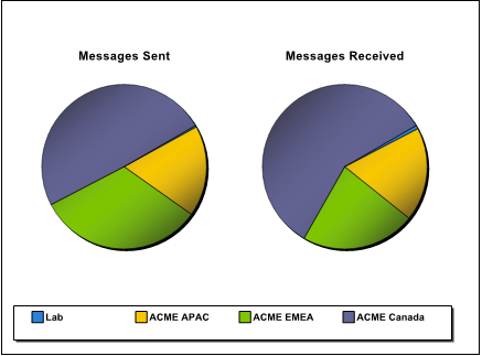
In this example, the following data source and fields (values) were used: Datasource: Data Values: Series Labels: Multi-Pie Select: |
|
To generate an XY or stacked area graph, you must, at a minimum, select fields for the following:
The following are general rules that apply when you create a XY graph:
In the XY graph examples, the data source is Mailboxes - Mailbox Activity Details.
|
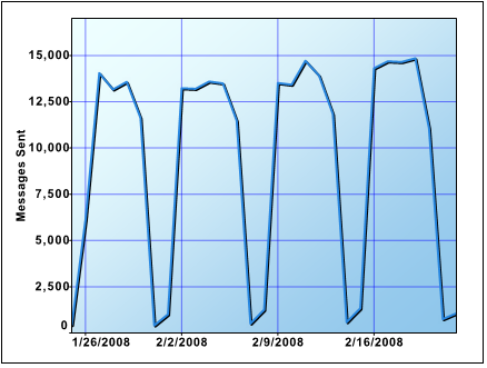
The X-Y data points plot successive points on a line. The following data source and fields (values) were used: Datasource: X-axis Values: Y-axis Values: |
| |
|
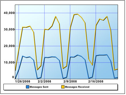
Each Y-axis value is plotted on a separate line, against the supplied X-axis value. The following data source and fields (values) were used: Datasource: X-axis Values: Y-axis Values: |
| |
|
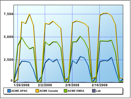
The X-Y values are plotted as lines. The value of the series label determines with which line a point is associated. The following data source and fields (values) were used: Datasource: X-axis Values: Y-axis Values: Series Labels: |
|
The following table describes the extent of editing for each type: