The Width and Height Behavior values of the Sizing property can be set to one of the following options:
|
• |
|
• |
The Minimum and Maximum values of the Sizing property override the natural size, which is useful for labels. |
|
• |
The Preferred value is not relevant, unless the component (such as a Time Plot Chart) has no natural size; in that case, the specified value is used as the natural size. |
|
• |
The Preferred value is used as the specified size. |
|
• |
|
• |
The Preferred value is used if the container has no notion of how big it should be (for example, in popups). |
|
• |
The Minimum and Maximum values are used to ensure a component is not squeezed or stretched in a manner that makes unsightly or unusable. |
Use the following considerations when setting the Width and Height Alignment values of the Sizing property:
|
• |
Start, Middle, and End correspond to left, middle and right if applied horizontally, or top, middle and bottom if applied vertically. |
|
• |
Determine how to align a component within its container if there is more space available than needed. This occurs when the available space is greater than the Natural or Specified size, or in the case of Stretchable, the Maximum size. |
A view’s Maximum Height and Maximum Width options are not overridden by the layout. The layout honors these settings. For example, if you create a view and set its maximum width to 100px, provide it with content wider than 100px, and place it in a grid that has layout properties that permit the view to stretch, the view continues to have a maximum width of 100px even if more space is available.
|
CAUTION: It is possible to select non-metric value when setting a metric. If you do select a non-metric value, no values display in the chart. For example, the Host property CPU Usage is a metric that belongs to a parent, but the Average is not. It is derived from the metric. Both metrics and non-metric data are selected from a dropdown tree. Currently, there is no indication whether or not an item is a metric. |
When you click a link on a page, what displays next depends on a common set of actions called Application Flows. These actions are set in the view editor’s Flow tab.
Flows can be set on parts of the component, such as a table’s rows or individual cells.
The following sections provided details about how to configure flows for a view.
|
• |
|
• |
|
• |
|
• |
This action refreshes the context for all the dependent views. For example, if you change the context on view A, then the data in view B is updated, and the data in view C is updated. By default, the context is initialized the first time a page or view is displayed. You may want to re-initialize context when more than two views are dependent on each other. If view A is not set to re-initialize its context, then view B updates, but view C does not change.
There is a Preserve current timestamp option, which if enabled allows an update to the page without changing the timestamp. This can improve response because fewer components need to be re-rendered.
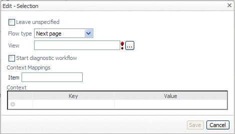
Next Page sets a specific target page. Select the target from a tree of pages. The tree is filtered to only include non-deprecated pages, and dashboards (that have their required context inputs (if any) satisfied by the definition being edited). The purpose of the target page must be Page or Dashboard. This means that the type and the list property what is list-ness?of the inputs must be satisfied. A target page must have its public attribute set unless it is in the same module hierarchy as the page that references it.
The tree of target views is filtered to only include non-deprecated views that have their required context inputs (if any) satisfied by the definition being edited (and their public attributes set unless they are in the same module hierarchy as the referencing page). This means that the type and the list property of the inputs must be satisfied. Also, the list of options is filtered to match views whose purpose includes Pagelet, Summary, Menu and Dialog. A target page must have its public attribute set unless it is in the same module hierarchy as the page that references it.
A Popup has four different behaviors:
|
• |
Dwell: If the popup is associated with a dwell action then it shows the target view in a transitory read-only window. This disappears when the user clicks the mouse anywhere. |
|
• |
Transient: If the action is not dwell and the selected popup type is “transient” the target view is displayed in a transitory window, but in this case user interactions are allowed. The target view disappears if the users clicks outside of it or if another action is fired. |
|
• |
Dialog: If the action is not a dwell then the target view is created in a popup dialog box which the user can interact with, move about, and dismiss. This new popup view is part of the page and disappears along with the rest of the current page if you traverse to a different page. |
|
• |
Modal Dialog: A modal dialog is like a regular dialog box, except that the rest of the UI is frozen until the modal dialog is dismissed. |
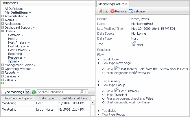
A Type Flow is defined in a Type Mapping using the Type mappings choice in the Module List drop-down. You can associate a default UI flow (via a tag) with a specific data type. For example, you can define a default flow for a Foglight Host to be a drill-down to the Host Summary page.
Type Flow links to selected pages when you specify a type of object. The figure shows a typical configuration. In this case, all cases flow to the same view, the Host Summary page. You have the option of marking the popup as temporary or permanent, which is the reason for having two drill downs to the same page. Also, the flow might be based on a menu choice.
If Select Type Flow is the flow type, Foglight looks for all Type Mappings available in the system for a match. If an exact match is not available, the search continues up the data type inheritance tree until a match is found; an error is reported if this fails. For example, if a WebLogicServer Type Flow is not defined, the system follows its inheritance tree to look for a match: WebLogicServer > JavaEEAppServer > JavaEECollectionModelInstance > CollectionModelInstance > ModelInstance > TopologyObject. If the search reaches the root without finding a match it reports an error.
|
1 |
Open the Flow tab. |
|
3 |
Clear the Leave unspecified check box. |
|
4 |
Click Flow Type and select one of the options. |
|
d |
|
e |
Specify the type whose flow you want to use. This is the name of the view’s context input key whose data type, matches the type flow. |
|
7 |
To use a Next page action to configure the drill down, complete the following steps: |
|
b |
Select the Update node. |
|
d |
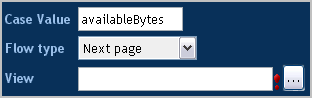
To do that, in the right pane, in the Case Value box, type the name of a metric. |
|
e |
To open another view when the user clicks the area in the chart that shows a metric, click Flow Type and select Next page from the list. |
|
f |
Specify the view that you want to appear when the user clicks the area in the chart. To choose from existing views, click the Browse button to the right of the View box. |
|
g |
Click Apply. |
|
8 |
|
9 |
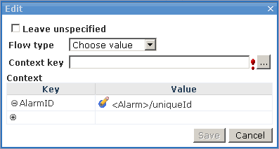
Click the Browse button to the right of the Context Key box and choose a name from the list that appears. |
|
10 |
Click Save. |
Follow the procedure given below to configure a case.
|
1 |
|
2 |
Select a key from the Context key drop-down list. This is the key that you have configured to have different bindings that are going to be used as case values. |
|
3 |
Click Save. |
|
1 |
Click  , whose tooltip is Click to add a case. , whose tooltip is Click to add a case. |
|
3 |
Type a context key in the Case Value text field and specify a Flow type in the drop-down list. |
|
6 |
Click OK. |
|
• |
Click  on the row of the case. on the row of the case. |
There is also a Context group box where you can specify any additional context to be passed to the target view. This may be necessary if the target view has a required context that is not already defined in the calling view’s context.
For example, use Choose Type if your type is Host and you want to go to different pages depending on whether the actual object is a WindowsHost or an AIXHost.
Invoke task allows you to invoke a task when an action occurs. For example, you acknowledge an alert or launch a program on your desktop with information from the Foglight® application. The tree of tasks is filtered to only include non-deprecated tasks that have their required context inputs (if any) satisfied by the definition being edited. This means that the type and the list property of the inputs of the task to be invoked must be satisfied.
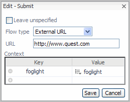
Instead of flowing to another Foglight view, any Web page can be referenced by specifying its URL.
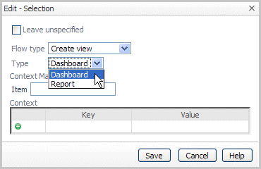
This choice provides a link to the Create Dashboard or Create Report wizards.
|
• |
Add: Add an existing component to the layout. |
|
• |
Define Customize: Place a link to a view in the General tab of the action panel. |
|
• |
Properties: Show the placement properties dialog box for the selected component. |
|
• |
Inspect: Inspect the chosen component by opening it in the Definitions pane. |
|
• |
Remove: Remove the selected component from the layout. |
