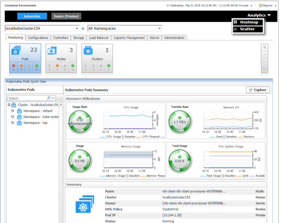
In the Container dashboard, choose Kubernetes from the header. Then click Analytics from the header, a drop down view will display with Heatmap and Scatter on it. Click Heatmap will navigate to the Kubernetes Heatmap Analytics dashboard, while click Scatter will navigate to the Kubernetes Scatter Plot Analytics dashboard.
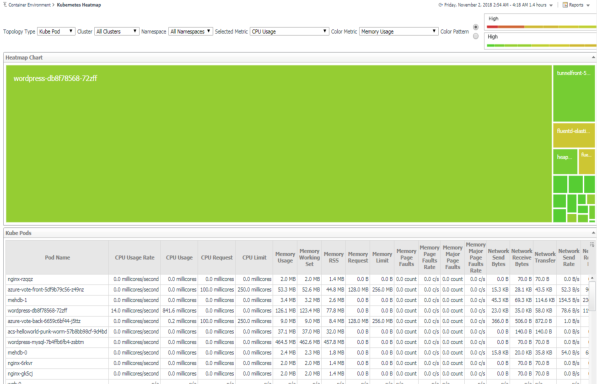
Heat maps will be refreshed automatically when you change either of the following fields:
|
• |
Topology Type: Indicates the monitored topology object, including Kubernetes Pod, Kubernetes Node, and Kubernetes Cluster. |
|
• |
Cluster: Lists all clusters available in the monitored Kubernetes environment. |
|
• |
Namespace: Lists all namespaces available in the monitored Kubernetes environment. |
|
• |
Selected Metric: Populates a rectangle based upon the selected metrics. For example, if you select Memory Usage from the Selected Metric drop-down list, the rectangle area will be populated based on the used memory for the selected topology object. For more information about metrics, refer to Kubernetes metrics . |
|
• |
Rendering related metrics: For example, if you select CPU Usage Rate and Red to Green, the rectangle of the topology object that has larger value of CPU Usage Rate will be rendered in red. |
|
• |
Color Metric: Renders the color of rectangle based upon the selected color metric. |
|
• |
Color Pattern: Offers two patterns, Red to Green (larger value shows in red) or Green to Red (larger value shows in green). |
Figure 39 shows an example of heat map. This sample diagram represents the “wordpress-db8f78568-72zff” has the maximum amounts of CPU usage, while “fluentd-elastic-ef455uh68-72cfe” has a higher Memory Usage. If you switch the Color Pattern, then “wordpress-db8f78568-72zff” will turn to red. Clicking the object name on the heat map directs you to the relevant object Explorer dashboard. For more information, see:
|
• |
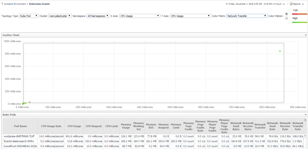
Topology Type: Indicates the monitored topology object, including Kubernetes Pod, Kubernetes Node, and Kubernetes Cluster. |
|
• |
Cluster: Lists all clusters available in the monitored Kubernetes environment. |
|
• |
Namespace: Lists all namespaces available in the monitored Kubernetes environment. |
|
• |
X Axis: Indicates which metrics will be plotted on X axis. |
|
• |
Y Axis: Indicates which metrics will be plotted on Y axis. |
|
• |
Color Pattern: Offers two patterns, Red to Green (larger value shows in red) or Green to Red (larger value shows in green). |
Figure 40 shows an example of Scatter Plot analytics. The purple circle in the middle represents the following: “wordpress-db8f78568-72zff” CPU Usage is around 0.85 cores, its Memory Usage is around 121MB, and its value of Network Transfer Bytes is not high. For more information, see:
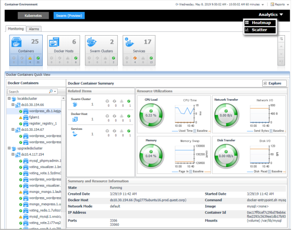
In the Container dashboard, choose Docker Swarm from the header. Then click Analytics from the header, a drop down view will display with Heatmap and Scatter on it. Click Heatmap will navigate to the Docker Swarm Heatmap Analytics dashboard, while click Scatter will navigate to the Docker Swarm Scatter Plot Analytics dashboard.