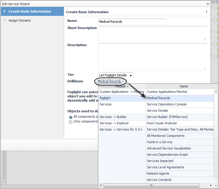
Chat now with support
Chat with Support

Foglight for Application Operations 5.9.8.5 - User Guide

Introducing Foglight APM Monitoring Transactions Examining Response Times Examining Error Breakdowns Viewing Real User Activity from a Geographical Perspective Using the SOC Transactions Tab Using the SOC for APM triage Creating Custom Drag-and-Drop Dashboards APM Tile and View Reference Appendix: Enabling End User Transactions from FxM and FxV

Linking a custom dashboard to the Explore icon for a service

After you have created the dashboard, you can add a link to it from the Explore icon for a service in the SOC.

1
Open the Service Builder. Under Dashboards, click Services > Service Builder.
7
Click Finish.

For more information about creating custom dashboards, see the Foglight User Help.


APM Tile and View Reference

This section contains reference information about APM-related tiles and views. Read this section to find out more details about the metrics appearing on these views.

Foglight displays monitoring data in views that group, format, and display data. The main types are described here.

Dashboards are top-level views that contain lower-level views. The dashboards supplied with Foglight, as well as those created by users, are accessible from the navigation panel.

Lower-level views in Foglight can be added to dashboards or can be accessed by drilling down from a dashboard. They receive and display data directly from the Management Server or from other views. Some views filter or select data that appears in other views in the same dashboard. Some are tree views with expandable nodes for selecting servers, applications, or data.

Foglight for Application Operations includes the Transactions dashboard, and the Transactions tab on the Service Operations Console (SOC), which allow you to monitor transactions using a combination of tiles and drill-down views when the appropriate options are selected. The sections that follow describes these tiles and views in more detail.

For a general introduction to the APM tiles and detail views, see Overview of APM tiles and Overview of Detail views.

The following table includes a list of monitored domain icons and links to their matching tile views.

Application Servers - .NET tile

Application Servers - Java tile

DB2 tile

Host tile

JMX tile

MQ tile

Oracle tile

OS tiles

Pivot tiles

Real User (APM) tile

Real User (FxM) tile

Sequence tile

SQL Server tile

Sybase tile

Synthetics tile

Virtual Hyper-V tile

VMware tile

For a list of topology object names associated with these tiles, see Topology object name reference table.

Overview of APM tiles

Foglight for Application Operations includes a tile view for each monitored domain. In order to populate these tiles, the appropriate Foglight cartridge must be installed and configured to monitor the domain or component. For example, in order to view the Application Servers - Java tile, you must install Foglight for Java EE Technologies and configure it to monitor at least one Java application server.

The metrics displayed on a tile are specific to the domain, but the overall look and functionality of the tiles are common. For example, the following tile presents JMX data:

Topology Object Name: JMXServer

The icon in the top left corner indicates the current state of alarms for the component.

The title bar includes the component name, and the Explore icon . Click the icon to open a detail view. For more information, see Overview of Detail views.

Each component is represented by a unique icon that provides easy, at-a-glance recognition of the domain.

The most important metric for the domain is displayed in the largest font, directly below the component icon, on the left side of the tile. Where no one metric takes precedence (for example, on the Host tile), the current alarms are displayed instead.

The right side of the tile displays a graphical summary of key metrics for the component. For example, the JMX tile includes a health breakdown for MBeans, as in the example above. Other domains include a chart of the key metric for the time range selected (such as Response Time), an overall health history (color-coded bar), or a list of session bottlenecks.

Additional metrics that are key to the component appear at the bottom of the tile.

NOTE: The values of these metrics are always current, unless the value appears in italics (for example, GC 0.26%). Italicized metrics reflect the period average instead of the current value.

Application Servers - .NET tile

Use the Application Servers - .NET tile to gather performance information about the state of .NET® transactions monitored by Foglight for Microsoft .NET, version 5.9.x or later.

Topology Object Name: CustomApplicationTransaction

Hits. The number of calls served in the most recent collection interval.
Health History Bar. The color-coded bar represents the alarm state of the monitored component over the time range selected in the SOC. The color of the bar changes depending on the alarm state. Red indicates a Fatal state, orange indicates Critical, yellow means Warning, and green is the Normal state.
Response Time. A plot of the request response time.
Exceptional Exits. The number of exceptional exits recorded.
Bottleneck. Indicates the portion of the application where requests are experiencing slowdowns.
Related Documents

The document was helpful.

Select Rating

I easily found the information I needed.

Select Rating