
Using the Web Component Tutorial
Browser Interface Views
How to Use this Tutorial
Tutorial 1: Drag and Drop
Tutorial 2: Creating a Dashboard
Constructing the Tutorial Module
Configuring a Query
Configuring a Row-Oriented Table
Building the Dashboard
Summary
Tutorial 3: Adding a Drilldown Page
Preliminary Setup
Adding a Column of Aggregate Alarms to the Table
Adding a Dependent Page
Summary
Tutorial 4: Adding Views
Designing the Page
Preliminary Setup
Defining the Alarms Query
Configuring a Table of Alarms
Configuring a Chart Component
Configuring a Label with an Action
Configuring the Drilldown Page
Configuring a Drop-Down List
Flowing Monitored Hosts to Host Details T3
Adding a Customizer
Adding Nested Views
Summary
Tutorial 5: Using a Grid
Tutorial 6: Reports
Configuring a Query
Creating a Basic Report Page
Creating a More Elaborate Hosts Table
Adding a Header
Adding a Footer
Adding an Iterator for a Multi-Page Report
Summary
Tutorial 7: Creating a Form
About this Tutorial
Defining the Enumerated Types for Manager and Staff
Defining the Manager and Staff Types
Defining the Company Type
Defining the Functions for Adding and Removing a Manager
Defining the Labels
Defining the Bean Input Components
Defining the Grid Layout
Defining the Dialog
Defining the Table of Managers
Summary
Tutorial 8: Renderers
Tutorial 9: Adding Questions and Answers
Working with Associations and Question Viewers
Tutorial 10: Sending Messages to Other Users
About Domain Associations
About Question Associations
About Category Associations
About Question Viewers
Building Associations for Your Question Viewer
Populating the Question Viewer with Questions and Answers
Building a Mini-Viewer
Summary
Add Text
|
1 |
If the dashboard is not already opened, select the dashboard from the My Dashboards node. |
|
2 |
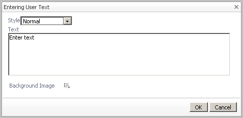
The Entering User Text dialog box appears.
Figure 10. Entering User Text
|
• |
Change the text Style (for example, Small) |
|
• |
Type the Text to appear in the dashboard. |
|
• |
Add a Background Image. For more information, see Adding a Background Image to a portal or its text component . |
|
4 |
Click OK. |
Delete This Page
|
1 |
If the dashboard is not already opened, select the dashboard from the My Dashboards node. |
|
2 |
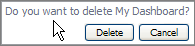
Figure 11. Deleting a dashboard
|
3 |
If you click Delete, the dashboard is deleted immediately. There is no additional confirmation dialog.
Adding a Background Image to a portal or its text component
By dragging a text component you can upload a background image, such as a map.
|
1 |
|
• |
For a portal, the choice is available on the General tab by choosing Properties > Edit basic properties. The Edit View Properties dialog box appears. |
|
• |
For the text component, the choice is available on the General tab by choosing Drag into portal to add text. The Entering User Text dialog box appears. |
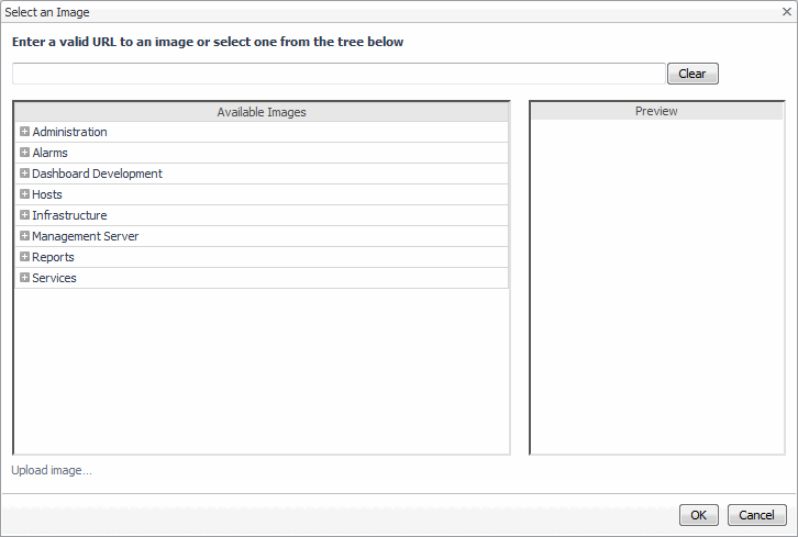
The Select an Image dialog box appears.
Figure 12. Select an Image
|
• |
In the tree under Dashboard Development > Support > Maps, choose one of the mapped, themed images that are included with Foglight. |
|
• |
Upload your own image by clicking Upload Image. |
You can use the image to add monitoring views based on absolute location by dragging and selecting views onto your image. For more information on adding views, see Add View .
Using the Metrics Analyzer
Figure 13. Metric charts

Figure 14. Metric Analyzer

|
2 |
Select other metrics so you can view them in that same parent. For example, if you select receiveRate, the corresponding chart also appears in the Metric Analyzer view. |
|
3 |
Select the Individual Charts tab to display each metric individually or click the Single Chart tab to view all selected metrics in a single chart. |
|
NOTE: From any view you have created on your dashboard, you can click the Options icon (  ), (also known as the Edit or Customizer icon depending on its usage). A popup appears that displays a list of other options available. ), (also known as the Edit or Customizer icon depending on its usage). A popup appears that displays a list of other options available. |
|
NOTE: You can also customize your view to add a configurable drill-down so you can go to another existing view or a drill-down you have created. For example to configure a user action so that a popup appears when a metric is selected, select Edit Properties. In the Config Portlet dialog box, click the Actions tab and choose the Popup option. For more information on configuring actions, see Actions tab . |