Monitoring Desktops
A Desktop component in your monitored XenDesktop® environment encapsulates Windows® desktop and application components that are delivered to end-users on demand. You can monitor the performance of Desktop components when you select the Desktops tile on the XenDesktop Environment dashboard. The information appearing in the XenDesktop Desktop Quick View can help you discover potential resource-level issues such as spikes in resource utilization, and to reallocate resources where they are most needed.
|
1 |
|
2 |
|
3 |
|
4 |
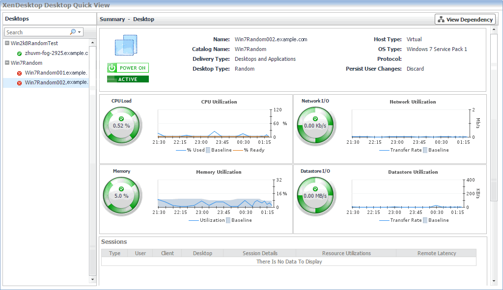
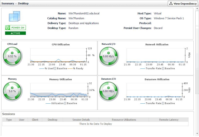
Investigating the use of Desktop resources
In your monitored environment, a Desktop component encapsulates a Windows® desktop together with application elements that are delivered to end-users on demand. You can review the performance of individual desktops in the Summary - Desktop view. This view shows the usage of system resources for the selected desktop. Use it to see the trends in usage of the selected component’s system resources, and to review any generated alarms, if they exist. For example, high peaks in the memory utilization chart, that drastically exceed historical values could result in performance degradation and should be investigated.
|
| |
|
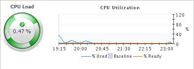
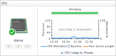
For virtual desktops, the CPU view displays the CPU Load spinner indicating the current percentage of the selected virtual machine’s CPU load, used to execute system code and user programs, based on the total CPU capacity. The % Used line in the CPU Utilization chart shows the percentage of the CPU utilization used by the virtual machine to execute system code and user programs, during the selected time period. % Ready displays the percentage of the virtual machine’s CPU resources that are ready to execute system code and user programs during the selected time period. The Baseline area in the chart indicates the expected CPU utilization range based on historical data. For physical desktops, the CPU Utilization line in the chart shows the percentage of the CPU utilization used by the physical machine to execute system code and user programs, during the selected time period. Run Queue Length displays the number of processes that are waiting to be executed, during the selected time period. The Baseline area in the chart indicates the expected CPU utilization range based on historical data. The History bar appearing above the chart indicates the alarm state of the selected desktop’s CPU resources over the selected time range period. The color of the bar changes over that period depending on the alarm state. Red indicates that the selected component is in Fatal state, orange indicates Critical, yellow means Warning, and green is for the Normal state. | |
|
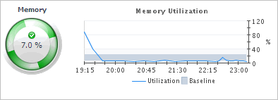
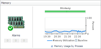
For virtual desktops, the Memory view displays the Memory spinner indicating the current percentage of the average memory usage by the selected virtual machine, based on the total memory capacity. The Utilization line in the Memory Utilization chart shows the percentage of memory used by the virtual machine during the selected time period. The Baseline area in the chart indicates the expected memory utilization range based on historical data. For physical desktops, the Memory Utilization line in the chart shows the percentage of the memory resources physical machine uses during the selected time period. The Baseline area in the chart indicates the expected memory utilization range based on historical data. The History bar appearing above the chart indicates the alarm state of the selected desktop’s memory resources over the selected time range period. The color of the bar changes over that period depending on the alarm state. Red indicates that the selected component is in Fatal state, orange indicates Critical, yellow means Warning, and green is for the Normal state. | |
|
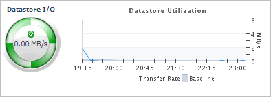
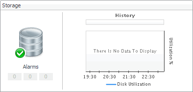
For virtual desktops, the Datastore view displays the Datastore I/O spinner indicating the current datastore I/O rate the selected virtual machine utilizes, based on the total datastore capacity. The Transfer Rate line in the Datastore Utilization chart shows the rate at which the virtual machine reads and writes data to the datastore during the selected time period. The Baseline area in the chart indicates the expected datastore utilization range based on historical data. For physical desktops, the Disk Utilization line in the chart shows the percentage of the disk resources the physical machine uses during the selected time period. The Baseline area in the chart indicates the expected disk utilization range based on historical data. The History bar appearing above the chart indicates the alarm state of the selected desktop’s disk resources over the selected time range period. The color of the bar changes over that period depending on the alarm state. Red indicates that the selected component is in Fatal state, orange indicates Critical, yellow means Warning, and green is for the Normal state. | |
|
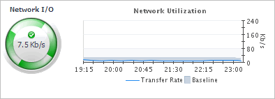
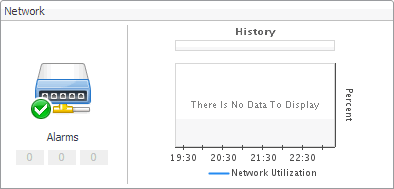
For virtual desktops, the Network view displays the Network I/O spinner indicating the current rate at which the selected virtual machine transfers data from and to the network. The Transfer Rate line in the Network Utilization chart shows the rate at which the selected virtual machine receives and sends data to the network during the selected time period. The Baseline area in the chart indicates the expected network utilization range based on historical data. For physical desktops, the Network Utilization line in the chart shows the percentage of the network resources the physical machine uses during the selected time period. The Baseline area in the chart indicates the expected disk utilization range based on historical data. The History bar appearing above the chart indicates the alarm state of the selected desktop’s network resources over the selected time range period. The color of the bar changes over that period depending on the alarm state. Red indicates that the selected component is in Fatal state, orange indicates Critical, yellow means Warning, and green is for the Normal state. | |
|
| |
|
|
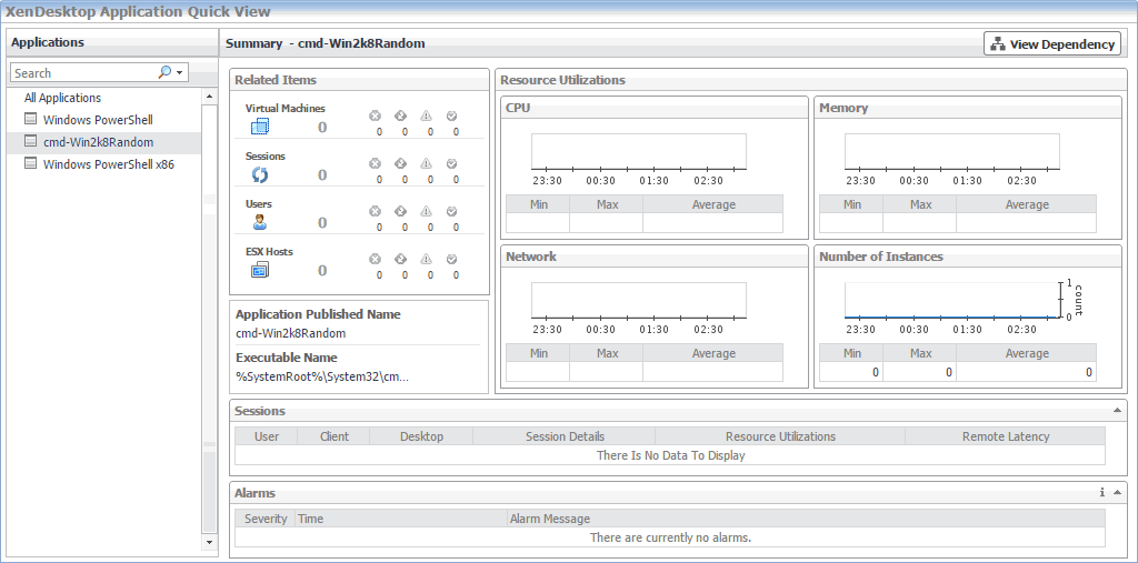
Monitoring Applications
XenDesktop® facilitates delivery of application components to end users on demand. You can monitor the performance of available applications when you select the Applications tile on the XenDesktop Environment dashboard. The information appearing in the XenDesktop Application Quick View can help you discover potential resource-level issues such as high number of application instances, and to reallocate resources where they are most needed.
|
1 |
|
2 |
|
3 |
In the XenDesktop Application Quick View, in the Applications view on the left, click All Applications. |
|
4 |
In the XenDesktop Application Quick View, in the Applications view on the left, click an application node. |
|
5 |
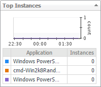
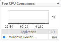
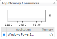
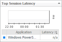
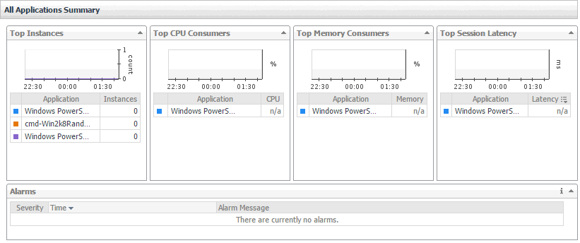
Identifying top Application consumers
Your monitored XenDesktop environment delivers applications to end users on demand. The All Applications Summary view identifies the applications with the highest number of instances, and the highest CPU and memory utilization, and session latency. This view appears in the Quick View when you select All Applications in the Applications view on the left. Use it to look for potential bottlenecks in your system and prevent potential service disruptions by reallocating system resources where they are most needed.