Working with Simple Bubble Charts
A Simple Bubble Charts allow you to compare objects of the same type, by analyzing three levels of data and using the values to affect the size and position of the representations on the chart.
One value is used to position the bubble on the X-axis, another value is used to position the bubble on the Y-axis, while the size of the bubble is based on the third property.
With its accompanying Data Quality Chart, it also enables you to see where your data is incomplete, by highlighting objects that do not have values set for the properties you are referencing.
If you want to use a Bubble Chart that visualizes data from associated or indirectly associated objects, see Working with Cluster Bubble Charts.
|
|
The Simple Bubble Chart requires three properties to compare - and these must all be either Whole Number or Decimal Number properties - or they can be Drop-Down properties where the Abbreviation contains a number. |
Why and how should you use one?
You should use a Simple Bubble Chart when you want to visualize a comparison between objects based on three properties.
A typical example would be to have some Application objects with three useful properties:
1. Cost - a Whole Number property to represent the monetary cost of the application
2. Business Alignment - a Drop-Down property ranging from '0 - Unknown' to '5 - Very High', which represents how important the application is to the business
3. IT Alignment - a Drop-Down property with the same range as Business Alignment, which represents how well aligned the application is to your current IT infrastructure, support and competencies
In this example the IT Alignment is used as the X-axis, the Business Alignment is the Y-axis, and the size of each bubble is based on the Cost.
Where and when can you use one?
Use the table below to see where you can use a Simple Bubble Chart:
|
Page Type |
Parent node |
Tabs |
Number on page |
Editable |
|
Index Page |
Object Type node |
The chart must be in a Tab, but there can only be one Tab |
The Bubble Chart must be the only item on the page |
No |
What would you like to do?
Add a Simple Bubble Chart to your page
|
|
These instructions assume you have an Index Page node, containing a Tab Controller with one Tab that includes an Object Type node. The result will be an Index Page including two Tabs, one which you created and named yourself and that holds the Bubble Chart, and the second which is automatically created and is used for the Data Quality Chart. |
1. Select the Object Type node and ensure all the properties you want to reference are selected in the Selected Properties area
2. If you want to filter the list of objects displayed, use the Filter Properties area to apply any filtering
3. Switch the Layout node beneath the Object Type node to Empty
To do this: Right-click the Layout node and choose Switch Layout > CW > Empty
4. Add the Bubble Chart (Simple) behavior to the Layout node
To do this: Right-click the Layout node and choose Add Behaviors > Bubble Charts > Bubble Chart (Simple)
A Dashboard Bubble Chart node is added
5. Select the Bubble Chart (Simple) node and configure the following settings:
oUse the Node Name to set the title of the chart as it appears in the web page
oUse Circle to specify the Scriptname of the property you want to use to affect the size of the bubble
Always use lower case when referring to Scriptnames
oUse X to enter the Scriptname of the property you want to use on the X-axis
oUse Y to enter the Scriptname of the property you want to use on the Y-axis
oUse the three Data Quality settings to choose whether the corresponding properties are Drop-Downs (Lookups) or number properties
Choose 'Lookup_Abbreviation_Not_o' if the property is a Drop-Down
Choose 'Not_Equal_To_o' if the property is a number
oUse Circle Unit to specify the text to be displayed on the chart for the bubble size value
oUse X Unit to specify the text to be displayed on the X-axis - leave blank to use the Property Type Name
oUse Y Unit to specify the text to be displayed on the Y-axis - leave blank to use the Property Type Name
oUse Circle Intersection Object Type to specify the Scriptname of the Object Type used on the Object Type node
6. Save your Site.
Working with Cluster Bubble Charts
Cluster Bubble Charts are similar to Simple Bubble Charts, except they allow you to visualize the properties of an Associated Object (directly or indirectly), or an Intersection Object.
You can analyze three levels of data of the Associated Objects, using the values to affect the size and position of the representations on the chart.
One value is used to position the bubble on the X-axis, another value is used to position the bubble on the Y-axis, while the size of the bubble is based on the third property.
The way the Cluster Bubble Chart evaluates Associated or Indirectly Associated Objects is very similar to the way Recursive Pie Charts work, however, instead of creating one chart that you can drill down through, it creates a number of Tabs, one for each of the items in the top-level Object List, and then creates a Bubble Chart on each one.
The Cluster Bubble Chart does not display a Data Quality Chart like the Simple Bubble Chart does.
|
|
The Cluster Bubble Chart requires at least one Association Type to exist - plus three properties on the Associated Object to compare. These properties must all be either Whole Number or Decimal Number properties - or they can be Drop-Down properties where the Abbreviation contains a number. |
Why and how should you use one?
You should use a Cluster Bubble Chart when you want to visualize a comparison between objects based on three properties - but you want to take a higher-level view by using one or more associations.
A typical example would be like the example for Simple Bubble Charts, to have some Application objects with three useful properties:
1.Cost - a Whole Number property to represent the monetary cost of the application
2.Business Alignment - a Drop-Down property ranging from '0 - Unknown' to '5 - Very High', which represents how important the application is to the business
3.IT Alignment - a Drop-Down property with the same range as Business Alignment, which represents how well aligned the application is to your current IT infrastructure, support and competencies
In this example the IT Alignment is used as the X-axis, the Business Alignment is the Y-axis, and the size of each bubble is based on the Cost.
However, where this differs from the Simple Bubble Chart is that instead of having one chart showing all the objects, your Applications are associated to different Location objects and you want to see a chart for each Location showing only the Applications associated to it.
The result is a Tab for each Location object and then a Bubble Chart for each showing just its associated Applications.
While this example shows one level of association, you could make your chart use several, such as Location > Organization > Application, or more.
Where and when can you use one?
Use the table below to see where you can use a Cluster Bubble Chart:
|
Page Type |
Parent node |
Tabs |
Number on page |
Editable |
|
Index Page |
Object Type node |
You must have an empty Tab Controller on the page |
The Bubble Chart must be the only item on the page |
No |
What would you like to do?
Add a Cluster Bubble Chart to your page
1. Create a new empty Index Page with an empty Tab Controller and an Object Type, both added to the Index Page node, in that order
See Create an Empty Index Page for instructions
2. Select the Object Type node and use the Filter Properties area to apply any filtering
3. Switch the Layout node beneath the Object Type node to Empty
To do this: Right-click the Layout node and choose Switch Layout > CW > Empty
4. Add the Bubble Chart (Cluster) behavior to the Layout node
To do this: Right-click the Layout node and choose Add Behaviors > Bubble Charts > Bubble Chart (Cluster).
A Bubble Chart (Cluster) node is added.
5. Add an Association node to the Object Type node
To do this: Right-click the Object Type node and choose New Association > [object-type] > [association-type]
A new Association Type node is added.
|
|
If your chart examines indirectly associated objects, add all the additional Association Types required, nesting them beneath each other The last Association node you add is for the Object Type you want the bubbles on the chart to represent. |
6. Select the Bubble Chart (Cluster) node and configure the following settings:
oUse the Node Name to set the title of the chart as it appears in the web page
oUse Circle to specify the Scriptname of the property you want to use to affect the size of the bubble
This should be from the Associated Object - or, if you are referencing an Indirect Association, from the last Associated Object in the path.
|
|
Always use lower case when referring to Scriptnames. |
oUse X to enter the Scriptname of the property you want to use on the X-axis.
oUse Y to enter the Scriptname of the property you want to use on the Y-axis.
oUse the three Data Quality settings to choose whether the corresponding properties are Drop-Downs (Lookups) or number properties.
Choose 'Lookup_Abbreviation_Not_o' if the property is a Drop-Down
Choose 'Not_Equal_To_o' if the property is a number
oUse Circle Unit to specify the text to be displayed on the chart for the bubble size value
oUse X Unit to specify the text to be displayed on the X-axis - leave blank to use the Property Type Name
oUse Y Unit to specify the text to be displayed on the Y-axis - leave blank to use the Property Type Name
oUse Circle Intersection Object Type to specify the Scriptname of the Associated Object Type
7. Save your Site.
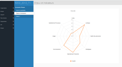
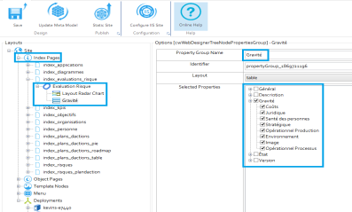
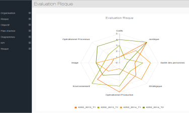
A Radar layout is used to create a chart that displays three or more* Object properties on different axes which start from the same central point.
A simple Radar chart uses one line to display the different properties of a single object (a Property Group).
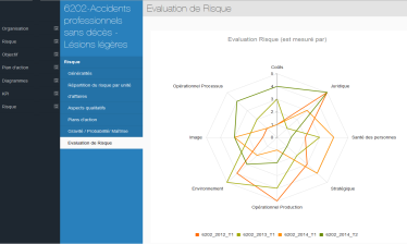
The Radar layout can also overlay multiple lines into a single chart to display the various properties of an Object List. Each line is used to represent a different Object.
With the Radar layout, you can use one chart to visually consolidate multiple values of a single object, or multiple values of many objects, against one another.
|
|
*We recommend that 3-10 properties or values are used per Object for clarity purposes. |
Why and how should you use one?
Use the Radar layout when you want to visually compare the different properties of a single object, or of many objects, against each other.
You can use radar layout list in an index page or a single page. To do this, add an index page (or add a “New Association” for single pages).
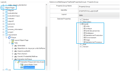
Next, add a properties group and under “Selected Properties”, tick the properties that you wish to display in the radar layout. Please note that only integer properties (i.e numbers) can be represented in radar layout.
Where and when can you use one?
Use the table below to see where you can use the Radar Layout:
|
Page Type |
Parent node |
Tabs |
Number on page |
Editable |
|
Index Page |
Object Type node |
Yes - optional |
Any |
No |
|
Object Page |
Association Type node |
Yes - mandatory |
Any |
No |
What do you want to do?
Use a Radar Layout
To create a Radar layout for the properties of a single object:
This is either the Object Type Node on an Index Page or an Association Type Node on an Object Page.
|
|
Selection is only applicable for integer Properties as Radar Layout requires that only integer values are used to create charts. Decimal numbers are permitted, however. |
|
|
|
1. In Evolve Designer, locate the Parent Node that you want your Radar Layout to be applied to.
2. From the Layout drop-down menu, select Radar.
3. In the Selected Properties area of the Parent Node, select all the properties that you want to display in the Radar.
4. Save and Publish your Site.
5. Navigate to the appropriate Object or Index Page on your Site, and the Radar chart will be displayed.
To create a Radar layout for the properties of many objects:
This is either the Object Type Node on an Index Page or an Association Type Node on an Object Page.
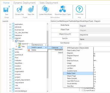
Choose Switch Layout > CW > Radar.
1.In Evolve Designer, locate the Parent Node that you want your Radar Layout to be applied to.
2.Right-click beneath the Parent Node Layout to change the Layout to Radar:
3.In the Selected Properties area of the Parent Node, select all the properties that you want to display in the Radar.
4.Save and Publish your Site.
5.Navigate to the appropriate Object or Index Page on your Site, and the Radar chart will be displayed.
|
|
|
|
|
|
|
|
When inserting a Property Group, we recommend you only display a small number of properties in any particular group - your page will look much better if you restrict the number of properties in each one. |
Working with the Visual Identity Layout
The Visual Identity layout is used to show a list of objects with Visual Indicators to represent some of their properties, rather like you can with Shape Regions in CW Modeler.
The layout displays each object as a rectangle, and then at the bottom of each shape you can show icons to represent the values of one or more properties of your object.
It means you can build a dashboard-like page for a set of objects, highlighting important data about each one, for example, showing a red circle if an object has a Business Risk of '3 - High' or a green circle if it has a Business Risk of '1 - Low', and so on.
|
|
As for all Visual Indicators, the Visual Identity layout only supports lookup (drop-down) and check box (true or false) properties of your objects. |
|
|
In order to use the Visual Identity layout you must have configured a Custom Site to support the use of Visual Indicators. |
Why and how should you use one?
Use the Visual Identity layout when you want to create a dashboard-like view of a set of objects or associated objects, highlighting some of the important data about the objects displayed.
For example you could use the layout to provide an overview of the state of a set of Server objects, using the indicators to show high-level data about each server.
Where and when can you use one?
Use the table below to see where you can use the Visual Identity layout:
|
Page Type |
Parent node |
Tabs |
Number on page |
Editable |
|
Index Page |
Object Type node |
Yes - optional |
One, or one per Tab |
No |
|
Object Page |
Association Type node |
Yes - mandatory |
One per Tab |
No |
Use the Visual Identity layout
|
|
These instructions assume you have already configured your Custom Site to support the use of Visual Indicators for the Object Types and Property Types you want to reference. |
To use the Visual Identity layout:
1. In Evolve Designer, locate the parent node you want your Visual Identity layout to be applied to
This is either the Object Type node on an Index Page or an Association Type node on an Object Page
2. In the Selected Properties area of the parent node, select all the properties you want to use as visual indicators
3. Switch the Layout of the node to Visual Identity
Right-click the layout beneath the parent node and choose Switch Layout > CW > Visual Identity
4. Select the Layout Visual Identity node
5. In the Properties List field, enter the Scriptname of the Property Type you want to be used as an indicator
You can reference multiple Property Types by entering the Scriptnames of each, separated using comas
6. Save and Publish your Site.