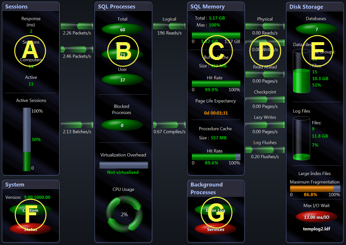
The Spotlight on SQL Server home page helps you locate system bottlenecks quickly. Related server statistics are grouped together on panels that are connected by a series of graphical flows and icons. Spotlight on SQL Server updates these flows in real time so you can see how quickly data is moving through the system. The icons change color as their values move through the range of thresholds.
The display is based on the SQL Server architecture diagram. See "A review of the SQL Server Architecture" (page 1) for more information.
To see the Spotlight Home Page
Click Monitor | Home.

|
A |
E |
||
|
B |
F |
||
|
C |
G |
||
|
D |
Dataflows |
||
|
|
|
|
Notes:
 on the affected component, chart or grid. Click the icon to see more information about the problem.
