Chat now with support
Chat mit Support

Foglight 5.9.2 - User Guide

Running a Report

You can run, create, and manage your reports from any dashboard. The Reports menu is available on the top right corner of a dashboard. Some dashboards have an associated report template displayed at the top of this menu. For example, open the hosts dashboard. The All Hosts Report template is listed. In addition, if a user has created reports based on a dashboard and allowed your user role access to it, these reports are also listed in the Reports menu for that dashboard. For more information on reports, see Reporting on Your Enterprise .

Choosing a Home Page

You can choose any dashboard and make it your personal home page. Other dashboards can also be designated as home pages by a dashboard developer. These are listed under Homes in the navigation panel.

2
Click Make this my home page in the action panel.
The dashboard is listed under Homes in the navigation panel and will be the first page that Quest Foglight displays every time you log in.

If you later choose another dashboard as your home page, it replaces the previous one.

Getting Started FAQ

Foglight controls access to dashboards and views by means of roles. Your Administrator assigns users to groups and then assigns roles to those groups.

If you do not see any dashboards in the navigation panel, the user you signed in as may not have been assigned to a group. Contact your Administrator for assistance.

When you try to access a dashboard or view, Foglight matches the roles of the groups to which you belong against the relevant roles and the allowed roles that were set for that dashboard or view.

Relevant roles control which dashboards and views are listed in the navigation and action panels. Allowed roles control which dashboards and views a group can access. In some dashboards, one or more views may not be available because your roles have not been set as allowed roles for them.

Operator

Access to basic dashboards. Operators can also access dashboards like Service Operations Console, Agents, and Hosts.

Advanced Operator

Extends Operator to include dashboards like the Service Builder.

Yes. If you leave a dashboard and then return to it, you see the last views that were displayed.


Working with Dashboards

This group of topics describes how to work with Quest Foglight dashboards and provides an overview of the common elements that are found on most dashboards.

Quest Foglight uses views to group, format, and display monitoring data.

Dashboards are top-level views that do not need to receive data from other views. Dashboards typically contain a number of other views that display monitoring data. You access dashboards using the navigation panel.

Quest Foglight includes a number of monitoring views and dashboards. You can also create and edit your own custom views and dashboards.

For information about common elements that are found on most dashboards, as well as creating your own custom views and dashboards, see the following topics:

This section describes the Quest Foglight screen elements that you can see regardless of which cartridges have been installed.

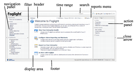
In addition to the display area and the two panels, a typical screen in Quest Foglight includes other elements, which are indicated in the following graphic.

For more information, see the following topics:

The navigation panel contains all the dashboards that you can access based on your role. On the left side of the page, hover your mouse over the arrow to view the list of available dashboards. Expand a module and select a dashboard to view it in the display area. When you move your mouse away, the navigation panel closes to give you a full view of the dashboard contents. If you want to keep the navigation panel open, click the arrow on the left of the display area. To close the panel, click the arrow again. See Close Arrows.

Quest Foglight remembers the state of the navigation panel between logins, so if you collapsed the navigation panel when logging out, the panel is collapsed the next time you log in.

Select the Filter icon to filter by preferred role. This way, you see only those dashboards that have preferred roles that match the ones you have set for your user account. This way, you see only those views that interest you.

1
Click the Filter icon for Homes or Dashboards.
3
Click Apply.

The action panel lists the various actions that you can perform on the current dashboard. It also lists views and data that you can add to a dashboard or report that you are creating and provides access to the online help.

On the right side of the page, hover your mouse over the arrow to view the list of the available actions. When you move your mouse away, the action panel closes to give you a full view of the dashboard contents. If you want to keep the action panel open, click the arrow on the right of the display area. To close the panel, click the arrow again. See Close Arrows.

Quest Foglight remembers the state of the action panel between logins, so if you collapsed the action panel when logging out, the panel is collapsed the next time you log in.

The following tabs are available in the action panel:

General tab—contains a number of actions that you can perform on the current dashboard or report, as well as other actions you can perform (such as opening a new window or creating a new dashboard or report).
Help tab—provides access to the online help and a search field for the help.

When you are working with a custom dashboard or report template, two more tabs appear:

Views tab—add a view from the list to your report or dashboard by dragging it to the display area. See Adding a View Using the Drag and Drop Functionality for more information.
Data tab—display a data object in a view (that Quest Foglight adds to your dashboard) by dragging the object into the display area. See Adding a View Using the Drag and Drop Functionality for more information.

The Close arrows are used to conserve space on the display area. Click the arrows to:

expand the display area and collapse the navigation and action panels.

Click the product name to navigate back to your Home page. By default the Welcome page is your home page. For information about changing your home page, see Choosing a Home Page.

Search

Type a search string to see hits in all Monitored Objects, Online Help, and Definitions. For more information, see Search.

username

Displays your user name.

Sign Out

Click this icon to log out. When you log out, Quest Foglight reclaims all resources used in the current session.

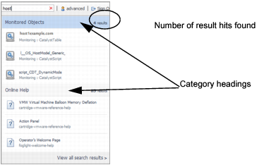
The Search field, located in the header, is a global search tool which allows you to search for any monitored object or help topic.

2
Optional—click the category heading to view all entries found for that category.
3
Optional—click View all search results.
a
Optional—in the left pane, narrow your search results by selecting one or more of the following category check boxes:
Monitored Objects: displays search results found in Quest Foglight.
Online Help: displays search results found in the online help.
Definitions: displays search results found in the Configurations > Definitions dashboard.
b
Optional—sort your search results by selecting one of the following options from the Sort By list:
Relevant: sort by the most relevant search items found first in the list.
Subject: sort by the display name.
Category: sort by category: Monitored Objects, Online Help, and Definitions (WCF).
c
Optional—in the Recent Searches list on the left pane, select a recent search string to review the found results.
Clicking an entry under the Monitored Objects category opens a dashboard associated with the monitored object. If the object is not associated with a specific dashboard, a summary view opens to display the metric details for that object.
Clicking an entry under the Online Help category opens a new browser tab and displays the online help topic.
Clicking an entry under the Definitions category opens the Configuration > Definitions dashboard to display the details of the WCF component.

You can run, create, and manage your reports from any dashboard. On the top right corner of the dashboard is a reports menu. Some dashboards have an associated report template displayed in the top of this menu. For more information on reports, see Reporting on Your Enterprise .

The display area is where you view dashboards or reports and work with elements in your custom dashboards and reports. See Creating a Custom Dashboard and Building a Custom Report Template for more information.

Copyright Quest Software, Inc.

Links to the copyright page on the Quest web site.

Contact Us

Links to local contact information on the Quest web site.

About

Displays product, contact, and support information.

Quest Foglight controls the current time range using a special control called a zonar. See Time Range for more information. The default time range is the last 4 hours.

You can freeze the data Quest Foglight displays at a specific time range to diagnose problems that occurred during that interval. See Freezing a Time Range for more information.

The time range at the top of a dashboard indicates the current time range for all the views on the page. You can override the default current time range setting (the last 4 hours), by choosing another interval in the User Preferences page. For more information, see Setting Your User Preferences.

By default, the time range in a dashboard is displayed in real time. You can freeze the time range so that the data Quest Foglight displays in the views reflects a certain interval. When the time range is frozen, the views do not display new data. Freezing the time range helps you diagnose problems that occurred during a specific interval. For further details, see Freezing a Time Range.

Changing the time range in a dashboard normally affects all the views in the dashboard. If an individual view in a dashboard has a different time range, that takes precedence over the time range for the dashboard.

Click the time range (shown below) to access the timeline and calendar options, which allow you to specify a new time range.

Figure 6. Time range.

Click the Timeline option in the time range to:

Hover the cursor over the zonar to cause a popup to appear that displays the dates and interval (number of hours or days) spanned by the time range.

Click the middle of the zonar to drag it to the left or the right. The start and end times of the range changes, but the total interval it spans stays the same.

Increase or decrease the interval by clicking and dragging one side of the zonar. As you drag, the popup displays the new time range.

As you drag the edges of the zonar, the timeline scale adjusts automatically, increasing or decreasing the units of time.

If you drag the right edge of the zonar when the time range is in real time (the word Now is shown in the time range display), the interval persists and not the specific date and time to which you set the zonar.

Use the calendar options to set a specific time range by specifying the time and date from which and to which you want the range to span.

2
Use the From and To fields to set the time range:
a
Click the calendar icon () in the From field to set the starting point for the time range. Alternatively, select Earliest available.
b
If you clicked the calendar icon: in the calendar popup, select a date and specify a time. Click above the field to close the popup.
c
Click the calendar icon () in the To field to set the end point for the time range. Alternatively, select Current time.
d
If you clicked the calendar icon: in the calendar popup, select a date and specify a time. Click above the field to close the popup.
3
Set the Granularity. See About granularity for more information.
4
Click Apply to update the views based on the new time range.

Granularity controls the size of the metric intervals. The default option is Raw, which displays the actual collected data points. The Auto option uses intervals that are sized according to the time range. For example, a one-hour range has five-minute intervals, while a one-week range has one-hour intervals. Ranges from 1 minute to 1 week are also available.

If you set too large an interval, there may not be enough points to plot on a chart. For example, if you only have one day of data, an interval of six months results in a single point. If an interval is too small, there may be too many data points to display if the chart is small.

The maximum and minimum values of a metric are actual numbers, while data points inside an interval are averaged. Agents may report their data at uneven intervals. Quest Foglight sets the data to be plotted in evenly-spaced intervals using data collected from any number of agents.

To do this, the data points inside the interval are averaged. This has the effect of evening out the maximum and minimum values if an interval contains more than one real data point. The maximum and minimum values of a metric are based on real data and not an averaged value. These values are often plotted as markers on the chart. Therefore the averaged values on the plotted curve or bar may not match the real values of the markers.

1
In the Calendar, select an option from the Granularity menu on the right side of the interface.
2
Click Apply.

By default, the time range on a dashboard is displayed in real time. You can tell this at-a-glance if the word Now is shown in the time range display.

You can disconnect from real time and “freeze” a dashboard at a specified time range. When this occurs, the views on the dashboard will not receive any new data.

Some views show a frozen time range by default. This type of time range is called a diagnostic time range. See Diagnostic Time Range for more information.

2
Click the icon to the left of the displayed time range at the top right of the dashboard.
Hover over the icon to display the message: Time range is in the past, click to switch to real time.

In some places in the Quest Foglight browser interface, a diagnostic time range is calculated when drilling down on an item of interest. This most often happens when looking at the details of an alarm. By default, Quest Foglight shows a four hour window, where the alarm time range is placed three hours into the window (that is, three hours prior and one hour past the alarm). The diagnostic time range stays frozen until you unfreeze (toggle) the time range.

The diagnostic time range function works as follows:

There are several different types of alert indicators used to represent monitoring data in Quest Foglight. The types are:

The severity and state icons tell you about the condition of an application, server, or process. What they represent changes according to their context. They often represent a rolled-up state of the data collected on the object. For example, the same state icon can indicate that a server is down or that a process is down.

Many summary views show icons that represent an aggregation of the detailed objects of similar types. You can have Quest Foglight prioritize the data when determining the aggregation by creating a service level agreement to do this. For example, if three test servers are down, and one production server is active, then a summary view would show a critical icon, not a fatal icon.

Depending on where it is, you can hover over a severity or state icon or click it to get further information about the condition it represents.

Severity indicators can indicate:

Normal

The component is operating within normal thresholds.

A normal severity level indicates that there have been no critical, warning, or fatal events fired. Quest Foglight does not record events that are successful; it can only determine that there are no events that had problems.

Warning

Represents a possible performance problem, based on calculations on current server metrics against best-practices thresholds.

Critical

Indicates that the current metric values point strongly towards performance-related problems with the specified component.

Fatal

There is a very strong indication that the server is experiencing conditions which will degrade performance.

Availability indicators show the availability of a service.

Available

Not available

Different types of smaller views provide additional detail about an element in a view. Examples of these views are:

Tooltips and dwells disappear when you move the mouse, but a popup remains open until you close it by clicking outside it or clicking the close icon in the corner. You can also maximize some popups by clicking the maximize icon in the upper right corner.

When you are creating a custom dashboard or report, you can choose one of the options under Columns under the General tab in the action panel to divide the display area into one, two, or three columns.

Figure 13. Column options.

Drop down lists are views that change the context of other views, such as those in the same container view. When you select an item from a drop down list, the view is refreshed with new data. For example, a view may contain a drop-down list of metrics, a chart, and a table. Selecting a different metric changes the context of the page, and the chart and table are updated accordingly.

A drop down displays a list of single options. A tree expands to display a hierarchy of options. Both can have the same effect on the context.

Depending on how the chart was designed, the customizer icon might appear when you hover the cursor over a chart or might always be visible. For example, on the Alarms dashboard, the customizer for the Alarm(s) table is always visible.

If the customizer icon is enabled you can:

The option to export data to PDF, Excel, CSV, XML, and Image formats are available for charts and tables.

For example, you can create new graphs using drag and drop metrics onto a dashboard, and then export the data to CSV output. Therefore, you can create multiple metrics, set a time range, export to CSV, and then open the data in Excel.

3
Click Export.
a
In the Title box, type a title for your report.
b
In the Notes Before box, type a note to appear after the title of your report.
c
In the Notes After box, type a note to appear after the exported view.
d
Click Yes to include a table summary of the data from the exported view.
e
In the View Export dialog box, click Save as Report to save it to My Dashboard in the navigation panel, or click Export to view it in a separate browser window.
8
Click Export.

Quest Foglight makes use of common views in most of the standard dashboards. Using common views in dashboards is an effective way to enable and create easy workflows. Examples of views used in many of the dashboards include the Alarm List and Host Summary.

The Alarm List view displays a summary of alarms. The Alarm list view allows you to examine alarms from different perspectives by choosing one of the following tabs:

Expand nodes in these tabs and click on details to drill down and further investigate aspects of the alarms in your system.

For additional information the Alarm List view, see the following topics:

An error instance is any object in your environment that is the source of an alarm.

Quest Foglight lists each error instance’s health, number of alarms, and health history in the Error Instance(s) tab.

You can isolate issues related to systems more easily by showing alarms organized by the originating host.

Quest Foglight lists each host’s health, number of alarms, and health history in the Related Host(s) tab.

You can understand which agents are causing alarms to fire by showing alarms organized by the agent that collected the data.

Quest Foglight lists each agent’s health, number of alarms, and health history in the Related Agents(s) tab.

You can hide any of the columns in the Alarms List view.

An alarm chain is a series of consecutive non-normal alarm states for the same alarm event. For example, the CPU utilization on a specific machine keeps changing values that trigger a non-normal state. The following chain describes the alarm from 10:55 until 11:30 (when it becomes normal again)

10:55 AM – Normal

11:00 AM – Warning

11:05 AM – Critical

11:15 AM – Fatal

11:20 AM – Warning

11:25 AM – Critical

11:30 AM – Normal

Using the Alarm Details dialog box, you can choose either the Acknowledge or Acknowledge Until Normal option for a current alarm if you want the alarm to remain acknowledged until it reaches a normal state. For example, if you choose the Acknowledge until Normal option at 11:00 AM, the alarm stays acknowledged until 11:30 AM. In contrast, if you choose the Acknowledge option at 11:00 AM, the alarm (chain) would be “Unacknowledged” again at 11:05 AM when the severity has changed.

From the Alarm Details dialog box, you can drill down to a view that shows historic occurrences of an alarm. For example, if you are looking at the CPU utilization alarm for host1, you can go to a view that shows historic occurrences of that alarm (CPU utilization) on the same object (host1).

2
On the Alarm Details dialog box, click Find Historic Occurrences.
A set of alarm occurrence controls: these controls show “>> No more occurrences” if there are no occurrences outside of the current time range. If there is a “<< Get more” control on the left, this indicates alarm occurrences prior to the current time range. Mouse over this control to show the creation time of the most recent occurrence before the current time range. Click on this control to display this alarm occurrence into the table and at the same time adjust the current time range to include this occurrence. The >> Get more” control works the same way for alarm occurrences after the current time range.

Alarm notes provide you with a handy way to record information about an alarm for all other users to view. For example, if you are managing alarms during an installation of Quest Foglight and if an urgent alarm comes up, you can add a note to the alarm that you are checking if the back-up process may be causing the problem. The note, along with a username stamp and a timestamp, are attached to the alarm.

There are two ways to add notes from the Alarm Details dialog box, by using either the:

History tab. The Notes icon in the Alarm History table is for maintaining notes attached to a particular alarm in the history table. Clicking the Notes icon, takes you to the Alarm Notes dialog box.
All Notes tab. New notes are automatically attached to the most recent alarm in the alarm history.

Alarm notes consist of free-form, non-localizable text, a user name, and a timestamp.

In the History tab, click on the Alarm note icon. The Alarm Notes popup appears. Click Add.
In the All Notes tab, click New.
3
Click Add.

Only the creator of the note can edit the note.

Click the History tab, and then click the Notes icon. The Alarm Notes dialog box appears.
From the All Notes tab, go to step 2.
2
Click the Edit icon.
4
Click Submit.

Only the creator of the note can delete the note.

Click the History tab, and then click the Notes icon. The Alarm Notes dialog box appears.
Click the All Notes tab, go to step 2.
3
Click Delete.

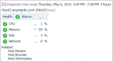
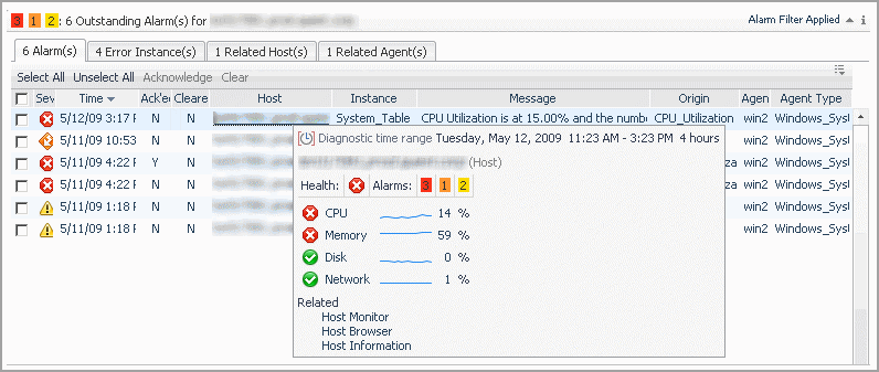
Click or hover the mouse over the name of a physical host to view a host summary popup or dwell.

A diagnostic time range is displayed at the top of the summary. This time range indicates the period during which the alarm was fired. It is usually in the past and is sometimes different from the time range that appears on a dashboard. For example, the following alarm occurred on Monday May 11th during a particular time range, while the date displayed on the dashboard is Tuesday May 12th.

Click on items in the popup to drill down to more information about the host, its alarms, and its performance.

Drilling down from the popup retains the time range during which the alarm occurred. To go back to the monitoring time range you last used, “unfreeze” the range by following the procedures in Freezing a Time Range.

Switch to console mode if you want to maximize the space available in the Quest Foglight browser interface. For example, when you want to focus on one dashboard in a small or non-standard display.

a
Click General > Actions > Properties > Link to this page in the action panel.
4
Replace page with noc in the URL. For example:
1
Delete everything after console from the URL. For example, if the URL is http://host1.example.com:8080/console/noc/user:operator.1, change it to the following:

In addition to using the dashboards that are supplied with Quest Foglight or created by dashboard developers in your organization, you can create custom dashboards for your specific needs. These dashboards can contain any combination of tables and charts that you find useful.

As with creating a custom report, the custom dashboards that you create are located under My Dashboards in the navigation panel.

TIP: Visit http://eDocs.quest.com to watch our learning videos. See How to create custom Foglight dashboards.
1
Use All Data—start with a blank dashboard and build it by selecting discrete components from your database. See Creating a Custom Dashboard Based on All Data.
Start with a service—build a dashboard based on components of the service you select. See Creating a Custom Dashboard Based on a Service.
Create a Custom Dashboard based on the current dashboard—use the data shown on the current dashboard to build a custom dashboard. See Creating a Custom Dashboard Based on the Current Dashboard.

When you finish creating your custom dashboard, you do not need to save it. It is automatically available under My Dashboards in the navigation panel.

You can construct a custom dashboard based on all Quest Foglight data by selecting any data available. Quest Foglight provides you with a blank display area to which you can add any elements you want.

2
Click Next.
1
In the Create Dashboard wizard, View Properties page, type a unique name for the dashboard in the Name field. This is the only information required to create a new dashboard.
2
Select one of the following Auto Refresh Rate options:
Every x second(s)type the number of seconds in the box to indicate the length of the refresh interval
3
Optional—by default, if you do not select any relevant or allowed roles, the dashboard is available to all roles.
Click the edit icon beside Relevant Role(s) and/or Allowed Role(s) and select the appropriate roles.
Relevant Role — Select the roles that allow existing dashboard users to view a dashboard. The Relevant Role applies to a user who has several roles, such as Dashboard Designer or Foglight Security Administrator. Selecting the Operator role allows anyone with this role to access the new dashboard.
Allowed Role — Determines which user role is allowed to see the dashboard. Leaving the role set to the default ‘all’ allows all roles to access the new dashboard.
4
Optional — Click the edit icon beside Background Image and select a background image to use for your custom dashboard. See Using a Map or Diagram as a Background Image.
5
You can enter a description of the dashboard in the Help text box. This text appears in a tooltip when you hover over the dashboard name in the navigation panel.
6
Select the Allow this dashboard to be included in other dashboards check box if you want to include this dashboard in other custom dashboards.
7
Click Next.
Single-Column Layout—specifies an evenly divided, columnar layout in which the display area is segmented into one column.
Two-Column Layout—specifies an evenly divided, columnar layout in which the display area is segmented into two columns.
Three-Column Layout—specifies an evenly divided, columnar layout in which the display area is segmented into three columns.
Fixed Size—gives you access to the Edit Page Layout option where you can precisely position the views. For more information, see Editing the Page Layout.
2
Click Finish.

You can construct a custom dashboard based on a service by selecting any service in Quest Foglight. Quest Foglight provides you with a blank display area to which you can add any elements you want.

2
Click Next.
3
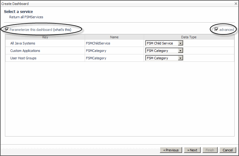
Optional—select the Parameterize this dashboard check box if you want to create a dashboard that is designed to run with any service.
4
Optional—when Parameterize this dashboard is selected, click the advanced checkbox to choose a data type for any of the services listed. This enables you to reduce the scope of the report to a particular data type.

You can create a custom dashboard based on an existing dashboard by selecting any dashboard in Quest Foglight as your starting point. Quest Foglight provides you with a blank display area to which you can add any elements you want.

2
3
In the Create Dashboard wizard, Build a Dashboard page, click Create a Custom Dashboard based on the current dashboard.
4
Click Next.
5
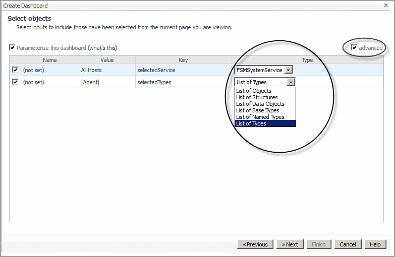
Optional—select the Parameterize this dashboard check box if you want to create a dashboard that is designed to run with any different instances of the specified parameters, which can be passed in from another view that is drilling into this one.
6
Optional—when Parameterize this dashboard is selected, click the advanced checkbox to choose a data type for any of the services listed. This enables you to reduce the scope of the report to a particular data type.

You can create a report based on a custom dashboard and schedule that report to generate at a specific time. For example, you have access to a custom dashboard which is monitoring the memory usage for a Host machine that has been experiencing memory leak problems the past several weeks; you want to send a report to several interested parties to inform them about the progress of performance for this particular host. To do this, you can quickly create and schedule a report based on this custom dashboard.

2
On the action panel, open the General tab, and click Other Actions > Reports > Createa New Report.
3
If your custom dashboard does not use parameterized input values, click Convert the current dashboard into a report and then click Finish.
4
If your custom dashboard uses parameterized input values, click Create a Report based on the current dashboard and click Next.
Direct Copy—copy all of the parameterized inputs and report-compatible views from the current dashboard to the new report. If you have selected this option, click Finish. The report is displayed in the display area. You can now run or schedule the report. See Online-Only Topics or Online-Only Topics.
New report with selected inputs—create a blank report and use a selection of the custom dashboard’s parameterized input values. If you have selected this option, select which parameterized input values you want your report to use, and then click Finish. The Add View wizard appears. See Adding a View and Using Parameterized Input Values.

You can add data to your custom dashboard and change the way it is displayed.

For more information, see the following topics:

The Add View wizard is provided for the same function as creating a custom report.

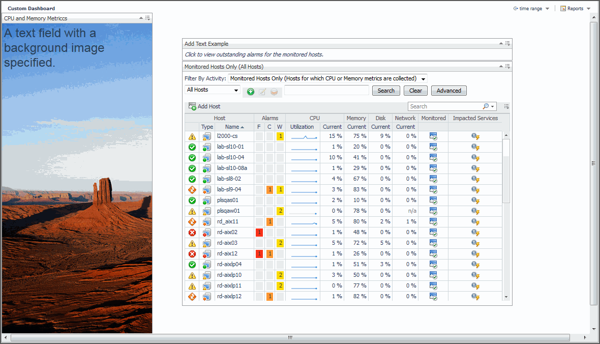
You can use the Add Text option, found on the General tab of the Action panel, to add text to your fixed position layout custom dashboard. The Add Text option allows you to set a font style for your text, specify a background image for the portlet view, and to configure an action for the portlet view. For example, you can configure the action to display a popup view when the user clicks on the text.

2
On the Action panel, click the General tab, and then click Add text.
Change the text Style (for example, Heading 1)
Type the Text to appear on the dashboard.
Add a Background Image.
4
c
Click Done.
6
Optional—configure the portlet view to complete an action. For example, specify the action to be a popup view, of the outstanding alarms associated with a view in your custom dashboard, when the user clicks on the text.
b
Click the Action tab, select the check box for the text, and then click the edit icon .

In conjunction with the fixed position layout custom dashboard, you can set the background to a geographical map or diagram and then precisely position views on top of it to represent the monitored state of objects at specific locations.

Use the Edit View Properties dialog box to upload a background image, such as map of a support or sales region or a diagram of your server rack.

2
Select General > Actions > Properties > Edit basic properties from the action panel.
3
Click the Background Image icon ().
4
Enter the URL for the image or navigate to the image in the tree provided or click Upload image to specify your own image to use a background. If you have specified your own image, a My Definitions directory for your user account is added to the tree. Each additional uploaded image is added to this directory.

If you chose the Fixed Size layout option in the Setting a Dashboard Layout dialog box, use the Edit page layout dialog box to position your view exactly where you want it.

You can also resize the view to fit the space you have available on the screen or change the view’s display options.

1
Select General > Actions > Edit page layout from the action panel.
Size and Position—resize or change the co-ordinates of the view.
Grouping—multi-select and group views that you have dragged onto the dashboard. For example, drag and drop a metric view and a property view related to one of our hosts onto your dashboard, select both, and click Group () to group them together. You can then work with them as one view.
Order—change the stacking order (bring the view to the front, back, forward, or backward).
Display options—select different options depending on whether you want to show the view title, show its border, or make it opaque.
4
Click Done at the top of the dashboard.

You can configure your settings for your custom views. For example, you can edit metric views by changing the display type, selecting metric labels, configuring chart settings, and choosing the action that occurs when you select or dwell over a metric.

a
Click the Options icon () at the top-right corner of the view.
b
Select Edit properties.
a
Select General > Actions > Edit page layout from the action panel.
c
Click the Edit icon.
If you are editing a table view: you can adjust the columns, filter the data you selected based on rules, and configure actions. See Step 1 in Adding a Table View, Filtering a List, and Actions tab.
If you are editing a property view: you can make changes to the property list or renderer and configure actions. See Step 8 and Step 9 in Adding a Property View and Actions tab.
If you are editing a metric view: you can make changes to the following:
Title—rename the view.
Height—set the height for all views or this view by selecting the check box and specifying a value.
Display type—select the visual display. For more information, see Display type tab.
Metrics—choose the metric labels for the chart. For more information, see Metrics tab.
Options—configure settings according to the display type. For more information, see Options tab.
Actions—set what happens when a user interacts with the view. For more information, see Actions tab.
4
Click Apply when you are finished editing your view.

The Display type tab contains options where you can select the visual layout according to a chart type, gauge type, or list type. For more information on the display types available and their settings, see Options tab.

Use the check boxes in the Metrics tab to select the metrics that you want to appear in your view.

The following tables lists the options available depending on the display type:

Table 6. Charts Table:

Plot (draws each series as a line graph)


Area (draws each series as connected points of data, filled below the points)


Stacking Area (draws each series as a stacked cluster)


Bar (draws each series as a bar in a cluster)

Line Width


Specifies the thickness of lines in all charts or this chart.


*available for Plot chart only


Metric Value

Controls the type of value that is displayed for one metric or all metrics in a chart.

Show one chart per metric

Indicate if you only want to display one chart per metric.

Check box


Only show axis of selected metric (different charts will line up)

Select this option to show only the axis for the selected metric. For an example, see Grouping Metrics with Many Parent Hosts.

Check box


Show thresholds for selected metric

If a metric has a threshold, it is displayed.

You can choose to show thresholds only for the selected metric.

Show data at both start and end of intervals

Applies only to plot and area charts.

Check box

Bounds

Sets the chart axis so that it does not go out of chart boundaries.

Selected by default.


Show Overall

Displays the overall value for the set time range as a dashed line.

Show Min/Max As

Displays the minimum and maximum per interval.

Show Baseline Min/Max As

Displays the baseline minimum and maximum.

Show Standard Deviation As

Similar to the Min/Max setting; lets you highlight a range per interval.

Standard deviation multiplier

Determine the high and low values by setting the deviation from the average.

The default value is 1, but the unit of deviation depends on the metric.

High/Low chart

Show Average Line

Emphasizes the highest and lowest values.

Settings for the other type of chart types are not available.


Table 7. Gauge Charts

Metric Indicator

Indicator Size

Useful for highlighting a fluctuating value in your real-time application in a visually meaningful way

Spinner

N/A

Represents data using a rotating wheel.

No options.

Horizontal Bar

Bar Thickness

Horizontal bar, Vertical bar, and cylinder give you flexibility to present data in terms of a graduated scale

Vertical Bar

N/A

No options.

Cylinder

N/A

No options.

Flow Gauge

Sparkline options

Communication between host server components are represented by animated data flow that indicate the direction of the communication.

Show Sparkline: (check box)


Sparkline displays:

Flow Direction:


Prominence

Table 8. Lists Chart

Metric List

Show Sparkline

Displays a sparkline for each metric.

Check box

Table List

Show Column For...

Display the columns you select.

Check boxes for:


You can set the actions that occur when a user interacts with your view, such as its popup, dwell, and drill-down behavior. For example, you can configure an action so that a popup appears when a metric is selected.

1
In the Actions tab, select the check box for the action you want to set.
2
Click the Select a metric check box to choose an action to describe how you want to show the next view.
The Edit icon is enabled.
3
Click Edit .
Popup—displays a view as a simple popup that has no title bar or borders and can be dismissed by clicking outside of it.
Dialog—displays a view in an interactive window, which can be moved around or dismissed through its title bar.
Next Page/Drill Down—drill into or go to another page containing a view of your choosing.
External URL—displays a specific web page by specifying its URL.
5
Click Next. The Select a data item to use page of the wizard appears.
No Data—select a view that does not require any particular data from the existing view.
Selected Metric Parent—select a parent of the metric selected from the chart.
Selected Metric—select the metric from the chart.
Metric Parents—select a parent from the list of parents of the metrics currently bound to the chart.
Metrics—select a metric from a list of metrics currently bound to the chart.
7
Click Next. The Choose a target view page of the wizard appears.
Optional—click the show by role check box to select a view for a particular role.

You can make changes such as sharing a view, editing its properties, or maximizing it by clicking the Options icon () in the title bar. See Working with Views.

3
Click OK to confirm that you want to remove the view.

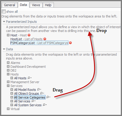
Using parameterized input values for your custom dashboard or report allows you to redefine an input value during scheduling or at run-time. With parameterized input values, you can customize a dashboard or report at any given time.

For example, you have a custom dashboard which is designed to monitor memory, storage disk, and network utilization, as well as space used, for a particular host. If you want to use the same custom dashboard to monitor another host, you can so quickly by resetting the parameterized input value defined in the Action panel, General tab, and Page Input value.

1
On the navigation panel, under Dashboards > My Dashboards, open your custom dashboard.
3
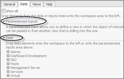
Click the down arrow to expand the Parameterized Inputs and Data elements.
7
Under Page Inputs, click the arrow to expand the parameterized input value.
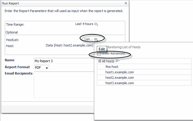
8
Remove the check mark from the Show Advanced option.
TIP: Visit http://eDocs.quest.com to watch our learning videos. See Customizing Foglight Reports with Parameterized Inputs.
1
On the navigation panel, under Dashboards > My Dashboards, open your custom report.
2
Complete Step 2 through Step 5 in the previous procedure.
e
Click Run.
d
Click Next.
f
Click Next.
h
Click Finish.
1
On the Action panel, open the Data tab and expand Parameterized Inputs.

You can delete any custom dashboard that you have created. You may also be able to delete dashboards created by other users, although this is not recommended. You cannot delete any default dashboards or dashboards created by dashboard developers in your organization.

2
Click Delete this page in the action panel.
3
Click Delete to confirm the deletion.

Add predefined charts to your custom dashboards and customize charts to access and analyze data provided by Quest Foglight.

Charts display data graphically. Certain graphing behaviors that they possess result in data being interpreted rather than recorded. Start/end behavior, data granularity, treatment of data holes, line thickness, minimum/maximum versus average, and data envelopes all influence how data is interpreted and displayed in a chart.

You can create a metric chart using:

The Data tab in the action panel to drag a metric onto a portal.

You can also add one or more metrics to an existing chart.

The y-axis shows the units for the metric. If there is more than one metric in the chart, the y-axis shows the units for the first metric that was charted, unless you have cleared the Only show axis of selected metric (different charts will line up) check box in the Options tab of the Add Metric View wizard (see Options tab for details).

By using the Customizer function you have the option to export metric data for charts to PDF, CSV, Excel, XML, or Image format. See Exporting Data from Charts and Tables.

For more information about working with charts, see the following topics:

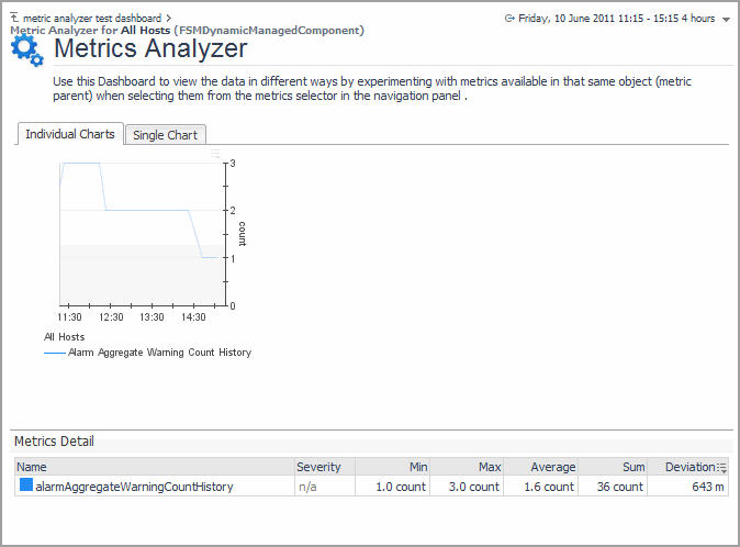
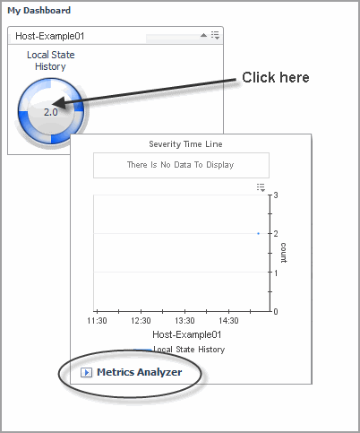
For any custom dashboard visualization views that you create dynamically (drag and drop), there are built-in, default drilldowns available, so you can navigate to another view. You can use the metrics analyzer to view the data in different ways, by experimenting with metrics included in the same parent object.

3
Select the Individual Charts tab to display each metric individually, or click the Single Chart tab to view all selected metrics in a single chart.

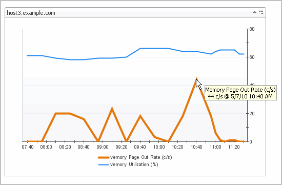
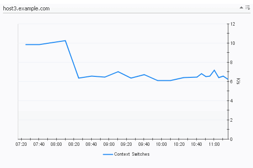
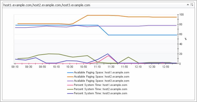
When you have many metrics from different parent hosts on a single chart, the parent label appears in the legend, as shown below.

You can choose to display only the y-axis of the selected metric. This is useful when the metrics you are charting have different units or a wide range of values. See Editing a View for information about changing this option.

If the Customizer (sometimes referred to as Edit) icon is enabled for charts, you have the option to dynamically change the chart to a different chart type (for example, bar, plot, area, stacking area). For example, switch the chart type to Area to emphasize the magnitude of change over time and illustrate the metric parts in relation to the whole graph.

3
In the Bounds section, set the chart Y axis range. The following options are available:

To export the chart to CSV, PDF, Excel, or XML format, see Exporting Data from Charts and Tables.

For plot or bar charts, you can zoom into an area to view data at different levels of detail by using CTRL + drag. You can also drag on an axis to specify the region you would like to zoom into (a zoom region).


Verwandte Dokumente

The document was helpful.

Bewertung auswählen

I easily found the information I needed.

Bewertung auswählen