Chatta subito con l'assistenza
Chat con il supporto

Foglight APM for Real User Experience 5.9.9 - User Guide

Getting started with Foglight APM Monitoring transactions Viewing real user activity from a geographical perspective Assessing real user experiences during key sequences Monitoring the performance of web sites and endpoints Searching APM data Replaying sessions, hits, and sequences Visualizing search results Creating custom drag-and-drop dashboards APM tile and view reference

SLA Violators tab

Click More Details on the SLA Violators tab to open the Geographical Perspective dashboard. For more information, see Viewing real user activity from a geographical perspective.

Synthetic Result detail view

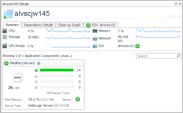
Health History Bar. The color-coded bar represents the alarm state of the monitored component over the time range selected in the SOC. The color of the bar changes depending on the alarm state. Red indicates a Fatal state, orange indicates Critical, yellow means Warning, and green is the Normal state.
Response Time. A chart of the response time for the transaction. The shaded background
Summary. Provides the total number of executions over the given time range, and the number of instructions for transaction.
Health. This icon indicates the transactions overall health status.
Alarms. Indicates how many of each type of alarm (Fatal, Critical, Warning) occurred in the selected time range.
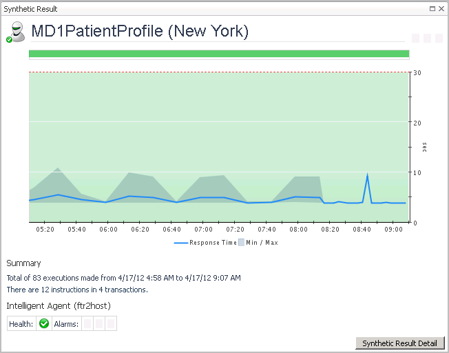
Click Synthetic Result Detail to see the script execution statistics in the End User Explorer dashboard. For more information about this dashboard, see the Foglight Transaction Player User and Reference Guide.

Synthetic User Performance detail view

Virtual Machine detail view

Click the ESX: <hostname> tab to access the ESX Server detail view.
Click More Details (not shown, located at the bottom right corner of the view) to drill down to a vmExplorer view.
Related Documents

The document was helpful.

Seleziona valutazione

I easily found the information I needed.

Seleziona valutazione