The following list illustrates the directory structure required to create module-specific images.
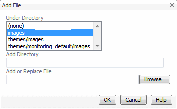
You add images to modules and create the required directory structure by adding files to your module. For more information, see Files.
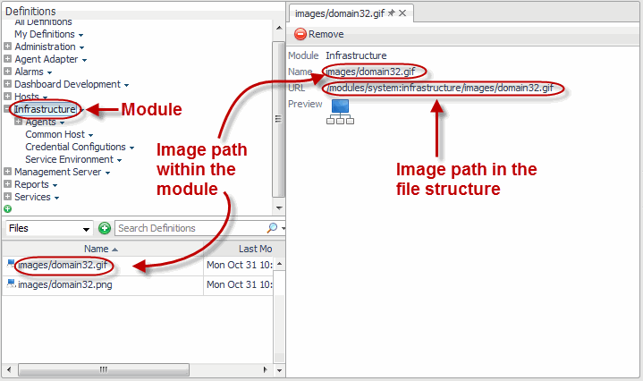
When you reference a module-specific image, the WCFMODULE: resource tag in the image URL indicates that an image file is defined in the module, and that it does not have any theme-specific variants.
In a default installation, Foglight® browser interface includes two default themes: Application and Monitoring. These themes allow you to control the background color for dashboards. For more information about these themes and other ways to customize the browser interface, see the Foglight User Help.
Theme-related sets of images allows you to change the look and feel of your views, and to personalize them to suit specific end-user needs. Your module can have one or more themes that enable the display of different styles, locales, and view sizes.
The implementation of themes relies on the existence of a base theme. The base theme contains a set of default images. When you reference a theme-specific image in a view or icon definition, you can only select a reference image from the base theme. When that view or icon appears in the browser interface, the system displays the image variant defined in the currently selected theme (such as Application or Monitoring), or the locale. This means that you only need to provide images for the themes whose images differ from the base theme images. For example, most images included with the Management Server have only the base theme and Monitoring theme variants because the Application theme is the default theme. The image variants for this theme are supplied in the base theme, which eliminates the need for a separate set of images for the Application theme.
|
• |
Themes are stored in the module’s theme directory. This directory must contain the base theme images in its images sub-directory. |
|
• |
|
• |
Each theme, except the base theme, must have an images sub-directory. |
|
• |
Theme-related images must be stored in the theme’s images sub-directory. |
The following list illustrates the directory structure required to implement themes.
For more information, see Files.
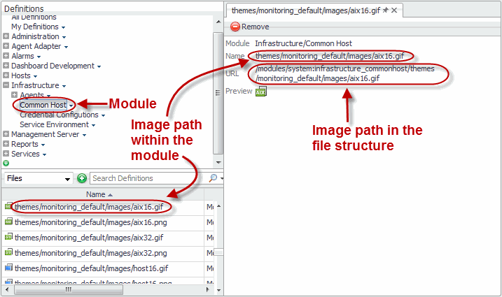
For example, you can have two different themes for two monitoring modes, Application and Monitoring. This requires a base theme directory, images (located under <module>/themes/images). If you need a separate set of images for the Application and Monitoring themes, you need to create image directories for those themes: <module>/themes/monitoring_default/images and <module>/themes/application_default/images. Theme-specific images are optional and only required if a theme is different from the base theme.
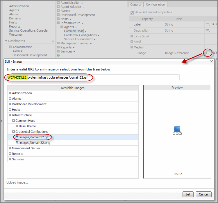
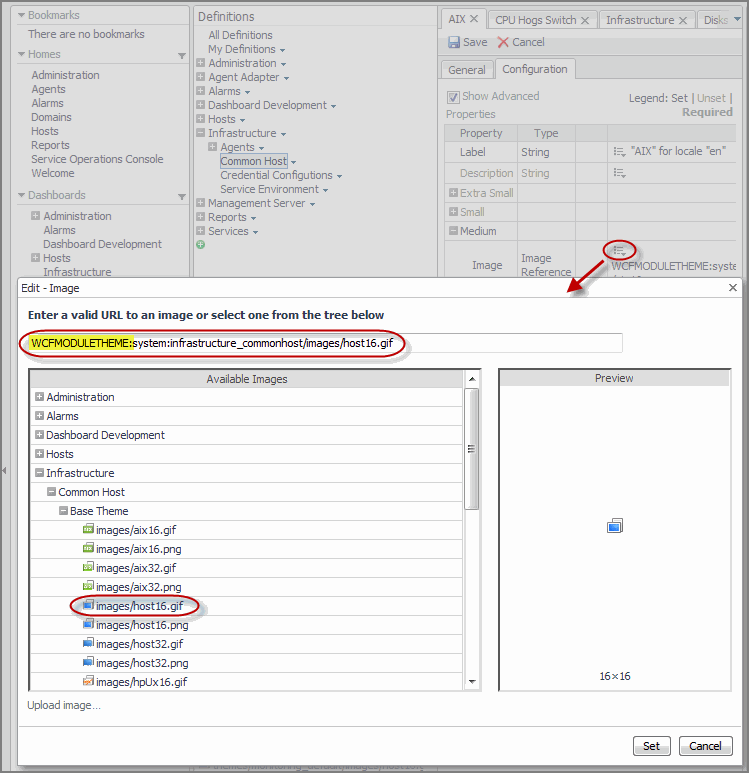
When you reference a theme-specific image in a view or icon definition, the WCFMODULETHEME: resource tag in the image URL indicates that a theme-specific image is selected. Specifying the image in the base theme instructs the system to display the image variant defined in the currently selected theme.
There are two different mechanisms available for printing in the Web Component Framework:
|
• |
To produce a printable version of a view in PDF format you need to create a report. Simple reports can be produced by selecting Create Report in the action panel. Drag in the views you want and click Create PDF. See the Foglight® User Guide for additional details. Custom reports can be produced using the PDF Layout component. See the Web Component Tutorial for instructions on using this component.
