|
1 |
With the APM > Transactions dashboard open in the display area, open the action panel on the right side of the browser interface. |
|
2 |
Click Tile Display Options. |

|
• |
The Enable Grouping option groups user tiles together by transaction name. By default, groups are sorted by their severity first, then by their name. This grouping is not affected by the Sort Order options. |
|
• |
The Show at most n tiles or groups setting determines the total number of tiles displayed. Synthetic transaction locations are first rolled up using the rollup criteria below. After that, the total number of tiles is determined by the maximum number of tiles that you specify. |
|
• |
the maximum number of single-location Synthetics tiles, using the Rollup if there are more than n FTR tiles setting, and then |
|
• |
the maximum number of locations per script, using the When there are more than n location(s) for a script setting. |
|
• |
Use the Sort Order options to sort the tiles by either type (Real End Users first) or alarm severity (Sort by Alarm State). |
|
• |
For example, you can configure the Transactions tab to display a maximum of ten tiles sorted by the alarm state (highest severity first). |
|
• |
The Show Transaction Pivots option controls whether transaction pivots are displayed. If you do not want to see Pivot tiles, clear this check box. |
|
• |
The Rollup Pivots option controls whether pivot data are grouped together or rendered individually. For example, Foglight can roll up all pivots such as Chrome™, Firefox®, Internet Explorer®, and Opera™ into a single web browsers pivot tile. |
|
4 |
Click Save. |

|
NOTE: If you are using a version 5.6.4 Management Server, only the List tab is available. The Map tab requires Management Server 5.6.5 or later. If you are using Internet Explorer® (IE) 8 or earlier, only the List tab is available. |
|
1 |
On the navigation panel, under Dashboards, click APM > Geographical Perspective. |
|
2 |
Select a transaction from the Transactions list at the bottom of the navigation panel. |

|
3 |
On the left side of the dashboard, select an Aggregation Type: top ten by city, country, or region. |
|
4 |
Select a Measurement from the list to view the related transaction data. The map and right pane update based on your selection. |
|
5 |
Select a timeslice from the Timeslice list, or use the forward or back arrows to step through the available timeslices. |
|
6 |
Click Transaction Detail (in the lower right corner of the right pane) to open the Summary view for the transaction. For more information about this view, see Real User (APM) Performance detail view. |
|
8 |

|
9 |
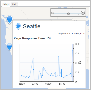
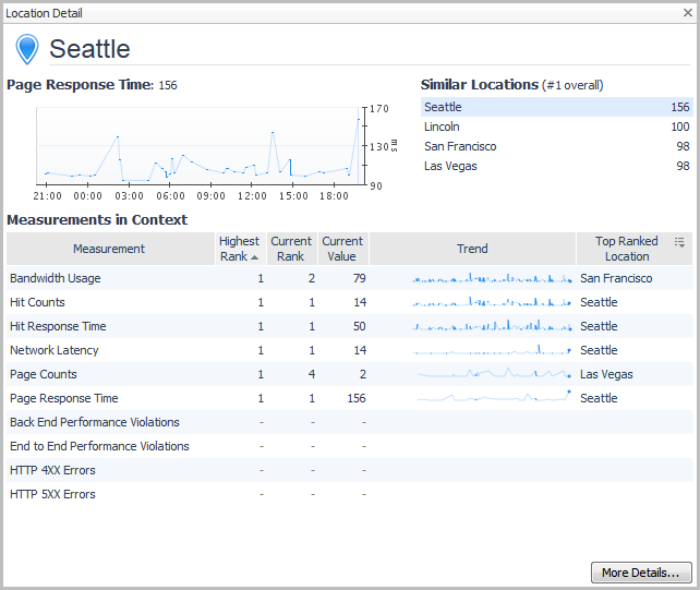
Click Location Detail to drill down to detailed information for the selected location. |
|
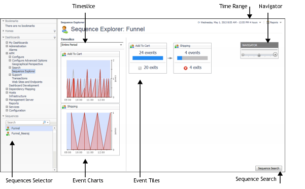
NOTE: APM Administrators define the sequences that appear in the Sequence Explorer. For more information, see “Introducing sequence analyzers” in the Foglight APM Administration and Configuration Guide. |
|
• |
On the navigation panel, under Dashboards, click APM > Sequence Explorer. |
|
Displays the number of users in the event over the selected Time Range. The stacked area chart identifies the number of users who exited the sequence (top) and the number of users who remained (bottom) at each data point. To identify timeslices of interest, use the charts to look for spikes representing a high number of exits compared to the number of entries into the event. Then you can select the timeslice from the Timeslice list, and display data from that period in the event tiles. | |
