Tables are the best method to view a wide variety of data within one report. Unlike the other report types in the Report Center, tables allow you to view multiple fields with data that you select to suit your needs.
9.Select your data fields for your table. You can add as many fields as you require.
10. Add aggregation, sorting and filtering to your table.
|
|
NOTE: Aggregation brings the amount of items you have in a field together. For example, if users are involved in multiple departments, aggregating on the Department field with the Count operator will show the number of departments for that user, rather than the name of the departments. |
11. Choose whether to enable paging. If paging is enabled, your table will be divided into multiple pages, depending on the amount of data collection for the section.
|
|
NOTE: Having paging enabled or disabled will not affect your download of your report; all data results will be listed within one table in your downloaded table. |
12. Choose your initial page size. This is the amount of records within each page.
You can now save your chart, and close the section.
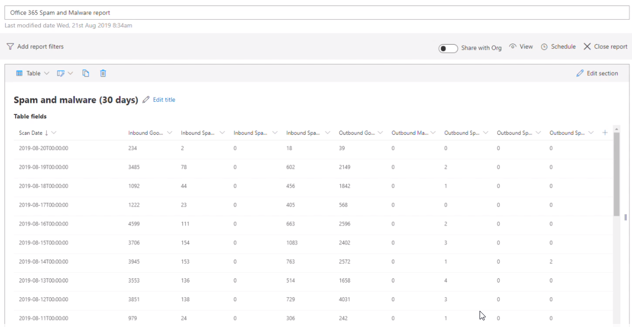
Custom table example: Spam and malware report (30 days)
You can create an Office 365 Spam and Malware report section that shows the number of spam and malware attempts over the last 30 days. The report section includes a table showing all fields related to the Office 365 Mail Traffic data source. It is sorted in descending order by scan date, and the results are filtered so only the last 30 days display. Here is how the finished report section looks:
Click here to see how to create this report in your Nova Environment.
|
Here are the steps to create this report section: 1.Enter a section title, for example Office 365 Spam and Malware (30 days) and a description if necessary. 2.Choose the Office 365 Mail Traffic data source under the Exchange Data data source category. 3.Choose and organization and group, if applicable. 4.Click the Select field... link and select the following fields a.Scan Date b.Outbound Spam IP Block c.Outbound Spam Envelope Block d.Outbound Spam Content Filtered e.Outbound Malware f.Outbound Good Mail g.Inbound Spam IP Block h.Inbound Spam Envelope Block i.Inbound Spam Content Filtered j.Inbound Good Mail 5.Click Add sorting, then Select field, then select Scan Date, and make sure descending is selected. 6.Enter 31 in the Limit field. 7.Save and close the section. |
Here is a video of these steps.
Custom table example: License utilization
However, what if we would like a table that includes the raw data, as well as data that shows assigned, unassigned and idle units? Let us see how we do that here
|
1.Enter a section title, for example License Utilization Table, and a description if required. 2.Choose the Tenant Licenses data source under the License Data data source category. 3.Under choose table fields. select, in this order: a.License name b.Percentage of consumed units c.Assigned Units d.Unassigned Units e.Idle Units 4.Set your offset and limits if necessary. 5.Save, then close the section. |
Check out this video on how to create this report below.
Custom table example: Assigned licenses over time
You may want to see assigned licenses for a specific license within your environment over a certain period of time. The step by step process below explains how to do that.
|
|
NOTE: Our license example is PowerBI, but use which license is relevant to your environment as you go through the steps. |
See how to create this report.
|
1.Add a title and description for your section. 2.Choose the Tenant License History data source under the License Data data source category. 3.Select your organization and organization group, if necessary. 4.Under Select fields, choose: ·The date of the statistics snapshot ·License Name ·Assigned Units 5.This will then show the amount of licenses you currently have assigned to each license you have within your environment. However, we want to see just the license assignment of Power BI. To do this, we need to click Add filter group. 6.On Select field, choose License Name. 7.On Select operator, choose contains. 8.In Enter filter value, enter Power BI.
9.Enter your offset and limits. 10.Sort the date in ascending or descending order, depending on your preference. 11.Save your report. |
Custom table example: List of users by department
This is a continuation of a report in the charts and pivots section of this guide. Below is a step by step guide on how to view your users by their associated department.
|
1.Click the plus sign to add a section to the report. 2.Click the Table section type to begin editing the section. 3.Add a section title, for example Users by Department. 4.Choose the Entra ID Users data source. 5.Choose and organization and group, if applicable. 6.Click the Select fields... link under Choose table fields 7.Select Display Name, Country/Region and Department, and close the dialog. 8.If desired, drag and drop the column names to re-order them. 9.Set your desired amount of data within your table by changing the number in the Limit' text field. 10.Click Close section. |
Which data sources are recommended for timeline charts?
Any data source which contains time-based information can be used to create a timeline chart. The following is a list of data sources that we recommend to use for informative charts:
·Office 365 Audit Data
·Office 365 Mobiles Devices
·Detailed Message Statistics
·Microsoft Entra ID Users
·SharePoint Site Usage
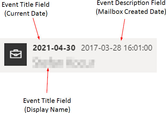
Here is a diagram of the required fields for a timeline report:
9.Choose your event title, event description and event date fields. Use the diagram above to help you decide which field to select in each location.
10.Optionally, select your Event category field and any fields you would like to show in detail view.
11.Decide how you would like your timeline to look.
a.You can group your timeline by day, month or year.
b.You can view your timeline as either standard or micro.
i.Standard view presents a record in its entirety, but may not be suitable for large data sets.
ii.Micro view presents all records, but individual data sets must be hovered to be revealed.
12. Add filters if required.
13. Add an offset and/or a limit.
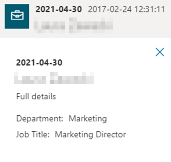
Individual records should now look like this:
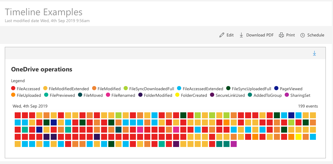
Custom timeline example: OneDrive operations
You create a section on a report that shows OneDrive operations, color-coded per operation. Here is how the finished report section looks:
Here are the steps to create this report section:
|
1.Enter a section title, for example OneDrive Timeline. 2.Choose the Office 365 Audit Data data source under the Audit Data data source category. 3.Choose and organization and group, if applicable. 4.Click the Timeline section type to begin editing the section. 5.Click the Select field... link under Choose event title field, and choose Display Name. 6.Click the Select field... link under Choose event description field, and choose Operation. 7.Click the Select field... link under Choose event date field, and choose Creation Time. 8.Click the Select field... link under Choose event category field. 9.In the Event category field, select Operation. 10.Click the Select field... link under Choose fields to show in detail view. 11.Expand the Microsoft Entra ID Users section, and choose these 6 fields: Display Name, Department, Country/Region, Operation, Result Status, and Creation Time in this order (Other fields can be added, if required). 12.Group your timeline by Day, Month or Year, depending on your preference. 13.In the drop-down list labeled Choose view type, select Micro, and enable the Show legend option. 14.Click Add filter. 15.Choose Workload is equal to OneDrive. 16.Save and close your section. |
Here is a video running through these steps.
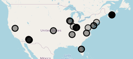
Using the Map report allows you to see who has logged audit data within Nova. Has there been activity in a location which is unfamiliar to your organization? The map allows you to see if there is suspicious activity occurring in locations which your company is not associated with.
Each circle is representative of audit data being logged in that specific location, which can be viewed down to street level. The shade of the circle represents the amount of logs performed at that location.
To add the map report:
9.Add a title and description if necessary.
10.For the data source, choose Office 365 Audit Data.
11.Select your organization and organization group if necessary.
12.For select field, select Geo Location.
13.Save and close the section.
Using the metric report in the Report Center is a quick way to see:
·If you are reaching goals or targets that you want to reach. For example, emails being sent internally.
·If there are issues within your environment that may need investigation. For example, incoming spam email.
The gauge helps you see if you are reaching your target or limit, thus giving you insight into whether you are on course for a goal, or if you need to take action for your limits.
|
|
NOTE: Your data sources need to be a numerical value. If you are looking for a report with information about departments, locations, license names, etc., select another report type. Check out this Report Center article for more information |
9.Click Gauge.
10. Select your operator and Applied to data field.
11. Add a filter group, if applicable.
12. Select your minimum and maximum ranges. For example, you can set the maximum number to an acceptable limit of spam mail being received.
13.Reverse the colors of the metric if desired.
Once you have finished, click save and close the section.
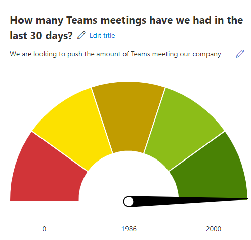
Custom metric example: How many Teams meetings did we have in the last 30 days?
This metric sections is helpful if your organization hopes to have a certain number of Teams meetings within the month. To see a gauge related to the status of your target:
|
1.Add a title and a description, if necessary. 2.For your data source, click Entra ID Users under Users Data. 3.For select chart type, click Gauge. 4.For select operator, click Sum. 5.For choose applied to, select Meeting count (30 days) under the Teams User Activity Aggregate category. 6.Set your minimum and maximum numbers. Your maximum number in this example should be the number of Teams meetings you are targeting within your tenant within the previous month.
7.Ensure the Reverse Colors checkbox is selected. 8.Close the section. Your report should now appear as a section. |
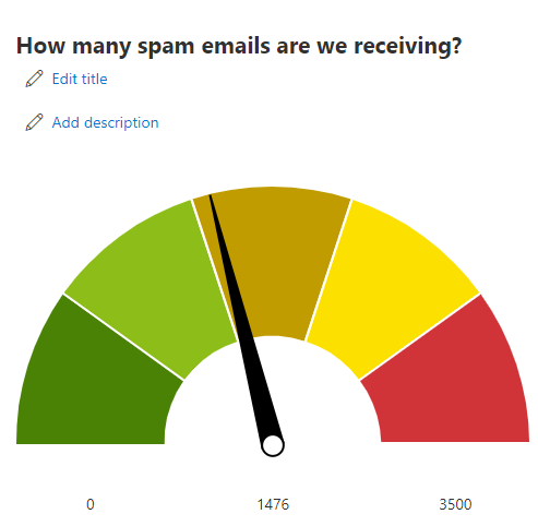
Custom metric example: How many spam emails are we receiving?
Perhaps you are looking to get a clear metric on how many spam emails are coming in to your tenant, with a limit on what is acceptable. This metric gives a clear image on whether this limit is being reached. To create it:
|
1.Add a title and a description, if necessary. 2.For your data source, click Office 365 Mail Traffic. 3.For select chart type, click Gauge. 4.For select operator, click Count. 5.For choose applied to, select Inbound Spam Content Filtered under the Office 365 Mail Traffic category. 6.Set your minimum and maximum numbers. Your maximum number in this example should be the number of spam emails your administrator deems as acceptable.
7.Ensure the Reverse Colors checkbox is not selected. 8.Close the section. Your report should now appear as a section. |