
|
Figure 66. Desktop properties
 | |
|
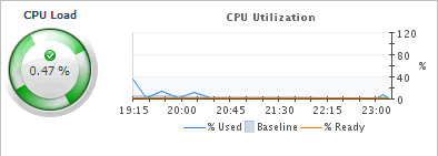
For virtual desktops, the CPU view displays the CPU Load spinner indicating the current percentage of the selected virtual machine’s CPU load, used to execute system code and user programs, based on the total CPU capacity. The % Used line in the CPU Utilization chart shows the percentage of the CPU utilization used by the virtual machine to execute system code and user programs, during the selected time period. % Ready displays the percentage of the virtual machine’s CPU resources that are ready to execute system code and user programs during the selected time period. The Baseline area in the chart indicates the expected CPU utilization range based on historical data.
Figure 67. Virtual desktop CPU view
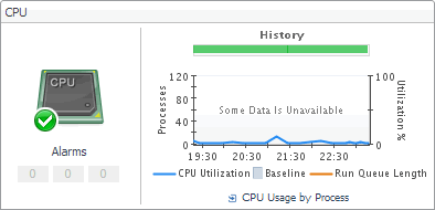
 For physical desktops, the CPU Utilization line in the chart shows the percentage of the CPU utilization used by the physical machine to execute system code and user programs, during the selected time period. Run Queue Length displays the number of processes that are waiting to be executed, during the selected time period. The Baseline area in the chart indicates the expected CPU utilization range based on historical data.
The History bar appearing above the chart indicates the alarm state of the selected desktop’s CPU resources over the selected time range period. The color of the bar changes over that period depending on the alarm state. Red indicates that the selected component is in Fatal state, orange indicates Critical, yellow means Warning, and green is for the Normal state.
Figure 68. Physical desktop CPU view
 | |
|
For virtual desktops, the Memory view displays the Memory spinner indicating the current percentage of the average memory usage by the selected virtual machine, based on the total memory capacity. The Utilization line in the Memory Utilization chart shows the percentage of memory used by the virtual machine during the selected time period. The Baseline area in the chart indicates the expected memory utilization range based on historical data.
Figure 69. Virtual desktop Memory view
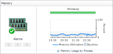
 For physical desktops, the Memory Utilization line in the chart shows the percentage of the memory resources physical machine uses during the selected time period. The Baseline area in the chart indicates the expected memory utilization range based on historical data.
The History bar appearing above the chart indicates the alarm state of the selected desktop’s memory resources over the selected time range period. The color of the bar changes over that period depending on the alarm state. Red indicates that the selected component is in Fatal state, orange indicates Critical, yellow means Warning, and green is for the Normal state.
Figure 70. Physical desktop Memory view
 | |
|
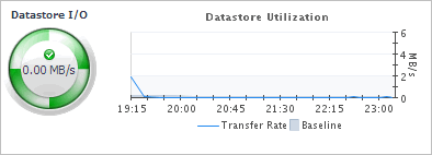
For virtual desktops, the Datastore view displays the Datastore I/O spinner indicating the current datastore I/O rate the selected virtual machine utilizes, based on the total datastore capacity. The Transfer Rate line in the Datastore Utilization chart shows the rate at which the virtual machine reads and writes data to the datastore during the selected time period. The Baseline area in the chart indicates the expected datastore utilization range based on historical data.
Figure 71. Virtual desktop Datastore view
 For physical desktops, the Disk Utilization line in the chart shows the percentage of the disk resources the physical machine uses during the selected time period. The Baseline area in the chart indicates the expected disk utilization range based on historical data.
The History bar appearing above the chart indicates the alarm state of the selected desktop’s disk resources over the selected time range period. The color of the bar changes over that period depending on the alarm state. Red indicates that the selected component is in Fatal state, orange indicates Critical, yellow means Warning, and green is for the Normal state.
Figure 72. Physical desktop Storage view
 | |
|
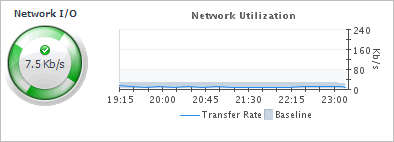
For virtual desktops, the Network view displays the Network I/O spinner indicating the current rate at which the selected virtual machine transfers data from and to the network. The Transfer Rate line in the Network Utilization chart shows the rate at which the selected virtual machine receives and sends data to the network during the selected time period. The Baseline area in the chart indicates the expected network utilization range based on historical data.
Figure 73. Virtual desktop Network view
 For physical desktops, the Network Utilization line in the chart shows the percentage of the network resources the physical machine uses during the selected time period. The Baseline area in the chart indicates the expected disk utilization range based on historical data.
The History bar appearing above the chart indicates the alarm state of the selected desktop’s network resources over the selected time range period. The color of the bar changes over that period depending on the alarm state. Red indicates that the selected component is in Fatal state, orange indicates Critical, yellow means Warning, and green is for the Normal state.
Figure 74. Physical desktop Network view
 | |
|
Figure 75. Sessions view
| |
|
Figure 76. Alarms view
|

|
1 |
|
2 |
|
3 |
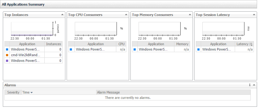
In the XenDesktop Application Quick View, in the Applications view on the left, click All Applications. |
|
4 |
In the XenDesktop Application Quick View, in the Applications view on the left, click an application node. |
|
5 |

|
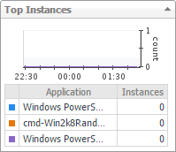
Figure 82. Top Instances view
 | |
|
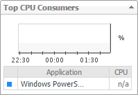
Figure 83. Top CPU Consumers view
 | |
|
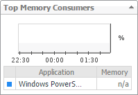
Figure 84. Top Memory Consumers view
 | |
|
Figure 85. Top Session Latency view
 |

|
Figure 87. Resource Utilizations view
 | |
|
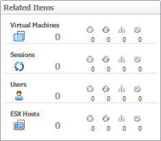
Figure 88. Related Items view
 | |
|
| |
|
Figure 90. Sessions view
|
