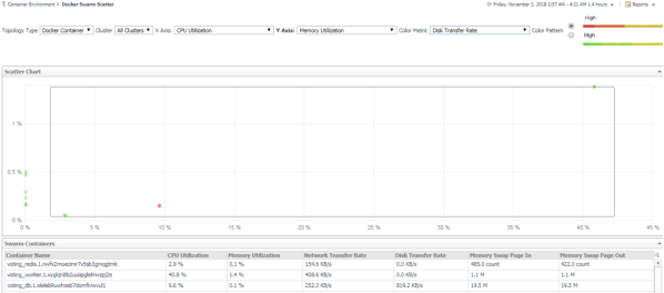
Scatter Plot analytics
|
• |
|
• |
Cluster: Lists all clusters available in the monitored Docker Swarm environment. |
|
• |
X Axis: Indicates which metrics will be plotted on X axis. |
|
• |
Y Axis: Indicates which metrics will be plotted on Y axis. |
|
• |
Color Pattern: Offers two patterns, Red to Green (larger value shows in red) or Green to Red (larger value shows in green). |
Figure 30 shows an example of Scatter Plot analytics. The purple circle in the middle represents the following: “voting_redis.1.nwfx2moecimr7v5sb3gmqgtmk” CPU Utilization is 2.9%, its Memory Usage is 0.1%, and its value of Network Transfer Bytes is not high. For more information, see:

