|
• |
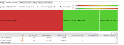
Topology Type: Indicates the monitored topology object, including Backup Server, Backup Client, Device Library, and Job. |
|
• |
Size Metric: Populates a rectangle based upon the selected metrics. For example, if you select Data Stored from the Size Metric drop-down list, the rectangle area will be populated based on the data stored in the topology object. |
|
• |
Rendering related metrics: For example, if you select Space Available and Red to Green, the rectangle of the topology object that has more available spaces will be rendered in red. |
|
• |
Color Pattern: Offers two patterns, Red to Green (larger value shows in red) or Green to Red (larger value shows in green). |
Figure 2 shows an example of heat map. This sample diagram represents the NVBU-PROD-NV12_BETA has the maximum amounts of devices and remaining spaces while NVBU-WIN-NNJ9 has the minimum amount. If you switch the Color Pattern, then NVBU-PROD-NV12_BETA will turn to green and NVBU-WIN-NNJ9 will show in red.
|
• |
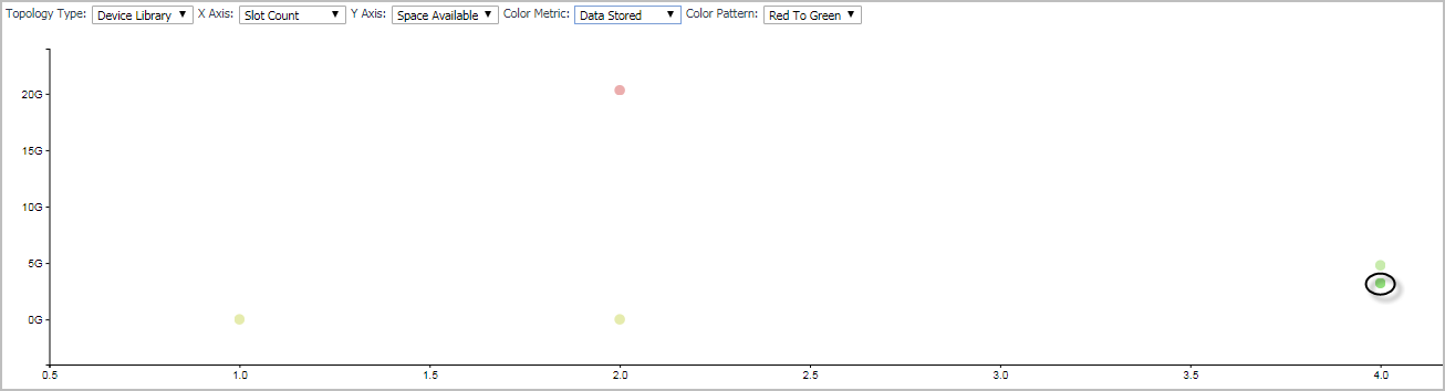
Topology Type: Indicates the monitored topology object, including Backup Server, Backup Client, Device Library, and Job. |
|
• |
X Axis: Indicates which metrics will be plotted on X axis. |
|
• |
Y Axis: Indicates which metrics will be plotted on Y axis. |
|
• |
Rendering related metrics: For example, if you select Space Available and Red to Green, the rectangle of the topology object that has more available spaces will be rendered in red. |
|
• |
Color Pattern: Offers two patterns, Red to Green (larger value shows in red) or Green to Red (larger value shows in green). |
Figure 3 shows an example of Scatter Plot analytics. The green point on lower-bottom represents the following: its Slot Count is 4, its Space Available is less than 5G, and it has the minimum amount of data stored as this point shows in green.
|
• |
Chapter “Explore the Agent Status dashboard” in the Foglight Administration and Configuration Guide. |
|
• |
In addition to the above guides, Quest also recommends that you read through the Quest NetVault Backup Administrator’s Guide, to get a comprehensive understanding about Quest NetVault Backup.