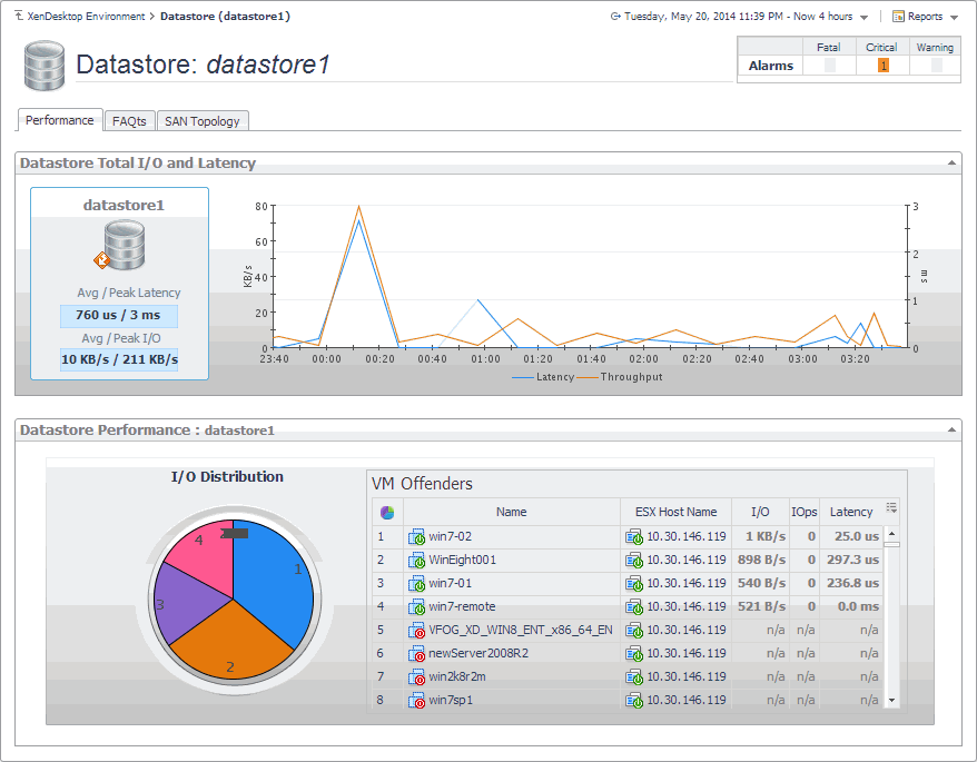
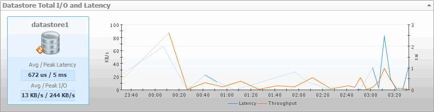
If you see any indicators that could lead to datastore performance degradation, you can explore it in more detail. The Performance tab on the Datastore Explorer view identifies the virtual machines that consume the highest amounts od the datastore resources. Use it to prevent potential performance bottlenecks by reallocating datastore resources where they are most needed.
The FAQTs tab on this view allows you to review common questions and answers about the selected datastore. For more information, see Reviewing Frequently Asked Questions. The SAN Topology tab is provided with Foglight™ for Storage Management. For more information about this tab, see the Foglight for Storage Management User and Reference Guide.
|
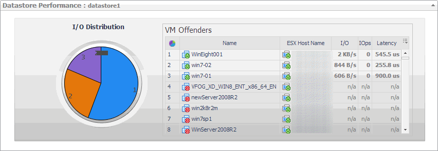
The average disk latency and data transfer rates for the selected datastore. | |
|
Identifies potential virtual machine offenders that consume the highest amounts of the selected datastore resources. It also displays a pie chart indicating how much the virtual machines associated with the selected datastore contribute to the overall I/O. For each identified virtual machine, it shows its name, the ESX® host on which it is running, the disk transfer rate, the rate of I/O operations per second, and the average time that passes between the time the virtual machine issues and executes disk read or write operations. |
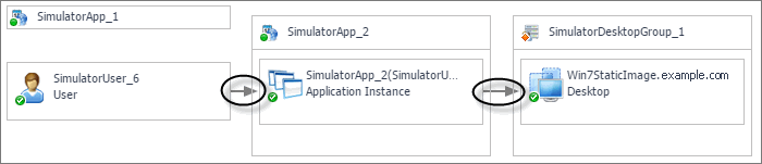
A typical XenDesktop® environment consists of many interrelated components. Understanding the dependencies between logical and virtual components in your monitored environment and the levels of resources they consume allows you to better understand resource-related issues, potentially affecting the stability of your system. This can help you predict the impact a potential outage may have on your environment, and to prevent such events, by reallocating resources where they are most needed.
|
• |
Alternatively, to see the dependencies associated with your monitored XenDesktop site, on the navigation panel, under Dashboards, choose XenDesktop > XenDesktop Dependency. |
|
• |
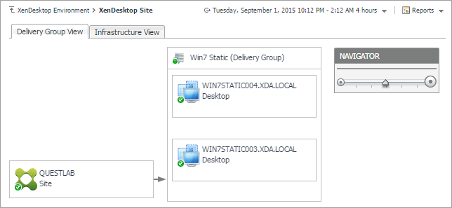
Delivery Group View: A Delivery Group specifies which users can access Desktops or Applications based on their user type. This tab illustrates the relationships between main components associated with the Delivery Groups that belong to the selected XenDesktop site, including the XenDesktop site, any Delivery Groups, and the Desktops and Applications available in these Delivery Groups. |
|
• |
Infrastructure View: This tab illustrates the relationships between main infrastructure elements components associated with the Delivery Groups that belong to the selected XenDesktop site, such as the NetScaler Gateway, StoreFront Server, Delivery Controller, Domain Controller Database, and the License Server. |
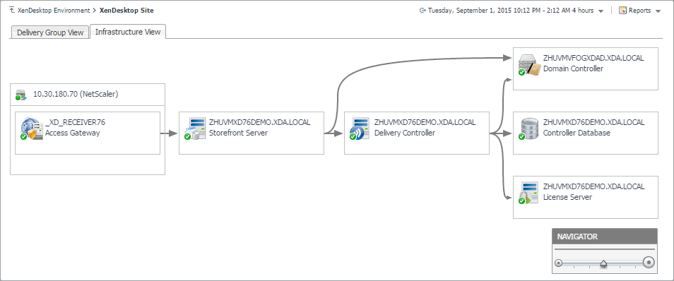
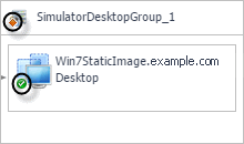
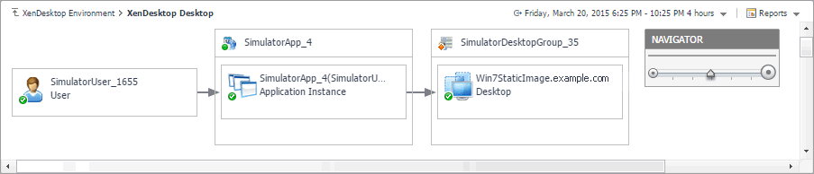
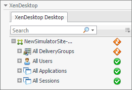
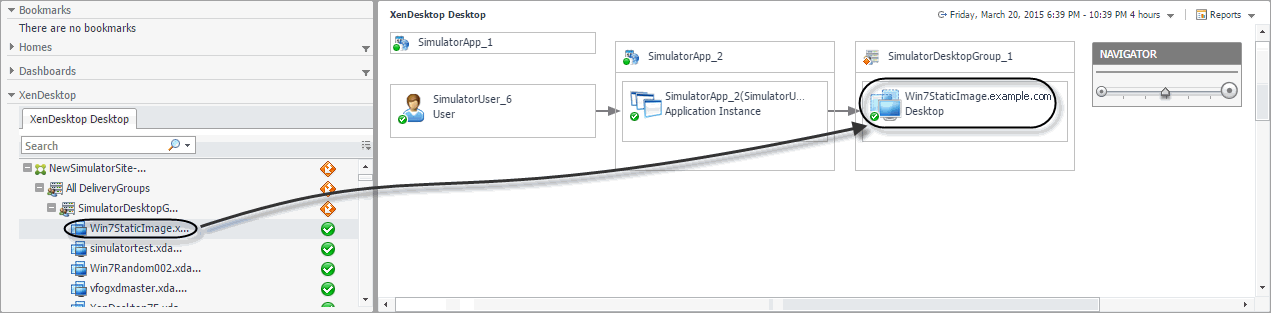
When you open a dependency map, the XenDesktop Desktop tab appears on the navigation panel. This tab displays a a navigation tree representing a simplified map of your monitored objects. On the right of each object or object group, alarm indicators appear. Each indicator represents the alarm of the highest severity that is generated against the object. For an object type container (for example, All DeliveryGroups), the status indicator represents the alarm of highest severity that is outstanding for all objects belonging to that group.
In a large multi-component environment, dependency maps are likely complex and may not fit your screen. The NAVIGATOR in the top-right corner allows you to easily set the zoom level by dragging the slider into the appropriate position.

 The complexity of the information appearing in a dependency map depends on the selected object and the dependencies that object has with other objects within your integrated infrastructure.