サポートと今すぐチャット
サポートとのチャット

Foglight 5.9.3 - Web Component Tutorial

Using the Web Component Tutorial Tutorial 1: Drag and Drop Tutorial 2: Creating a Dashboard Tutorial 3: Adding a Drilldown Page Tutorial 4: Adding Views Tutorial 5: Using a Grid Tutorial 6: Reports Tutorial 7: Creating a Form Tutorial 8: Renderers Tutorial 9: Adding Questions and Answers Tutorial 10: Sending Messages to Other Users

Tutorial 2: Creating a Dashboard

The term dashboard in Foglight® denotes a container that includes a pre-set collection of visual data, but does not necessarily require any user interaction to complete the picture. Technically, a dashboard cannot have any required context inputs, although it can have additional context entries. A dashboard presents an overall view of the health of a monitored system through the use of colored buttons, tabular data, various icons representing system alerts, and other graphical components. It supports a drilldown mechanism to show Web pages containing more detailed information about a selected item.

This tutorial shows you how to create a dashboard that shows a table of all the hosts in the monitored system.

User actions that cause the view to update will be covered in a subsequent tutorial.

The first thing you have to decide is whether you want to take the top-down or the bottom-up approach. In the top-down approach, you create the dashboard first, then you populate it with components. In the bottom-up approach, you focus on the information you want to display, which forces you to think about which query or queries you want to build and how you want to present the results, such as in a table, or a chart, or some other component. The dashboard is a container that holds the components, so you define it after knowing what it will contain.

Since this is a tutorial, we will do a bit of both approaches. Our stated goal is to display a hosts table in the dashboard. That is our design for the moment. It is not really a design, just a bit of an outline, but it will serve to guide us as we build the view.

With that much of a goal in mind, we start the bottom-up approach with a query. Next, we use the query to populate the rows of a table and then add the table to an empty dashboard.

Views are assembled from View Components whose properties are listed in the Web Component Reference, which is accessible from the Help tab on the action panel.

The starting place for working with View Components is to choose, from the left panel, in the Dashboards group, Configuration > Definitions. Make this selection to follow along with the tutorial. (Your user module is labeled My Definitions.)

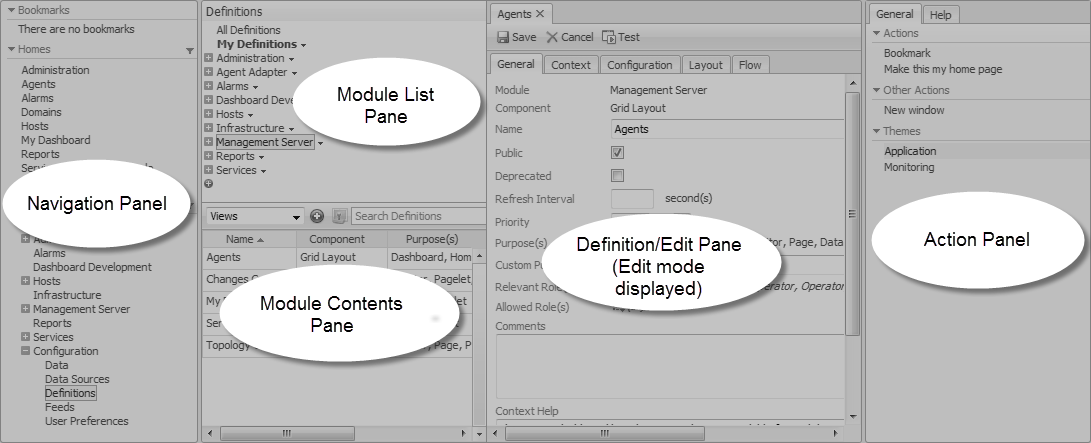
The Configuration > Definitions page contains all the functionality needed to create new customized views, as well as allowing anyone with proper user permissions to edit existing modules. The Module List pane at the upper left side of the window lists all the modules for which definitions exist.

In this tutorial, we start off by configuring a user query in your user module My Definitions. First, select this module, and then focus your attention on the Module Contents pane. At the top of the pane on the left there is an Add button. You will use this button to add your new query. Above the Add button there is a drop-down list. The first two items are Views and Queries. We will be working with these items in this part of the tutorial.

We are going to start by defining a query, so ensure that the Queries choice is selected. When it is, the Module Definition pane on the right side of the window will be used to configure the query.

Constructing the Tutorial Module

There are two ways to work through this tutorial. The recommended way is to build all the queries and views yourself. That will give you the experience you need to become comfortable with the Web Component development environment. If you are pressed for time, you can read the tutorial and examine the pre-built components.

1
On the navigation panel, choose Dashboards > Configuration > Definitions.
2
Navigate to Dashboard Support > Tutorials.
4
Choose Edit from the menu that appears.
5
In the Edit Module dialog box that appears, on the right of Relevant Role(s), click .
6
In the dwell that appears, select the Dashboard Designer check box, and then click Apply.
7
Click OK to close the Edit Module dialog box.
8
Optional. Refresh the browser interface.

Configuring a Query

Web Component Reference queries are similar to SQL queries and perform a similar function. They are used to select a subset of the information in a data source. Foglight® agents collect a vast amount of data, so Web Component Reference queries are used to access specific items. The Web Component Reference building blocks are used to present this information in a readily understandable way.

Recall that these queries return objects. In most cases you want to use only a portion of the data returned by the query.

The query we want to define extracts from the data source information about all the hosts in our monitored system. To accomplish this task, it is helpful to understand something about Data Source Types, Data Source IDs, Object Types, and paths in the data object graph.

The Add Query dialog box appears.
2
In the Add Query dialog box, on the Create a Blank Query tab, in the Name column, click Host (with Monitoring in the Namespace column).
The list of data object types on this tab contains the names of all the object types known to this running instance of Foglight. You can search the by typing Host in the search box. list box responds to keystrokes, so you can type Host to quickly locate the Host type.
3
In the Name box, type Active Hosts.
4
Leave the ID box set to (auto).
5
Ensure that the UI Query and Public check boxes are clear.
Selecting the UI Query check box causes the query to appear as a node in the Data area. This is only useful if you want users to be able to explore the data objects returned by this query.
6
Ensure that the Deprecated check box is clear.
7
Leave Relevant Role(s) and Allowed Role(s) unchanged.
This makes the query available to everyone without restriction. See the section on roles in the <Emphasis>Web Component Guide for more information about setting roles.
8
Observe that the Object Type is set to foglight-5:Host.
9
Click the Root Reference box and choose Data Sources > Monitoring (Default Instance) from the list that appears.
Click the Path box and choose ModelInstances from the list that appears.
11
Select the Ignore Reference Objects check box. This limits the size of the returned host objects to those sub-objects and properties that are strictly contained by a host.
An example of a contained object is an agent installed on a host. However, this same agent contains a back reference to the host containing it, so if Ignore Reference Objects is cleared, back references such as these are shown as nodes underneath the agent node. There are cases where this is the desired behavior, but it is not so in this tutorial.
12
14
Click Test. This button appears at the top of the tab.
Figure 2. Test button
The Query Results dialog box appears, showing the name or names of the hosts. In the Query Results dialog box, the Data Type column indicates that all of the returned objects are of the Host type. The Value column is empty because there is no numerical value associated with these Host objects. Simple types have values, while Host objects do not.
15
In Query Results dialog box appears, click Close.
16
On the New Query tab, click Save to save the query. The tab name changes to Active Hosts.

Configuring a Row-Oriented Table

After completing the task in Configuring a Query, you have a query that returns a list of hosts. The next step is to use the query to populate the rows of a table.

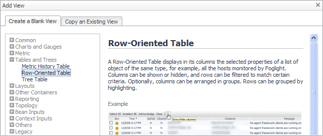
The Add View dialog box appears.
2
In the Add View dialog box, ensure that the Create a Blank View tab is selected.
3
On the Create a Blank View tab, choose Tables and Trees > Row-Oriented Table.
4
5
In the Definitions pane, on the General tab, in the Name box, type Monitored Hosts.
6
Leave the ID box set to (auto).
7
Ensure that the Public and Deprecated check boxes are clear.
8
Set the Preferred Width and Preferred Height values. You can edit these values later when you have seen the table displayed, so you can choose any values you want. For now, set Preferred Width to 300 and Preferred Height to 150.
9
Leave the Refresh Interval box blank.
10
Leave the Priority box set to None.
On the right of Purpose, click Edit (). In the dwell that appears, select Pagelet, and leave all the other check boxes cleared. Since the table will be placed on a dashboard, we need to ensure that view has the Pagelet purpose
Click Apply in the dwell to save this change and close the dwell.
12
Leave the Custom Purpose(s), Relevant Role(s) and Allowed Role(s) values unchanged.
See the <Emphasis>Web Component Guide for more information about these settings.
13
Complete the Comments and Context Help boxes with any descriptive text, as required. In a production environment, comments should contain information for other developers and context help should contain information for end users. It becomes part of the context sensitive help for the component.
関連ドキュメント

The document was helpful.

評価を選択

I easily found the information I needed.

評価を選択