|
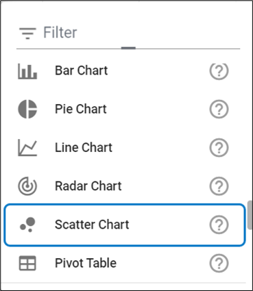
Scatter Chart
Scatter Chart helps to visualize trends between two datasets.
To create a Scatter Chart:
1.Click on All Views in the editor and then click on  icon placed at the bottom of the list of views. icon placed at the bottom of the list of views.
2.Select Scatter Chart from the list.
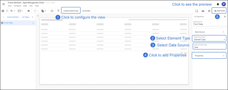
3. To Configure the Scatter Chart,
Click on Configuration on the toolbar or right-click on the view to select.
Select Data Source, either Element Type for a new one or Filter.
Set Limit to display if needed.
Applying X and Y Axis Properties is must to configure the Scatter Chart.
Click Preview to see the result.
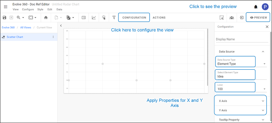
4. To add properties on X and Y Axis.
Click on X Axis > Select Data Source > Property.
Click on Y Axis > Select Data Source > Property.
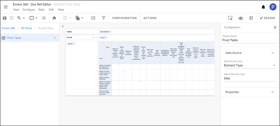
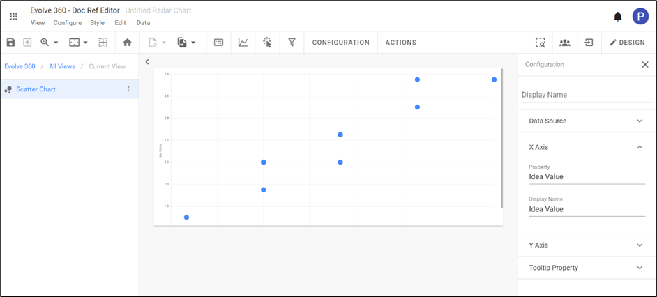
5. The preview of the configured Scatter Chart is shown in the picture below with the properties.
|

|
Properties selected must be numeric. |
6. To set the origin to Zero or the start of the dataset, click on icons  and and  respectively. respectively.
|