Tchater maintenant avec le support
Tchattez avec un ingénieur du support

MessageStats 7.8.1 - Reports User Guide

Upgrading MessageStats Overview Typical MessageStats Upgrade Scenarios Moving the MessageStats Database Moving and Upgrading MessageStats Moving Custom Reports and Report Subscriptions Viewing, Creating, and Editing MessageStats Reports My Reports and Corporate Reports Exchange Executive Summaries Reports Exchange Organizations Reports Exchange Server Reports Exchange Content Analysis Reports Exchange Mailboxes Reports Exchange Mail Contacts Reports Exchange Distribution Groups Reports Exchange Public Folders Reports Exchange Storage Reports Exchange Internet Reports Exchange Inventory Reports Migration Reports MessageStats Gathering Reports Appendix A: How to Read the Reports Report Filter Definitions

Guidelines for Creating Bar Graphs

The following guidelines apply when creating bar graphs and stacked bar graphs using the Graph Wizard.

To plot a bar graph, you must, at a minimum, select fields for the following:

The following are general rules that apply when you create a bar graph:

In the first three examples, the selected data source is Servers - Server Activity Totals. In the fourth example, the data source is Storage - Exchange Database Summary.

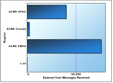
One data value

One category label

The values of field selected for the category label is used to label each bar in the bar graph.

In this example, the following data source and fields (values) were used:

Datasource:
Servers - Server Activity Totals

Data Values:
External User Messages Received

Category Labels:
Region

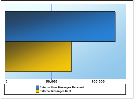
Two or more data values

Each field selected provides data for a bar.

In this example, the following data source and fields (values) were used:

Datasource:
Servers - Server Activity Totals

Data Values:
External User Messages Received

External Messages Sent

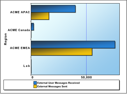
Two or more data values

One or more category labels

The fields selected as the category labels are used to categorize the values on the vertical axis.

Each category has a bar for each data value. The legend title contains the field display-name.

In this example, the following data source and fields (values) were used:

Datasource:
Servers - Server Activity Totals

Data Values:
External User Messages Received

External Messages Sent

Category Labels:
Region

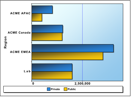
One data value

One category label

One series label

The value of the category label determines the groups of bars. The value of the series label determines the color of the bar, and the legend label.

The following data source and fields (values) were used:

Datasource:
Storage - Exchange Database Summary

Data Values:
Database Size (MB)

Category Labels:
Region

Series Labels:
Database Type

All the blue bars are mailbox databases, and yellow are public folder databases.

Guidelines for Creating Pie Charts

The following guidelines apply when creating pie charts and multi-pie charts using the Graph Wizard.

To create a pie chart, you must, at a minimum, select fields for the following:

The following are general rules that apply when you create a pie chart:

In the first three examples of pie charts, the selected data source is Mailboxes - Mailbox Activity Details. In the fourth example, the data source is Storage - Exchange Database Summary.

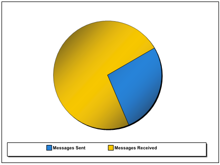
Two or more data values

Each field provides data for a pie wedge.

The value of the data labels determine the color of the wedge, and the legend label.

The following data source and fields (values) were used:

Datasource:
Mailboxes - Mailbox Activity Details

Data Values:
Messages Sent

Messages Received

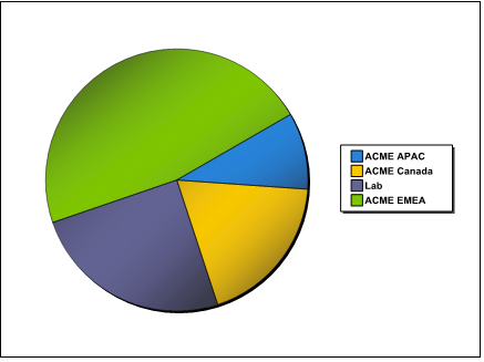
One data value

One series label

The value of the series label is used to associate data values with a particular pie wedge. There is one pie wedge for each series value.

The following data source and fields (values) were used:

Datasource:
Mailboxes - Mailbox Activity Details

Data Values:
Messages Sent

Series Labels:
Region

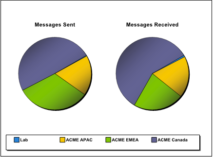
Two or more data values

One series label

The value of the series label is used to associate values with a particular pie wedge. There is one pie for each data value.

The following data source and fields (values) were used:

Datasource:
Mailboxes - Mailbox Activity Details

Data Values:
Messages Sent

Messages Received

Series Labels:
Region

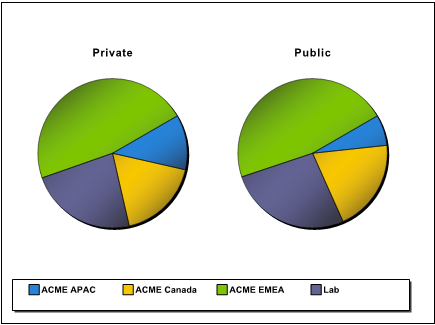
One data value

One series label

One Multi-Pie Select field

The values of the Multi-Pie Select field determine on which pie to plot the values. The value of the series label determines with which pie wedge the data values are associated.

In this example, the following data source and fields (values) were used:

Datasource:
Storage - Exchange Database Summary

Data Values:
Database Size (MB)

Series Labels:
Region

Multi-Pie Select:
Database Type

Guidelines for Creating XY Graphs

The following guidelines apply when creating XY graphs and XY stacked area graphs using the Graph Wizard.

To generate an XY or stacked area graph, you must, at a minimum, select fields for the following:

The following are general rules that apply when you create a XY graph:

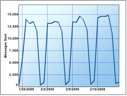
In the XY graph examples, the data source is Mailboxes - Mailbox Activity Details.

One X-axis value

One Y-axis value

The X-Y data points plot successive points on a line.

The following data source and fields (values) were used:

Datasource:
Mailboxes - Mailbox Activity Details

X-axis Values:
Date

Y-axis Values:
Messages Sent

(The data is filtered for last month.)

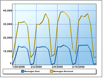
One X-axis value

Two or more Y-axis values

Each Y-axis value is plotted on a separate line, against the supplied X-axis value.

The following data source and fields (values) were used:

Datasource:
Mailboxes - Mailbox Activity Details

X-axis Values:
Date

Y-axis Values:
Messages Sent

Messages Received

(The data is filtered for last month.)

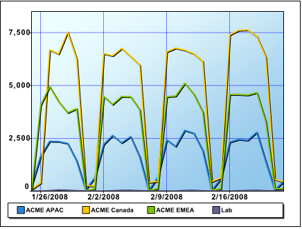
One X-axis value

One Y-axis value

One series label

The X-Y values are plotted as lines.

The value of the series label determines with which line a point is associated.

The following data source and fields (values) were used:

Datasource:
Mailboxes - Mailbox Activity Details

X-axis Values:
Date

Y-axis Values:
Messages Sent

Series Labels:
Region

(The data is filtered for last month.)

Editing Reports

You can modify both the configured MessageStats Reports and any custom reports that you create using edit and grouping functionality. You can edit reports in the following ways:

The following table describes the extent of editing for each type:

Edit Button

Allows you to copy the report to a different destination folder, move the report to a different location, rename or delete the report, or edit the report description.

Filters

Allows you to restrict the report content to specific information before the report is rendered.

Quick Filter Bar

Allows you to change filter options and regenerate the report.

For more information, see Using Quick Filters .

Column Header

Allows you to add or remove fields in the report, and change group and sort options. For more information, see Changing Grouping OptionsChanging Grouping Options .

Edit Menu

Opens the Web Report Wizard to allow you to customize or modify an existing report.

Documents connexes

The document was helpful.

Sélectionner une évaluation

I easily found the information I needed.

Sélectionner une évaluation