Custom Homepage
The Custom Homepage feature offers options to customize your home page by disabling My Menu option from the left pane.
Hover over 
To configure home page, follow these steps:
-
Open the browser and login to erwin Evolve Web Platform.
-
Click a model. For example, EA Foundation – Sample Model.
-
Click Administration.
-
Click Custom Homepage.
-
Switch the Deactivate the My Menu feature option on.
-
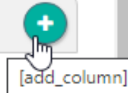
Click the add_column icon.
-
Enter appropriate values in the fields. Refer to the following table for field descriptions.
Field
Description Name Specifies the column name.
For example, Column 1.Approved Roles Specifies approved roles Order Specifies the column order
Use up or down arrow to change the column order.
Width Specifies the width of the column.
For example, 300.
The width value should be in percent.

-
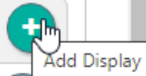
Click the Add Display icon.
You can add multiple displays per column.
-
Enter appropriate values in the fields. Refer to the following table for field descriptions.
Field
Description Name Specifies the Display name.
For example, Display 1.
Description Specifies the description of the display Approved Roles Specifies approved roles
-
Click the Display settings section.
-
Enter appropriate values in the fields. Refer to the following table for field descriptions.
Field
Description Additional Information
Order Specifies the display order
Transparent Specifies whether the display is transparent Fixed Width Specifies whether the column width is fixed
No Padding Specifies whether there is space between two displays Width Specifies the display width
For example, 20% or 100px or 20vh.
Extendable Specifies whether the display name and display type is displayed in extended mode Height Specifies the display height
For example, 100px or 50vh.
Expand Button With Text Specifies whether the display name header is used as a button and enables viewing display types in collapsed and expanded modes Available when you switch on the Extendable option Collapse By Default Specifies whether the display is in collapsed mode by default Available when you switch on the Extendable option Type Specifies the column display type. For more information refer to the Column Display Types
Select the required column display type from the drop-down option.
On the Homepage you can display the following column display types:
- Favorite
- Displays objects marked as a favorite.
- Link Based on Roles
- Displays all roles and my menu items on the homepage.
- Index Page
- Displays configured index page from Evolve view. Selecting Index Page from Type drop-down enables additional fields.
It only works with the Layout List (Simple) and Layout List Box of the index page.
To display an index page, follow these steps:
-
Click the Index Page section.
-
Use the following options:
-
Evolve view: Use this option to display an index page. Select the required index page from the drop-down option.
-
Give Index Context
-
Give Single Context
-
Get Context From: Use this option to get context from different displays.
-

- Object Page
- Displays configured object page from Evolve view.
- Selecting Object Page from Type drop-down enables additional fields.
- To display an object page, follow these steps:
-
Click the Object Page section.
-
Use the following options:
-
Evolve View: Use this option to display an object page. Select the required object page from the drop-down option.
-
Give Index Context
-
Give Single Context
-
Get Context From
Use this option to get context from different displays.
-
- Selecting Object Page from Type drop-down enables additional fields.
- Description of an Object
- Displays the description of an object. Selecting the Description of an Object from the Type drop-down list enables additional fields.
- To display an object description, follow these steps:
-
Click the Description of an Object section.
-
Click the Select the object drop-down list box and select the required object. For example, Application.
-
Click the second drop-down list box and select the required option. For example, Activity Monitoring.
- To display an object description, follow these steps:
- Last Modified Objects
- Displays all last modified objects with their custom properties. Selecting Last Modified Objects from the Type drop-down list enables additional fields.
- To display all modified objects, follow these steps:
-
Click the Last Modified Objects section.
-
Enter appropriate values in the fields. Refer to the following table for field descriptions.
Field
Description Additional Information
Show Evolve Page Specifies whether an Evolve page is displayed
Link Specifies the link to evolve page Available when you switch on the Show Evolve Page option. Text Specifies the text with the evolve page link Available when you switch on the Show Evolve Page option. Show Icon if Favorite modified Specifies the icon of modified favorite objects Url icon Specifies the url of the icon Show Objects Modified Days Specifies the object's modified days ObjectTypes to display Specifies the object types to display Configure Object Type Specifies the object type to configure Custom Display String Displays the text in accordance with the specified script name
Available when you select the ObjectTypes to display and Configure Object Type Enhanced Property display Specifies an enhanced properties to display Available when you select the ObjectTypes to display and Configure Object Type Filter Specifies the filter option to filter the properties To add a new filter, click
-
Click the Property drop-down list box, and select the required option.
-
Click the Operator drop-down list box and select the required option.
-
Use Value or drop-down list to specify the property value
-
- To display all modified objects, follow these steps:

- Carousel
- Displays a slide show of images and content.
- Selecting Carousel from the Type drop-down list, enables additional section.
To display slide show, follow these steps:
 |
You can add multiple slides. |
|---|
-
Click the Carousel section.
-
Click
to add slide.
-
Enter appropriate values in the fields. Refer to the following table for field descriptions.
Field
Description Additional Information
Title Specifies the name of slide.
Description Specifies the description of slide Order Specifies the slide order
Note: Use up or down arrow to change the column order.
Left Picture Specifies the left-side picture
Enter a picture link to display on the left side.
Right Picture Specifies the right-side picture
Enter a picture link to display on the right side.
- Links In Box
- Displays images with links.
- Selecting Links In Box from the Type drop-down list, enables additional section.
To display an image with links, follow these steps:
-
Click the Link In Box section and use the following options:
-
Alignment
Use this option to set an alignment of images and links.
-
Image Width
Use this option to specify the width of image.
-
Round Shape
Switch this option to apply round shape.
-
Font Size
Use this option to specify the font size. For example, 20px.
-
Links
Use this option to upload picture and add target link and text.
-
To add a new link, follow these steps:
-
Click
to add a new link.
-
In the Order box, specify order of link.
You can add multiple slides.
-
Click the Carousel section.
-
Click
-
Enter appropriate values in the fields. Refer to the following table for field descriptions.
Field
Description Additional Information
Title Specifies the name of the slide
Description Specifies the description of the slide Order Specifies the slide order
Note: Use up or down arrow to change the column order.
Left Picture Specifies the left-side picture
Enter a picture link to display on the left side.
Right Picture Specifies the right-side picture.
Enter a picture link to display on the right side.
- Displays images with links.
- Selecting Links In Box from the Type drop-down list enables an additional section.
To display an image with links, follow these steps:
-
Alignment
Use this option to set an alignment of images and links.
-
Image Width
Use this option to specify the width of the image.
-
Round Shape
Switch this option to apply a round shape to the picture.
-
Font Size
Use this option to specify the font size. For example, 20px.
-
Links
Use this option to upload a picture and add a target link and text.
To add a new link, follow these steps:
-
Click
to add a new link.
-
In the Order box, specify the order of link.
Use up or down arrow to change the order.
-
In the Text to Display box, enter a text to display with target link.
-
Under Url of the Picture, click Choose File.
-
Select the required picture and click Open.
-
In the Target Link box, enter a target link.
Clicking this link, you will be redirected to that link.
-
- Selecting Links In Box from the Type drop-down list enables an additional section.
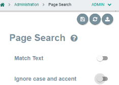
Page Search
The Page Search feature enables you to configure the filter properties of the search box on all object pages.
Hover over
To configure the Page Search feature:
-
Open the browser and login to erwin Evolve Web Platform.
-
Click a model. For example, EA Foundation – Sample Model.
-
Click Administration.
-
Click Page Search.
The Page Search screen appears.
-
Enable appropriate filter configurations. Refer to the following table for descriptions.
Field
Description Match Text Specifies whether the search results return only those results where all terms in a search string occur Ignore case and accent Specifies whether the case and accent common in non-English languages are ignored - Click
.
You will be notified that "Configuration draft has been saved". - Click
.
You will be notified that "Configuration published successfully". The page search filter feature takes effect.
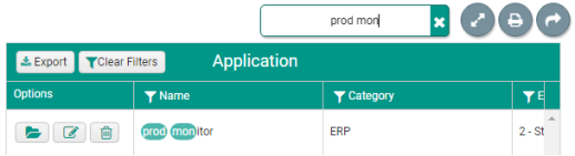
For example, if you enable Match Text property and search for the term prod mon, the search results will display only those results that contain both words, prod and mon.
If you enable the Ignore case and accent property, an é will be considered as an e.
Enhanced Property Display
The Enhanced Property Display feature offers formatting options to enhance Display URL, Boolean, Numeric, and Lookup properties.
Hover over
To configure property display, follow these steps:
-
Open the browser and login to erwin Evolve Web Platform.
-
Click a model. For example, EA Foundation – Sample Model.
-
Click Administration.
-
Click Enhanced Property display.
-
Use the following options:
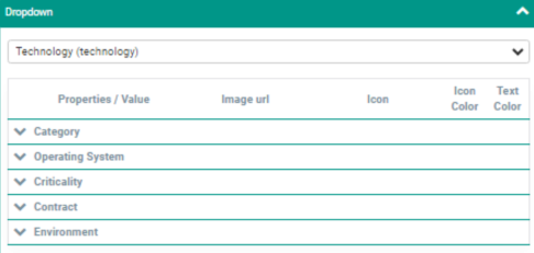
- Drop Down
- Use this option to improve different properties of object types.
- Clicking this section enables a drop-down, where you select the required object type for which you want to enhance property display. For example, Technology.
- A technology properties section appears.
- Expanding each property section displays its values.
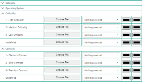
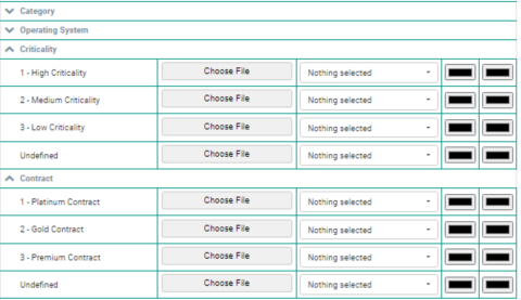
- For example, to enhance the Criticality property, follow these steps:
-
Click the Criticality section.
A value of criticality appears.
-
Under Image url, click Choose File.
-
Select the required image and click Open.
-
Under Icon, click the drop-down list box and select the required icon.
-
Under Icon Color, click
.
Use the color palette to set the icon color.
-
Under Text Color, click
.
Use the color palette to set the text color.
Similarly, you can add images and set the color of text and icons for other properties.
- Url
- Use this option to add a documentation link.
- Boolean
- Use this option to display the Boolean values such as True and False.
- Selecting Use an icon check box, displays a boolean icon. For example,
and
.
- Number
- Use this option to display the minimum and maximum number of enhanced property displays.
- To add numeric values to the Enhanced Property display, follow these steps:
-
Click the Number section.
-
Click the drop-down list box and select the required object. For example, Application (application).
You can now add steps for any property that you want to update on the object page.
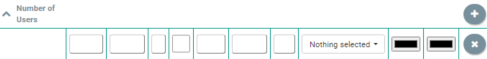
For example, if you want to add steps for the Number of Users property, follow these steps:
-
Click the Add Step icon.
The column fields appear.
For example, if you want to add steps for the Number of Users property, follow these steps:
-
Enter appropriate values in the fields. Refer to the following table for field descriptions.
Field
Description Additional Information
Minimum Specifies the minimum value of enhanced property Maximum Specifies maximum value of enhanced property Unit Specifies the unit
For example, $, kg, %
In Front ? Specifies unit before or after the value
To specify the unit before the value, select the In Front check box. Decimal Splitter Splits the integer and fraction parts using a decimal point or decimal comma
For example, 12.50 or 12,50
Thousand Splitter Splits thousands in numbers with more than three digits to the left of the decimal separator using a comma or point.
For example, 78,000 or 78.000
Image url Specifies the image url
Icon Displays font awesome icon Icon Color Displays icon color To change the color, click and use the color palette to set the color.
Text Color Displays text color. To change the color, click
-
-
Click
.
-
Click
.
- MemoText
- Use this option to display Object Type and index pages used for MemoText Mapping.
- Global Mapping
- Use this option to display global mapping.


- Dropdown
- Use this option to improve different properties of object type.
- Clicking this section, enables a drop-down where you select the required object type for which you want to enhance property display. For example, Technology.
- A technology properties section appears.
- Expanding each properties section, displays their values.
- For example, to enhance the Criticality property, follow these steps:
-
Click the Criticality section.
Values of criticality appear.
-
Under Image url, click Choose File.
-
Select the required image and click Open.
-
Under Icon, click the drop-down list box and select the required icon.
-
Under Icon Color, click
.
Use the color palette to set the icon color.
-
Under Text Color, click
Use the color palette to set the text color.
Similarly, you can add images and set the color of text and icons for other properties.
- Clicking this section, enables a drop-down where you select the required object type for which you want to enhance property display. For example, Technology.
- Url
Use this option to add documentation link.
-
Boolean
Use this option to display the Boolean values such as True and False.
Selecting Use an icon check box, displays boolean icon. For example,
and
.
-
Number
Use this option to display minimum and maximum number of enhanced property display.
-
MemoText
Use this option to display Object Type and index pages used for MemoText Mapping.
-
Global Mapping
Use this option to display global mapping.
Redirect Edit View
The Redirect Edit View enables you to redirect Evolve users to different views on entering the edit mode.
Hover over
| |
Redirection works only with more than one object type. |
|---|
To create an object page for an object type, follow these steps:
-
Start Evolve Designer.
-
Click a model. For example, EA Foundation Sample Model.
-
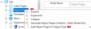
Click Site.
-
Expand Site.
-
Right-click Object Pages and select Add Object Page for Object Type.
-
Select the required object type. For example, Application.
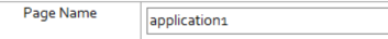
-
In the Page Name box, replace “application” with “application1”.
-
Click Save.
-
Click Dynamic Site.
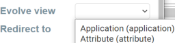
To configure the Redirect Edit View feature, follow these steps:
-
Click Administration.
-
Click Redirect Edit View.
-
Click the Evolve view drop-down list box and select the required object type. For example, Application (application).
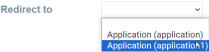
-
Click the Redirect to drop-down list box and select the object page where you want to redirect. For example, Application (application1).
-
Click
You will be notified that the "Configuration draft has been saved".
-
Click
to publish the configuration.
You will be notified that the "Configuration published successfully".
To view the redirect URL, follow these steps:
-
In the left pane, click Application, and select Application List.
-
Click Application List.
-
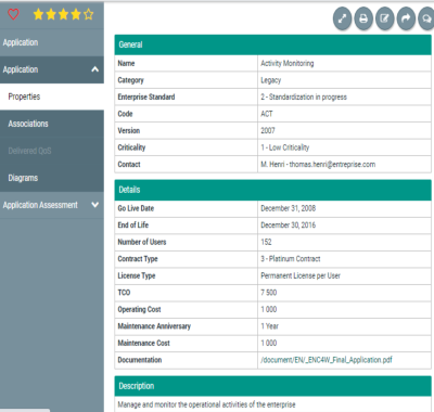
Click
to open the object page of the required application.
For example, the following image displays the object page of Activity Monitoring.
-
Click
.
This redirects you to the application1 view.
In the address bar, you can now see redirected view selected during configuration.
-