Pivot tiles
The Pivot tiles display metrics from pivots defined in Foglight APM Appliances analyzers. The layout of the tiles is common, with a unique icon representing one of four types of pivot groups: browsers, content types, locations, and OSes.
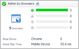
You can click the title bar to drill down to Pivot Breakdown detail view.
|
|
|
• |
Icon. Indicates the type of pivots. |
|
|
|
|
• |
Health Breakdown. The current number of pivots in each state (Normal  , Warning  , Critical  , Fatal  ), along with a color-coded bar. The length of colored bar indicates the number of pivots in the corresponding state compared to the total number of pivots. | |
|
|
|
• |
Most Errors. The pivot type with the most errors. For example, for web browser pivots, this may be Chrome ™, Firefox ®, Internet Explorer ®, Opera ™, or Mobile Device. For a location pivot, this metric would indicate the city and country. | |
|
|
|
Real User (APM) tile
The Real User (APM) tile shows summarized data about real user transactions captured by Foglight APM Appliances analyzers.
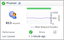
Topology Object Name: EUHitInteraction
Click the title bar to drill down to the Real User (APM) Performance detail view.
|
|
|
• |
Requests. The total number of requests for the transaction. | |
|
|
|
• |
Health History Bar. The color-coded bar represents the alarm state of the monitored component over the time range selected in the SOC. The color of the bar changes depending on the alarm state. Red indicates a Fatal state, orange indicates Critical, yellow means Warning, and green is the Normal state. | |
|
|
|
|
|
|
• |
Performance. This indicator shows that performance metrics are tracking to their historical norms. Deviations from those norms indicate an anomaly that should be investigated. | |
|
|
|
• |
Errors. This indicator shows that errors are tracking to their historical norms. Deviations from those norms indicate an anomaly that should be investigated. | |
|
|
|
• |
Last Updated. The time the metrics were last updated for this transaction. | |
Real User (FxM) tile
The Real User (FxM) tile shows summarized data about real user transactions captured by Foglight Experience Monitor (FxM).
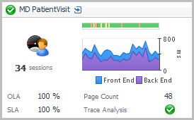
Topology Object Name: FxMApplicationResult
Click the title bar to drill down to the Real User (FxM) Performance detail view.
|
|
|
• |
Current Sessions. The total number of active end users that are currently interacting with the monitored transaction. | |
|
|
|
• |
Health History Bar. The color-coded bar represents the alarm state of the monitored component over the time range selected in the SOC. The color of the bar changes depending on the alarm state. Red indicates a Fatal state, orange indicates Critical, yellow means Warning, and green is the Normal state. | |
|
|
|
• |
Front End. The time from when the first byte of a transaction is sent from the end user’s browser until the time the last byte of that transaction was processed in the browser. This includes all Back End time, network time, and browser processing time. Front End times are given over the time range period selected in the SOC. |
|
• |
Back End. The time from when the first byte of a transaction request is detected on the receiving web server until the time the last byte of that transaction response was sent out of the web server. This includes all web server time, application server time, database time, and web service call time spent behind the web server needed to fulfill the transaction request. Back End times are given over the time range selected. | |
|
|
|
• |
OLA. The current average percentage of pages that satisfy the Operation Level Agreement (OLA), as defined by the Page Processing Time threshold. | |
|
|
|
• |
SLA. The current average percentage of pages that satisfy the Service Level Agreement (SLA), as defined by the Page End-to-End Time threshold. | |
|
|
|
• |
Page Count. The average number of page download requests over the time range selected. | |
|
|
|
• |
Trace Analysis. If any counters are selected in the Real User (FxM) Performance detail view, this indicator shows the highest severity alarm raised against one or more selected counters: Normal , Warning , Critical , or Fatal . If no counters are selected, this indicator appears disabled  . This indicator shows that trace analysis metrics are tracking to their historical norms. Deviations from those norms indicate an anomaly that should be investigated. | |
Sequence tile
Use the Sequence Tile to review a summary of a sequence defined by a Foglight APM Appliances sequence analyzer.
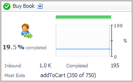
Topology Object Name: EUSequenceInteraction
Click the title bar to open the Sequences dashboard. For more information about sequences, see the Foglight APM User Guide.
|
|
|
• |
Percent Completed. Summarizes the number of successful completions of the sequence as a percentage of total sequences initiated. The graph presents the same data. | |
|
|
|
• |
Health History Bar. The color-coded bar represents the alarm state of the monitored component over the time range selected in the SOC. The color of the bar changes depending on the alarm state. Red indicates a Fatal state, orange indicates Critical, yellow means Warning, and green is the Normal state. | |
|
|
|
• |
Inbound. The number of hits on the first event in the sequence. | |
|
|
|
• |
Completed. The number of successfully completed sequences. | |
|
|
|
• |
Most Exits. The event in the sequence with the largest number of exits. Both the name of the event and the number of exits out of the total hits are displayed. | |
