Cluster Bubble Charts are similar to Simple Bubble Charts, except they allow you to visualize the properties of an Associated Object (directly or indirectly), or an Intersection Object.
You can analyze three levels of data of the Associated Objects, using the values to affect the size and position of the representations on the chart.
One value is used to position the bubble on the X-axis, another value is used to position the bubble on the Y-axis, while the size of the bubble is based on the third property.
The way the Cluster Bubble Chart evaluates Associated or Indirectly Associated Objects is very similar to the way Recursive Pie Charts work, however, instead of creating one chart that you can drill down through, it creates a number of Tabs, one for each of the items in the top-level Object List, and then creates a Bubble Chart on each one.
The Cluster Bubble Chart does not display a Data Quality Chart like the Simple Bubble Chart does.
|
|
The Cluster Bubble Chart requires at least one Association Type to exist - plus three properties on the Associated Object to compare. These properties must all be either Whole Number or Decimal Number properties - or they can be Drop-Down properties where the Abbreviation contains a number. |
|---|
Why and how should you use one?
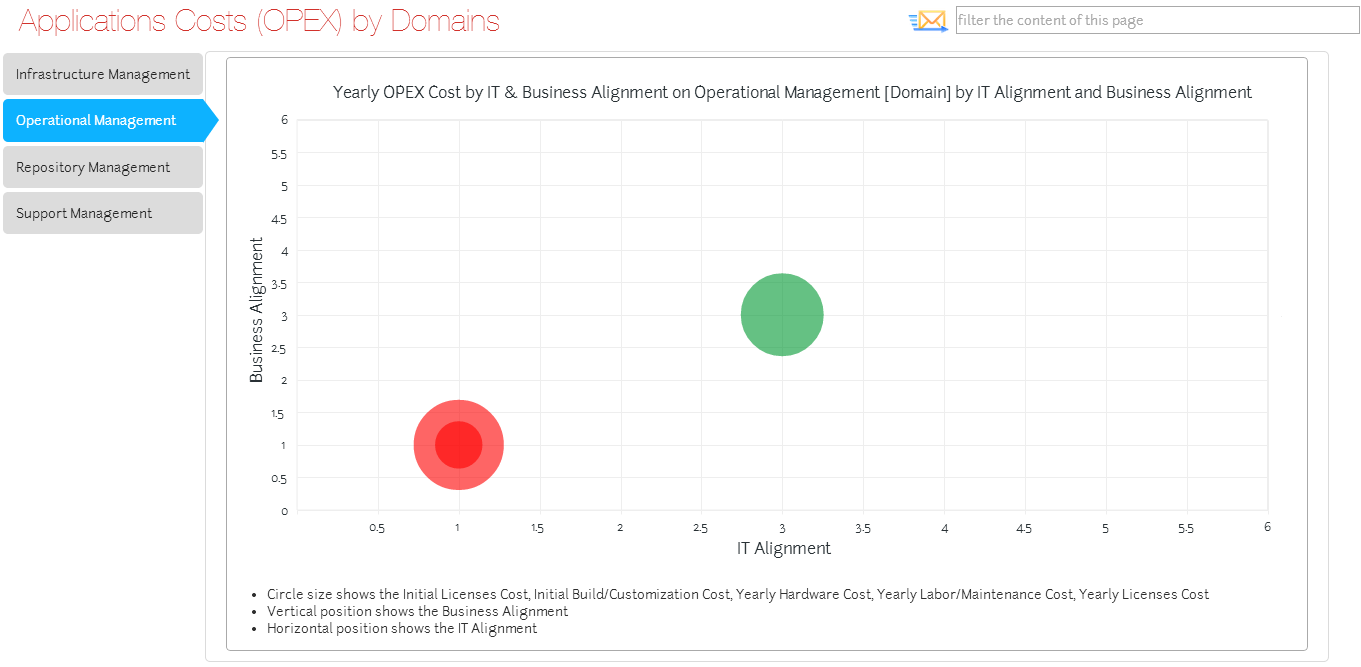
You should use a Cluster Bubble Chart when you want to visualize a comparison between objects based on three properties - but you want to take a higher-level view by using one or more associations.
A typical example would be like the example for Simple Bubble Charts, to have some Application objects with three useful properties:
Cost - a Whole Number property to represent the monetary cost of the application
Business Alignment - a Drop-Down property ranging from '0 - Unknown' to '5 - Very High', which represents how important the application is to the business
IT Alignment - a Drop-Down property with the same range as Business Alignment, which represents how well aligned the application is to your current IT infrastructure, support and competencies
In this example the IT Alignment is used as the X-axis, the Business Alignment is the Y-axis, and the size of each bubble is based on the Cost.
However, where this differs from the Simple Bubble Chart is that instead of having one chart showing all the objects, your Applications are associated to different Location objects and you want to see a chart for each Location showing only the Applications associated to it.
The result is a Tab for each Location object and then a Bubble Chart for each showing just its associated Applications.
While this example shows one level of association, you could make your chart use several, such as Location > Organization > Application, or more.
Where and when can you use one?
Use the table below to see where you can use a Cluster Bubble Chart:
|
Page Type |
Parent node |
Tabs |
Number on page |
Editable |
|---|---|---|---|---|
|
Index Page |
Object Type node |
You must have an empty Tab Controller on the page |
The Bubble Chart must be the only item on the page |
No |
What would you like to do?
Add a Cluster Bubble Chart to your page
Create a new empty Index Page with an empty Tab Controller and an Object Type, both added to the Index Page node, in that order
See Create an Empty Index Page for instructions
Select the Object Type node and use the Filter Properties area to apply any filtering
Switch the Layout node beneath the Object Type node to Empty
To do this: Right-click the Layout node and choose Switch Layout > CW > Empty
Add the Bubble Chart (Cluster) behavior to the Layout node
To do this: Right-click the Layout node and choose Add Behaviors > Bubble Charts > Bubble Chart (Cluster).
A Bubble Chart (Cluster) node is added.
Add an Association node to the Object Type node
To do this: Right-click the Object Type node and choose New Association > [object-type] > [association-type]
A new Association Type node is added.
|
|
If your chart examines indirectly associated objects, add all the additional Association Types required, nesting them beneath each other The last Association node you add is for the Object Type you want the bubbles on the chart to represent. |
|---|
Select the Bubble Chart (Cluster) node and configure the following settings:
Use the Node Name to set the title of the chart as it appears in the web page
Use Circle to specify the Scriptname of the property you want to use to affect the size of the bubble
This should be from the Associated Object - or, if you are referencing an Indirect Association, from the last Associated Object in the path.
|
|
Always use lower case when referring to Scriptnames. |
|---|
Use X to enter the Scriptname of the property you want to use on the X-axis.
Use Y to enter the Scriptname of the property you want to use on the Y-axis.
Use the three Data Quality settings to choose whether the corresponding properties are Drop-Downs (Lookups) or number properties.
Choose 'Lookup_Abbreviation_Not_o' if the property is a Drop-Down
Choose 'Not_Equal_To_o' if the property is a number
Use Circle Unit to specify the text to be displayed on the chart for the bubble size value
Use X Unit to specify the text to be displayed on the X-axis - leave blank to use the Property Type Name
Use Y Unit to specify the text to be displayed on the Y-axis - leave blank to use the Property Type Name
Use Circle Intersection Object Type to specify the Scriptname of the Associated Object Type
Save your Site.

