
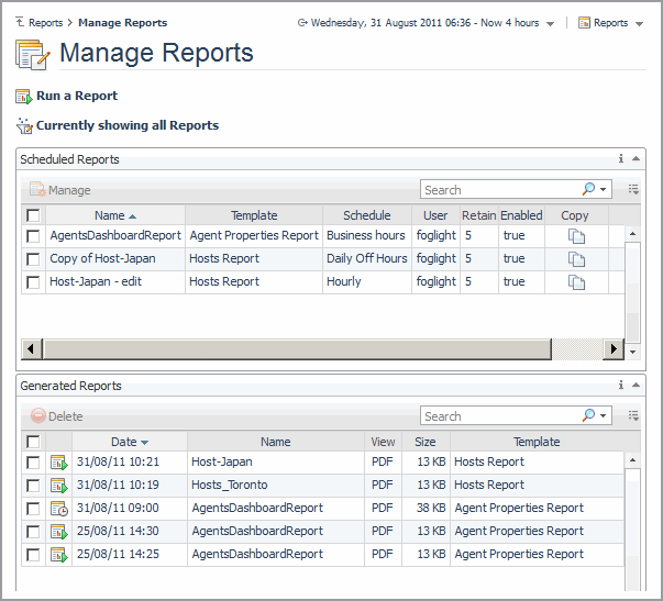
Managing Reports
Click Manage Reports on the Reports dashboard to access the Manage Reports dashboard.
Video Tutorials
There are a number of Foglight learning videos available. To view a video, on the action panel, select the Help tab, expand Using Foglight > Foglight User Help > Reporting on Your Enterprise > Video Tutorials, and then click the title of the video you wish to view.

Working with Dashboards
Quest Foglight uses views to group, format, and display monitoring data.
For more information, see the following topics:
|
• |
|
• |
When you move your mouse away, the navigation panel closes to give you a full view of the dashboard contents. If you want to keep the navigation panel open, click the arrow on the left of the display area. To close the panel, click the arrow again. See Close Arrows.
Use the navigation panel’s Edit Mode to show only the dashboards that interest you. Changes made to the navigation panel will persist after logging out.
|
1 |
 .
.|
2 |
Next to each module you want to hide, click the Hide/Show icon . |
|
3 |
|
1 |
On the right side of the page, hover your mouse over the arrow to view the list of the available actions. When you move your mouse away, the action panel closes to give you a full view of the dashboard contents. If you want to keep the action panel open, click the arrow on the right of the display area. To close the panel, click the arrow again. See Close Arrows.
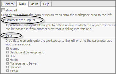
The following tabs are available in the action panel:
|
• |
General tab—contains a number of actions that you can perform on the current dashboard or report, as well as other actions you can perform (such as opening a new window or creating a new dashboard or report). |
|
• |
Design tab—provides access to design the display area, including area definition, layout, and context. |
|
• |
Help tab—provides access to the online help and a search field for the help. |
When you are working with a custom dashboard or report template, two more tabs appear:
|
• |
Views tab—add a view from the list to your report or dashboard by dragging it to the display area. See Adding a View Using the Drag and Drop Functionality for more information. |
|
• |
Data tab—display a data object in a view (that Quest Foglight adds to your dashboard) by dragging the object into the display area. See Adding a View Using the Drag and Drop Functionality for more information. |
The Close arrows are used to conserve space on the display area. Click the arrows to:
expand the display area and collapse the navigation panels.
|
|
|||||||||
|
Type a search string to see hits in all Monitored Objects. For more information, see Search. | |||||||||
|
Displays your user name. Clicking the icon or the arrow, two sub items will be displayed, Preferences and Sign out.
| |||||||||
|
|
Displays the general information for Foglight, including the following sub items:
|
 username
You can run, create, and manage your reports from any dashboard. On the top right corner of the dashboard is a reports menu. Some dashboards have an associated report template displayed in the top of this menu. For more information on reports, see Reporting on Your Enterprise .
The display area is where you view dashboards or reports and work with elements in your custom dashboards and reports. See Creating a Custom Dashboard and Building a Custom Report Template for more information.
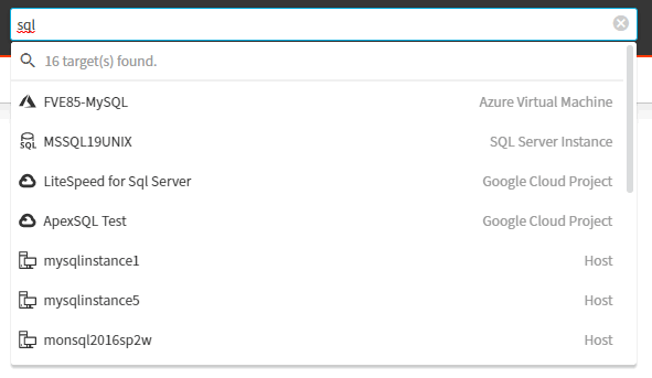
Quest Foglight controls the current time range using a special control called a zonar. See Time Range for more information. The default time range is the last 4 hours.
You can freeze the data Quest Foglight displays at a specific time range to diagnose problems that occurred during that interval. See Freezing a Time Range for more information.
The time range at the top of a dashboard indicates the current time range for all the views on the page. You can override the default current time range setting (the last 4 hours), by choosing another interval in the User Preferences page. For more information, see Setting Your User Preferences.
By default, the time range in a dashboard is displayed in real time. You can freeze the time range so that the data Quest Foglight displays in the views reflects a certain interval. When the time range is frozen, the views do not display new data. Freezing the time range helps you diagnose problems that occurred during a specific interval. For further details, see Freezing a Time Range.
Click the Timeline option in the time range to:
If you drag the right edge of the zonar when the time range is in real time (the word Now is shown in the time range display), the interval persists and not the specific date and time to which you set the zonar.
|
1 |
|
2 |
|
a |
Click the calendar icon (  ) in the From field to set the starting point for the time range. Alternatively, select Earliest available. ) in the From field to set the starting point for the time range. Alternatively, select Earliest available. |
|
b |
If you clicked the calendar icon: in the calendar popup, select a date and specify a time. Click above the field to close the popup. |
|
c |
Click the calendar icon ( ) in the To field to set the end point for the time range. Alternatively, select Current time. |
|
d |
If you clicked the calendar icon: in the calendar popup, select a date and specify a time. Click above the field to close the popup. |
|
3 |
|
4 |
Click Apply to update the views based on the new time range. |
Granularity controls the size of the metric intervals. The default option is Raw, which displays the actual collected data points. The Auto option uses intervals that are sized according to the time range. For example, a one-hour range has five-minute intervals, while a one-week range has one-hour intervals. Ranges from 1 minute to 1 week are also available.
|
1 |
In the Calendar, select an option from the Granularity menu on the right side of the interface. |
|
2 |
Click Apply. |
By default, the time range on a dashboard is displayed in real time. You can tell this at-a-glance if the word Now is shown in the time range display.
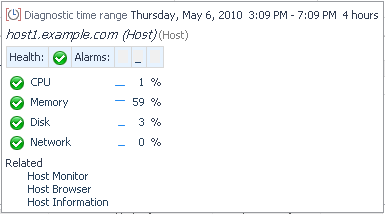
Some views show a frozen time range by default. This type of time range is called a diagnostic time range. See Diagnostic Time Range for more information.
|
2 |
 .
. 
|
• |
The diagnostic time range function works as follows:
Severity indicators can indicate:
|
|
||
|
|
||
|
|
||
|
|
Availability indicators show the availability of a service.
|
|
|
|
|
If the customizer icon is enabled you can:
|
• |
|
3 |
Click Export. |
|
5 |
|
a |
In the Title box, type a title for your report. |
|
b |
In the Notes Before box, type a note to appear after the title of your report. |
|
c |
In the Notes After box, type a note to appear after the exported view. |
|
d |
Click Yes to include a table summary of the data from the exported view. |
|
e |
In the View Export dialog box, click Save as Report to save it to My Dashboard in the navigation panel, or click Export to view it in a separate browser window. |
|
8 |
Click Export. |
Quest Foglight makes use of common views in most of the standard dashboards. Using common views in dashboards is an effective way to enable and create easy workflows. Examples of views used in many of the dashboards include the Alarm List and Host Summary.
For additional information the Alarm List view, see the following topics:
An error instance is any object in your environment that is the source of an alarm.
You can hide any of the columns in the Alarms List view.
Using the Alarm Details dialog box, you can choose either the Acknowledge or Acknowledge Until Normal option for a current alarm if you want the alarm to remain acknowledged until it reaches a normal state. For example, if you choose the Acknowledge until Normal option at 11:00 AM, the alarm stays acknowledged until 11:30 AM. In contrast, if you choose the Acknowledge option at 11:00 AM, the alarm (chain) would be “Unacknowledged” again at 11:05 AM when the severity has changed.
|
2 |
On the Alarm Details dialog box, click Find Historic Occurrences. |
|
• |
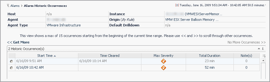
A set of alarm occurrence controls: these controls show “>> No more occurrences” if there are no occurrences outside of the current time range. If there is a “<< Get more” control on the left, this indicates alarm occurrences prior to the current time range. Mouse over this control to show the creation time of the most recent occurrence before the current time range. Click on this control to display this alarm occurrence into the table and at the same time adjust the current time range to include this occurrence. The “>> Get more” control works the same way for alarm occurrences after the current time range. |
There are two ways to add notes from the Alarm Details dialog box, by using either the:
|
• |
History tab. The Notes icon in the Alarm History table is for maintaining notes attached to a particular alarm in the history table. Clicking the Notes icon, takes you to the Alarm Notes dialog box. |
|
• |
All Notes tab. New notes are automatically attached to the most recent alarm in the alarm history. |
Alarm notes consist of free-form, non-localizable text, a user name, and a timestamp.
|
• |
|
• |
|
3 |
Click Add. |
Only the creator of the note can edit the note.
|
• |
|
• |
|
2 |
Click the Edit icon. |
|
4 |
Click Submit. |
Only the creator of the note can delete the note.
|
• |
|
• |
|
3 |
Click Delete. |
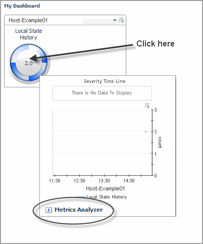
Click or hover the mouse over the name of a physical host to view a host summary popup or dwell.
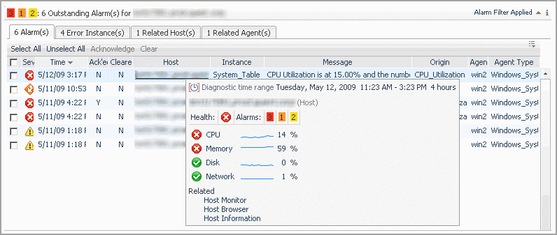

Drilling down from the popup retains the time range during which the alarm occurred. To go back to the monitoring time range you last used, “unfreeze” the range by following the procedures in Freezing a Time Range.
|
TIP: Create a custom dashboard to focus on a single view. Add just that view to the dashboard and then maximize it (Options > Maximize in the top-right corner of the view). See Creating a Custom Dashboard for more information. |
|
a |
On the Foglight navigation menu, click the Open Foglight classic web console icon  . The classic web console will open in a new tab. . The classic web console will open in a new tab. |
|
a |
Click General > Actions > Properties > Link to this page in the action panel. |
|
5 |
|
1 |
Delete everything after console from the URL. For example, if the URL is http://host1.example.com:8080/console/noc/user:operator.1, change it to the following: |
|
TIP: Visit http://eDocs.quest.com to watch our learning videos. See How to create custom Foglight dashboards. |
|
a |
On the Foglight navigation menu, click the Open Foglight classic web console icon . The classic web console will open in a new tab. |
|
2 |
On the action panel, click Create Dashboard. |
|
• |
Use All Data—start with a blank dashboard and build it by selecting discrete components from your database. See Creating a Custom Dashboard Based on All Data. |
|
• |
Start with a service—build a dashboard based on components of the service you select. See Creating a Custom Dashboard Based on a Service. |
|
• |
Create a Custom Dashboard based on the current dashboard—use the data shown on the current dashboard to build a custom dashboard. See Creating a Custom Dashboard Based on the Current Dashboard. |
|
1 |
|
2 |
Click Next. |
|
1 |
In the Create Dashboard wizard, View Properties page, type a unique name for the dashboard in the Name field. This is the only information required to create a new dashboard. |
|
2 |
Select one of the following Auto Refresh Rate options: |
|
• |
Every x second(s)—type the number of seconds in the box to indicate the length of the refresh interval |
|
• |
|
3 |
Optional—by default, if you do not select any relevant or allowed roles, the dashboard is available to all roles. |
 beside Relevant Role(s) and/or Allowed Role(s) and select the appropriate roles.
|
• |
Relevant Role — Select the roles that allow existing dashboard users to view a dashboard. The Relevant Role applies to a user who has several roles, such as Dashboard Designer or Foglight Security Administrator. Selecting the Operator role allows anyone with this role to access the new dashboard. |
|
• |
Allowed Role — Determines which user role is allowed to see the dashboard. Leaving the role set to the default ‘all’ allows all roles to access the new dashboard. |
|
4 |
Optional — Click the edit icon beside Background Image and select a background image to use for your custom dashboard. See Using a Map or Diagram as a Background Image. |
|
5 |
You can enter a description of the dashboard in the Help text box. This text appears in a tooltip when you hover over the dashboard name in the navigation panel. |
|
6 |
Select the Allow this dashboard to be included in other dashboards check box if you want to include this dashboard in other custom dashboards. |
|
7 |
Click Next. |
|
• |
Single-Column Layout—specifies an evenly divided, columnar layout in which the display area is segmented into one column. |
|
• |
Two-Column Layout—specifies an evenly divided, columnar layout in which the display area is segmented into two columns. |
|
• |
Three-Column Layout—specifies an evenly divided, columnar layout in which the display area is segmented into three columns. |
|
• |
Fixed Size—gives you access to the Edit Page Layout option where you can precisely position the views. For more information, see Editing the Page Layout. |
|
2 |
Click Finish. |
|
1 |
In the Create Dashboard wizard, Build a Dashboard page, select Start with a service. |
|
2 |
Click Next. |
|
3 |
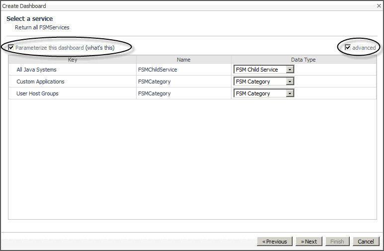
Optional—select the Parameterize this dashboard check box if you want to create a dashboard that is designed to run with any service. |
|
4 |
Optional—when Parameterize this dashboard is selected, click the advanced checkbox to choose a data type for any of the services listed. This enables you to reduce the scope of the report to a particular data type. |
|
a |
On the Foglight navigation menu, click the Open Foglight classic web console icon . The classic web console will open in a new tab. |
|
3 |
On the action panel, click Create Dashboard. |
|
4 |
In the Create Dashboard wizard, Build a Dashboard page, click Create a Custom Dashboard based on the current dashboard. |
|
5 |
Click Next. |
|
6 |
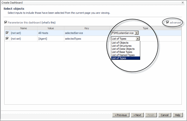
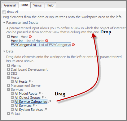
Optional—select the Parameterize this dashboard check box if you want to create a dashboard that is designed to run with any different instances of the specified parameters, which can be passed in from another view that is drilling into this one. |
|
7 |
Optional—when Parameterize this dashboard is selected, click the advanced checkbox to choose a data type for any of the services listed. This enables you to reduce the scope of the report to a particular data type. |
|
a |
On the Foglight navigation menu, click the Open Foglight classic web console icon . The classic web console will open in a new tab. |
|
3 |
|
4 |
If your custom dashboard does not use parameterized input values, click Convert the current dashboard into a report and then click Finish. |
|
5 |
If your custom dashboard uses parameterized input values, click Create a Report based on the current dashboard and click Next. |
|
• |
Direct Copy—copy all of the parameterized inputs and report-compatible views from the current dashboard to the new report. If you have selected this option, click Finish. The report is displayed in the display area. You can now run or schedule the report. See Running a Report or Scheduling a Report. |
|
• |
New report with selected inputs—create a blank report and use a selection of the custom dashboard’s parameterized input values. If you have selected this option, select which parameterized input values you want your report to use, and then click Finish. The Add View wizard appears. See Adding a View and Using Parameterized Input Values. |
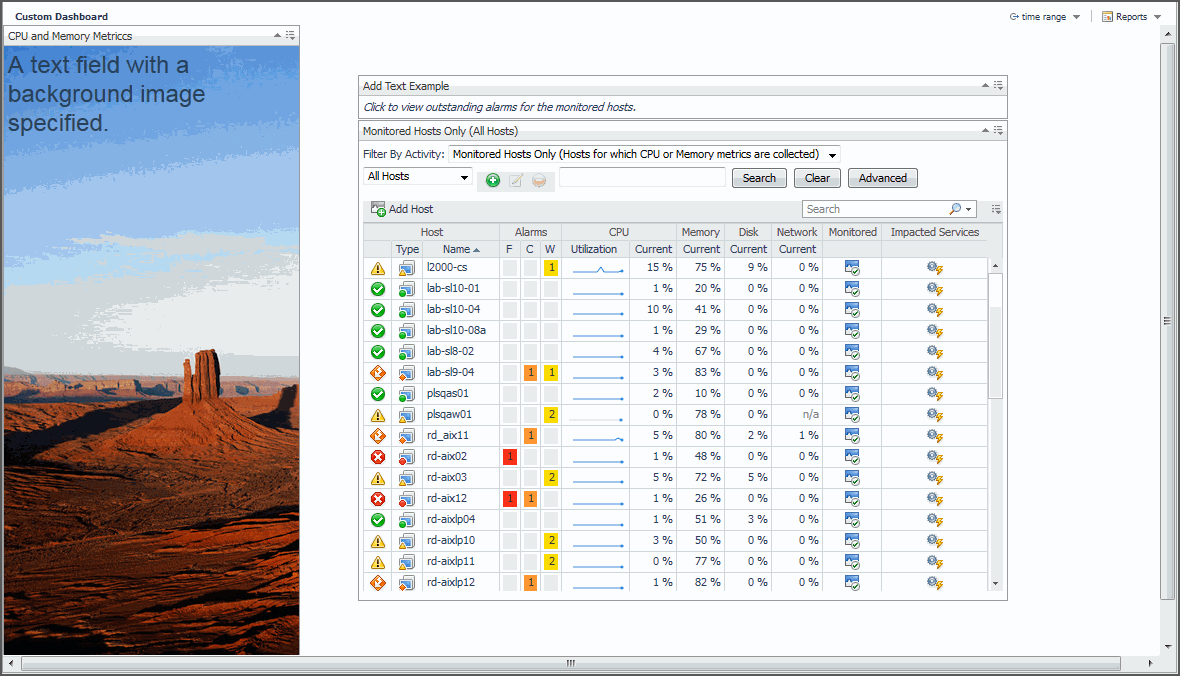
You can add data to your custom dashboard and change the way it is displayed.
For more information, see the following topics:
The Add View wizard is provided for the same function as creating a custom report.
|
1 |
If the dashboard is not already opened, select the dashboard from the My Dashboards node. |
|
a |
On the Foglight navigation menu, click the Open Foglight classic web console icon . The classic web console will open in a new tab. |
|
1 |
If the dashboard is not already opened, select the dashboard from the My Dashboards node on the navigation panel. |
|
a |
On the Foglight navigation menu, click the Open Foglight classic web console icon . The classic web console will open in a new tab. |
|
3 |
|
• |
Change the text Style (for example, Heading 1) |
|
• |
Type the Text to appear on the dashboard. |
|
• |
Add a Background Image. |
|
5 |
Click OK. |
|
c |
Click Done. |
|
7 |
Optional—configure the portlet view to complete an action. For example, specify the action to be a popup view, of the outstanding alarms associated with a view in your custom dashboard, when the user clicks on the text. |
|
a |
|
b |
 .
.|
TIP: Quickly add a map as your background image by selecting one of the map images that are included with Foglight from Dashboard Development > Support > Maps > Base Theme. |
|
a |
On the Foglight navigation menu, click the Open Foglight classic web console icon . The classic web console will open in a new tab. |
|
3 |
Select General > Actions > Properties > Edit basic properties from the action panel. |
|
4 |
|
5 |
Enter the URL for the image or navigate to the image in the tree provided or click Upload image to specify your own image to use a background. If you have specified your own image, a My Definitions directory for your user account is added to the tree. Each additional uploaded image is added to this directory. |
|
7 |
If you chose the Fixed Size layout option in the Setting a Dashboard Layout dialog box, use the Edit page layout dialog box to position your view exactly where you want it.
|
a |
On the Foglight navigation menu, click the Open Foglight classic web console icon . The classic web console will open in a new tab. |
|
2 |
Select General > Actions > Edit page layout from the action panel. |
|
• |
Size and Position—resize or change the co-ordinates of the view. |
|
• |
Grouping—multi-select and group views that you have dragged onto the dashboard. For example, drag and drop a metric view and a property view related to one of our hosts onto your dashboard, select both, and click Group (  ) to group them together. You can then work with them as one view. ) to group them together. You can then work with them as one view. |
 ) in the edit mode popup.
|
• |
Order—change the stacking order (bring the view to the front, back, forward, or backward). |
|
• |
Display options—select different options depending on whether you want to show the view title, show its border, or make it opaque. |
|
5 |
Click Done at the top of the dashboard. |
|
a |
|
b |
Select Edit properties. |
. The classic web console will open in a new tab.|
b |
Select General > Actions > Edit page layout from the action panel. |
|
d |
 icon.
icon.|
• |
Title—rename the view. |
|
• |
Height—set the height for all views or this view by selecting the check box and specifying a value. |
|
• |
Display type—select the visual display. For more information, see Display type tab. |
|
• |
Metrics—choose the metric labels for the chart. For more information, see Metrics tab. |
|
• |
Options—configure settings according to the display type. For more information, see Options tab. |
|
• |
Actions—set what happens when a user interacts with the view. For more information, see Actions tab. |
|
4 |
Click Apply when you are finished editing your view. |
The Display type tab contains options where you can select the visual layout according to a chart type, gauge type, or list type. For more information on the display types available and their settings, see Options tab.
Use the check boxes in the Metrics tab to select the metrics that you want to appear in your view.
The following tables lists the options available depending on the display type:
|
• |
|
• |
|
• |
|
|
| |||||||||||||||||||||
|
|
||||||||||||||||||||||
|
|
| |||||||||||||||||||||
|
|
||||||||||||||||||||||
|
|
||||||||||||||||||||||
|
|
|
|
|
||||||
|
|
|
|
1 |
In the Actions tab, select the check box for the action you want to set. |
|
2 |
Click the Select a metric check box to choose an action to describe how you want to show the next view. |
|
3 |
Click Edit . |
|
5 |
Click Next. The Select a data item to use page of the wizard appears. |
|
7 |
Click Next. The Choose a target view page of the wizard appears. |
|
• |
Optional—click the show by role check box to select a view for a particular role. |
You can make changes such as sharing a view, editing its properties, or maximizing it by clicking the Options icon (
|
2 |
 icon.
icon.|
3 |
Click OK to confirm that you want to remove the view. |
|
1 |
On the navigation panel, under Dashboards > My Dashboards, open your custom dashboard. |
|
a |
On the Foglight navigation menu, click the Open Foglight classic web console icon . The classic web console will open in a new tab. |
|
3 |
On the Action panel, open the Data tab. |
|
4 |
|
6 |
|
7 |
|
8 |
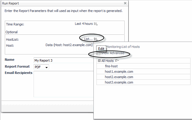
Under Page Inputs, click the arrow to expand the parameterized input value. |
|
9 |
Remove the check mark from the Show Advanced option. |
|
10 |
|
TIP: Visit http://eDocs.quest.com to watch our learning videos. See Customizing Foglight Reports with Parameterized Inputs. |
|
1 |
On the navigation panel, under Dashboards > My Dashboards, open your custom report. |
|
a |
On the top of your report, click Run Report. |
|
b |
Click the edit icon  and then remove the check mark for Show Advanced. and then remove the check mark for Show Advanced. |
|
e |
Click Run. |
|
a |
On the top of your report, click Schedule Report. |
|
b |
Click the edit icon and then remove the check mark for Show Advanced. |
|
d |
Click Next. |
|
f |
Click Next. |
|
h |
Click Finish. |
|
1 |
 delete icon to remove the parameterized input value.
|
1 |
|
a |
On the Foglight navigation menu, click the Open Foglight classic web console icon . The classic web console will open in a new tab. |
|
3 |
Click Delete this page in the action panel. |
|
4 |
Click Delete to confirm the deletion. |
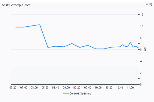
You can create a metric chart using:
|
• |
The Data tab in the action panel to drag a metric onto a portal. |
You can also add one or more metrics to an existing chart.
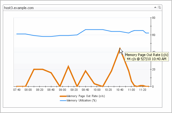
The y-axis shows the units for the metric. If there is more than one metric in the chart, the y-axis shows the units for the first metric that was charted, unless you have cleared the Only show axis of selected metric (different charts will line up) check box in the Options tab of the Add Metric View wizard (see Options tab for details).
By using the Customizer function you have the option to export metric data for charts to PDF, CSV, Excel, XML, or Image format. See Exporting Data from Charts and Tables.
For more information about working with charts, see the following topics:

|
2 |
|
3 |
Select the Individual Charts tab to display each metric individually, or click the Single Chart tab to view all selected metrics in a single chart. |
|
4 |
To view the data in different ways, experiment with metrics available in that same object (metric parent). Select metrics from the Metrics Selector in the navigation panel. |

You can choose to display only the y-axis of the selected metric. This is useful when the metrics you are charting have different units or a wide range of values. See Editing a View for information about changing this option.
|
3 |
In the Bounds section, set the chart Y axis range. The following options are available: |
To export the chart to CSV, PDF, Excel, or XML format, see Exporting Data from Charts and Tables.
 in the top-right corner.
Online-Only Topics
|
2 |
Select one of the Keep for options to indicate whether you want to keep the bookmark indefinitely or for a specified number of days. If you choose the latter, type the number of days in the box provided. |
|
3 |
Select Send an email with a link to this bookmark if you want to email someone a link to the new bookmark. |
|
4 |
Select Preserve state if you want to preserve the context input of the dashboard. For example, you bookmark a dashboard, and HostX is selected in a menu of that dashboard. When you view the bookmarked dashboard later, HostX is still selected. |
|
5 |
If you select Preserve state, the Preserve time range check box is available. Select this check box if you want to keep the bookmarked dashboard’s current start and end times. Otherwise, if the time range is relative (for example, Last 24 Hours), the bookmarked dashboard displays metrics for the default time period whenever you access it. |
|
6 |
Optional — Type a description for the bookmark. |
|
7 |
Click OK. |
|
8 |
If you selected the email option in Step 3 above, an email window opens, containing a link to the new bookmark. Provide the required information and click Send. |