The report properties dialog provides a way to control the reports page setup, report printer settings, font styles and report global settings.
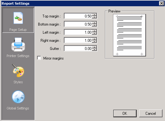
Sets the top margin value in inches.
Sets the bottom margin value in inches.
Sets the left margin value in inches.
Sets the right margin value in inches.
Sets the amount of space between columns in inches. Specifying a gutter gives extra space between the edge of the page and the margins. This allows reports to be bound.
Check this box to set the inner margins in the report in a way that opposite pages have the same width and the outside margins for opposite pages have the same width.
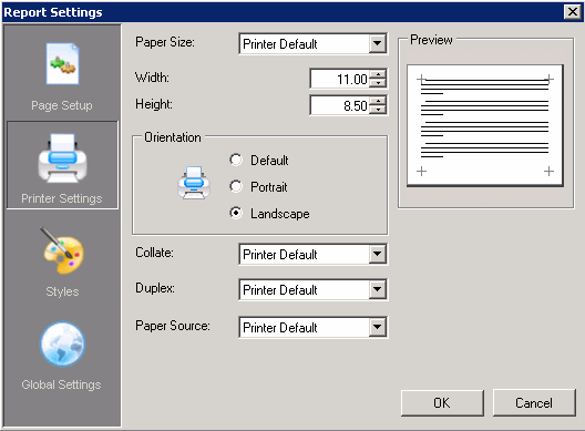
Select a paper size from the list. Several paper sizes are available. If the necessary paper size is not available in the list, choose Custom paper. When this is selected, enter in a paper height and width (in inches) in the respectable fields below the paper size selection box.
Enter a custom size paper width in inches.
Enter a custom size paper height in inches.
Select the Orientation in which to print the report. Select from Default, Portrait or Landscape. Default will use the printers default setting.
Select the Collation mode for the report. Choose from Printer Default, Collate or Don't Collate. Collate will print a complete copy of the report before the first page of the next copy is printed. Don't Collate will print each page by the number of copies specified before printing the next page. Printer Default will use the printer's collate setting.
Select the Duplex mode for the report. Duplexing allows the report to be printed double-sided. Select Duplex to print the report double-sided. Select Simplex to turn off duplex printing. Select Horizontal to print horizontally on both sides of the paper. Select Vertical to print vertically on both sides of the paper. Select Printer Default to print the report use the printer's duplex setting.
Select the paper source for the report. Printer Default will print the report using the printers default paper source.
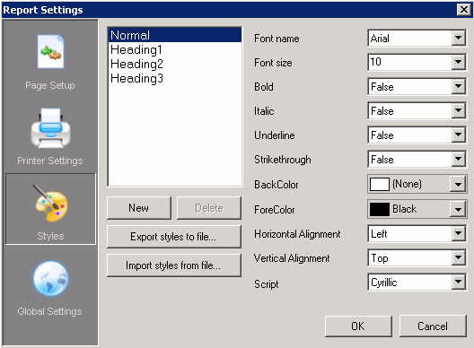
The styles dialog is used to create style sheet settings that can be used within the report design. Once styles are created, they can be used to easily and consistently modify the appearance of text associated controls within the report. A style is applied to a control via the Style property for the control.
The Style list displays all styles that have already been created. To the right of the list, the properties associated with the style are displayed.
Click New to create a new style. Select a style and click Delete to remove a style.
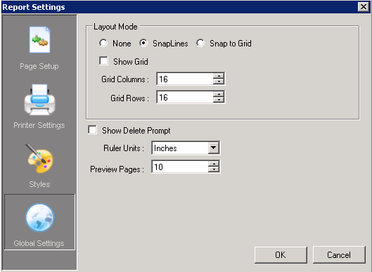
Select this box to display the grid in the design surface of the report. Clear this box to hide the grid in the design surface of the report.
Select this box for controls to automatically snap to the grid as they are added to or moved within the report design area; otherwise clear this box.
Set the number of grid columns.
Set the number of grid rows.
Select the units of measurement for the ruler. Select from Inches or Centimeters.
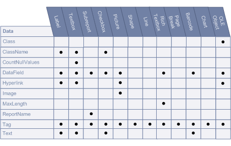
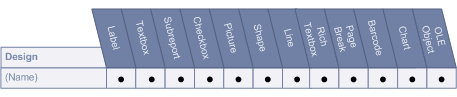
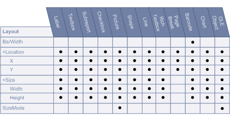
The Properties Toolbox is used to change the properties of all report elements, including report sections (bands) and controls. The following list defines the supported properties of each band/control.
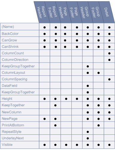
Text to be used as the name of the report section.
Sets the color to be used as the background color of the report section. Use the drop list to select a color or enter in a color's Hex value.
Indicates whether the height of the section can grow if the controls within the section extend beyond the section's original height. Select True to allow the section height to grow. Select False to force the section height to remain the same regardless of the controls within it.
Indicates whether the height of the section should be adjusted to the exact total height of the controls within the section. Select True to allow the section height to adjust. Select False to force the section height to remain the same regardless of the controls within it.
Sets the number of newspaper style columns for the detail section of the report.
Specifies the direction of the columns. Select DownAcross for the columns to print Top to Bottom, Left to Right. Select AcrossDown for the columns to print Left to Right, Top to Bottom.
Use this property is to prevent a group from splitting across columns. If the group will not fit in the current column, an attempt will be made by the report engine to render the full group in the next column. If the group is too large to fit in a single column, this property will be ignored.
This property will only be implemented when the GroupHeader's GroupKeepTogether property is set to All.
Set to True if the report section will have the same number of columns as its detail section. Set to False if the section will have a single column.
Sets the size of the space between the specified number of columns.
Specifies the data field to be used for grouping. Changes in the value of the specified data field are monitored and a new group is started when the value changes. Current groups are ended (i.e. the group footer section is printed) before the new group is started.
Specifies whether a group header and footer pair with associated details will print as a single block on the same page.
None: A page can be broken immediately after a group header prints.
FirstDetail: The group header will print with at least the first detail section on the same page or column.
All: The group header, detail and group footer sections will print together on the same page.
Sets the height of the selected report section.
When this property is set to True, the report engine will attempt to print the section on the current page. If the contents do not fit on the current page and the current page is not a new page, the section will be moved to the next page. If the section does not fit on the following page, it will be moved back to the original position and the contents will be split across multiple pages.
When this property is set to False, the report engine will make no attempt to adjust the destination of the section currently being printed.
This property is used to determine whether a new column (in a columnar report) should be started before and/or after printing the section.
After: The report will break to a new column after each instance of the section.
Before: The report will break to a new column before each instance of the section.
BeforeAfter: The report will break to a new column before and after each instance of the section.
None: Sections will continue printing in the same column until they've run out of space.
This property is used to determine whether a new page will be started before or after a section prints.
After: The report will break to a new page after each instance of the section.
Before: The report will break to a new page before each instance of the section.
BeforeAfter: The report will break to a new page before and after each instance of the section.
None: Sections will continue printing on the same page until they've run out of space.
Set to True if the footer section will be printed at the bottom of the page; otherwise set this property to False.
Setting more than one group footer section in a report layout to print at the bottom of the page will cause subsequent group footer sections to print on separate pages.
Specifies whether the group header section will be repeated on subsequent detail pages within the same group.
None: The group header will not be repeated when the associated detail sections print on a new page.
OnPage: Repeat the group header section with every new page.
OnColumn: Repeat the group header section with every new column.
All: Repeat the group header section on every page or column.
OnPageIncludeNoDetail: Repeat the group header section on every page that includes an associated detail section or a group footer section. This setting prevents orphaned group footer sections.
Set this property to True for the following section to start rendering at the top of the current section; otherwise set to False.
Set this property to True to print the report section. Set this property to False to hide (not print) the report section.
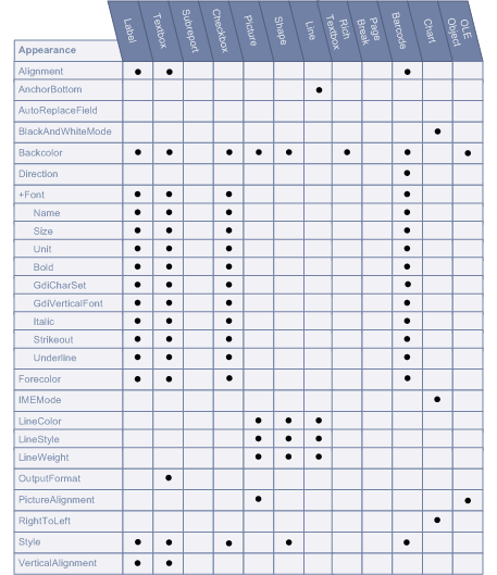
Sets the alignment of the text within the control. Select from Left, Right, Center and Justify.
Anchors the line control to the bottom of the containing section. When set to True, this property will create a continuous line from line controls in adjacent sections.
Specify whether the chart will be drawn in black and white using hatch patterns and line dashing to designate colors. Set to True to print the chart in Black and White. Set to False to print the chart in Color.
Sets the color to be used as the background color of the control. Use the drop list to select a color or enter in a color's Hex value.
Sets the barcode's direction, horizontally or vertically.
 Font
Font Sets the font information used to draw the control.
Name
Sets the Name of the font to be used in the control.
Size
Sets the size of the font used to render the control.
Unit
Sets the unit of the font (i.e. point, inch, etc.).
Bold
Sets the appearance of the defined font to bold.
GdiCharSet
Specify a byte value that sets the GDI character set that this Font set uses.
GdiVerticalFont
Specify whether the Font set is derived from a GDI vertical font. Set to True if it is derived from a GDI vertical font, otherwise False.
Italic
Sets the appearance of the defined font to italics.
Strikeout
Sets the appearance of the defined font to strikeout.
Underline
Sets the appearance of the defined font to underline.
Sets the foreground (font) color of the control.
Sets the Input Method Editor (IME) mode of the control. IME allows users to enter characters from other languages such as Chinese, Japanese, Korean, etc.
Sets the color of a line control.
Sets the style of a line control.
Sets the weight (thickness) of a line control.
Sets the display format of the data field. Formatting can only be used to format date, time, currency, and other numeric values. There is no support for formatting alphanumeric strings.
Times:
hh:mm tt = 09:00 AM
HH:mm = 21:00 (twenty-four hour clock)
HH = hours in 24 hour clock
hh = hours in 12 hour clock
mm = minutes
ss = seconds
tt = AM or PM
Dates:
dddd, MMMM d, yyyy = Saturday, December 25, 2004
dd/MM/yyyy = 25/12/2004
d or dd = day in number format
ddd = day in short string format (i.e. Sat for Saturday)
dddd = day in string format (i.e. Saturday)
MM = month in number format
MMM = month in short string format (i.e. Dec for December)
MMMM = month in string format (i.e. December)
y or yy = year in two digit format (i.e. 04 for 2004)
yyyy or yyyy = year in four digit format (i.e. 2004)
Currency and numbers:
$00.00 = $25.50
$#,#00.00 = $06.25
0 = digit or zero
# = digit or nothing
% = percent-multiplies the string expression by 100
Determines the position of the picture within the control (TopLeft, TopRight, Center, BottomLeft, BottomRight).
Used to allow the control to support text that should be printed right to left. Set to True to support right to left printing; otherwise set to False.
Defines the string style to use for the control.
Sets the vertical alignment of text within the control. Select from Top, Middle, or Bottom.
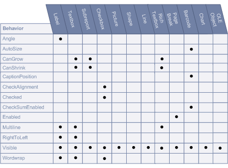
Sets the angle of the text within the control area.
Set to True to automatically have the barcode stretch to fit the control. Set to False to leave the barcode size static.
Indicates whether the height of the control can grow, if needed, based on the content within the control. Select True to allow the control's height to grow. Select False to force the control's height to remain the same regardless of the content within it.
Indicates whether the height of the control should be adjusted based on the content within the control. Select True to allow the control's height to adjust. Select False to force the control's height to remain the same regardless of its content.
Specifies the position of the barcode caption relative to the barcode symbol.
None: Caption is not printed.
Above: Caption is printed above the barcode symbol.
Below: Caption is printed below the barcode symbol.
Sets the alignment of the checkbox text within the control drawing area.
Set to True if the check box is in the checked state; otherwise, False. The default value is False.
Determines whether the checksum of a barcode will be computed and included in the barcode when applicable. This property has no effect if the barcode style is EAN-13 which requires a check digit. Set to True to enable the checksum. Set to False to disable the checksum.
Determines whether the PageBreak is currently enabled.
Sets the ability of a RichTextBox control to print a single or multiple lines.
Used to allow the control to support text that should be printed right to left. Set to True to support right to left printing; otherwise set to False.
Set this property to True to print the control. Set this property to False to hide (not print) the control.
Indicates whether a multi-line control automatically wraps words to the beginning of the next line when necessary. Select True to force automatic wordwrap; otherwise select False.
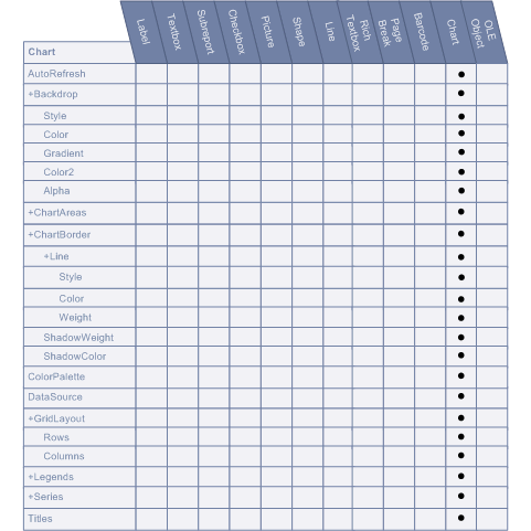
Sets a value to indicate whether the chart will be automatically refreshed for every property change.
Backdrop Sets the background style for a chart control.
Style
Specify the type of backdrop to use. Select from Transparent, Solid, Gradient, Pattern and Picture.
Color
Specify the primary color to use to fill the backdrop.
Gradient
Specify the GradientType used for the Backdrop. Select from Horizontal, Vertical, DiagonalUp, DiagonalDown, FromCenter, and FromCorner.
Color2
Specify the secondary color to use for gradient effects and patterns.
Alpha
Specify the alpha level (transparency).
A collection of values that define the properties of a chart. Click the ellipsis to set the specific chart properties.
ChartBorder Sets the border to be used to draw around the chart.
Specify the line style used to draw the border of the graph.
Style
Specify the style to use to draw the line. Select from None, Solid, Dash, Dot, DashDot, DashDotDot.
Color
Specify the color of the line.
Weight
Specify the line thickness in points.
ShadowWeight
Specify the width of the shadow outlining the border.
ShadowColor
Specify the color of the shadow outlining the border.
Sets the color palette used for the chart.
Sets the data source for the chart control.
GridLayout Rows
Sets the number of rows for the grid.
Columns
Sets the number of columns for the grid.
Defines the properties for chart legends.
Defines the number of series the chart will use. The properties for each series is also set within this collection.
Defines the number of titles the chart will use. The properties for each title is also set within this collection.
Specify the class name of the Ole object.
Sets a style rule class name used to format the control.
Determines whether Null values should be included as zeroes in summary fields.
Specifies the data field to be used for grouping. Changes in the value of the specified data field are monitored and a new group is started when the value changes. Current groups are ended (i.e. the group footer section is printed) before the new group is started.
Defines a URL address that will be launched in Internet Explorer when clicked.
Defines the image to be used in the Picture control.
Defines the maximum number of characters that can be entered in the RichTextBox control. A value of 0 allows an unlimited size.
This property is used to defined the name of the subreport being called by the subreport control. This property is used for informational purposes only.
Sets user-defined information to be persisted with the control.
Defines the text to be displayed in the control.
Enter a string of text that will be used as the control's name.
This property sets the width for the barcode's narrow bars. Setting the width to 0 expands the barcode to fit the control. The width ratio is 1 to 0.012 inches. So setting the BarWidth to 2 will have a value of 0.024 inches, while a value of 10 yields a bar width of 0.12 inches for the narrowest bars.
Location Sets the X-Y position of the control.
X
Sets the X position of the control.
Y
Sets the X position of the control.
Size Defines the size of the control
Width
Sets the Width of the control in inches.
Height
Sets the Height of the control in inches.
Determines how the image is sized to fit the Picture control area.
Clip: The image is clipped to fit within the control area.
Stretch: The image is stretched to fit the control area.
Zoom: The image is scaled until it fits horizontally and vertically within the control area.
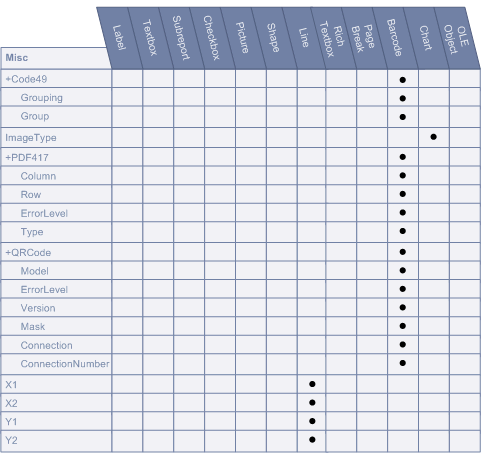
Code49 Grouping
If Grouping is set to True, the Group property may be set to a number between 0 and 8. The default values are False and 0, respectively.
Group
If Grouping is set to True, the Group property may be set to a number between 0 and 8. The default values are False and 0, respectively.
Sets the type of image to which the chart will be rendered on the report (Metafile, PNG).
For future use only.
PDF417 Pdf417 is a popular high-density 2-dimensional symbology that encodes up to 1108 bytes of information. This barcode consists of a stacked set of smaller barcodes. Encodes the full ASCII character set. Capable of encoding as many as 2725 data characters.
Column
Sets column numbers for the barcode.
Row
Sets row numbers for the barcode.
ErrorLevel
Sets the error correction level for the barcode.
Type
Sets the PDF417 barcode's type.
QRCode QRCode is a 2D symbology that is capable of handling numeric, alphanumeric and byte data as well as Japanese kanji and kana characters. This symbology can encode up to 7,366 characters.
Model
Sets the QRCode's model
ErrorLevel
Sets the error correction level for the barcode
Version
Sets the QRCode's version.
Mask
Sets the pattern used for the barcode's masking.
Connection
Sets whether connection is used for the barcode.
ConnectionNumber
Sets the connection number for the barcode.
Sets the horizontal coordinate of the line's starting point.
Sets the horizontal coordinate of the line's ending point.
Sets the vertical coordinate of the line's ending point.
Sets the vertical coordinate of the line's ending point.
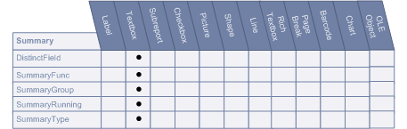
Sets the name of the data field used in a distinct summary function.
Defines the type of summary calculation to be performed on the data contained within the control. Choose from Sum, Avg, Count, Min, Max, Var, StdDev, StdDevP, DSum (based on distinct values), DAvg (based on distinct values), DCount (based on distinct values), DVar (based on distinct values), DVarP (based on distinct values), DStdDev (based on distinct values), DStdDevP (based on distinct values). All summary calculations are based on the values in the specified summary region.
Defines the name of the group header section that is used to reset the summary value when calculating subtotals.
Determines whether the data field summary value will be accumulated or reset for each level (detail, group or page).
None: Summary values are not accumulated.
Group: Calculates a running summary (each value is the sum of the current value and all preceding values) within the same group level.
All: Calculates a running summary for all values in the report.
Determines the summary type to be performed.
None: No summarization.
GrandTotal: Evaluate the specified summary function for all records in the report.
PageTotal: Evaluate the specified summary function for all records on each page.
SubTotal: Evaluate the specified summary function for all records in each group level.
PageCount: Print the page count or page number. Used with SummaryRunning set to All to print the page number.
|
KACE® Desktop Authority 11.2.1 |
|
Reporting Guide |
Desktop Authority includes several pre-defined reports for use within the Reporting tool. Pre-defined reports may be used as is or modified to suit ones particular needs.
The pre-defined report set includes the following report categories:
All pre-defined reports have a parameter dialog that displays prior to the actual report. This parameter dialog is used to filter data on the reports. The filters offered for each report are used in the SQL statement that fetches the data for the report. The parameter dialogs differ based on the selected report.
In the parameter dialogs, all character based values can use the % wildcard value. A % symbol can be added to the beginning and/or end of a phrase.
%RD will return all values that end with RD
RD% will return all values that start with RD
%RD% will return all values that contain the characters RD
Example Parameter Dialog:
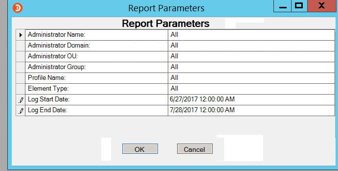
This example demonstrates the use of a wildcard value in the Computer Name parameter. In this case, using PC% in the computer name field, will return all data corresponding to computers that begin with the letters 'PC'.
