Basic Customization
Basic Customization
Customizing Styles using LESS variables
Customizing Styles using LESS variables
LESS variables are used to change the properties of various elements within Evolve easily and simultaneously. By changing the value of a single LESS variable, you can alter the appearance of multiple HTML elements within the Evolve webpage. This enables simple customization through only a small subset of variables.
The following sections detail what to be aware of when using LESS variables, particularly when upgrading between product versions. The Appendix also covers an overview of the key variables and what they impact.
Upgrading Custom Themes with LESS variables
Since Evolve 2016.2.1 the Themes (LESS variables) are automatically upgraded when performing an 'Update Meta Model & Themes' within Evolve Designer. However, if you find that the variables have not updated correctly, the following instructions will help you to diagnose the issues.
Should a theme still be incompatible with the installed version of Evolve, the following error can appear in Evolve Designer when you Deploy Dynamic/Static site:
To upgrade the theme to be compatible with the installed version, follow these steps.
1. Ensure you know which default theme your custom theme was based on
e.g. Evolve7, Grey, Blue
2. Locate a copy of this theme in the new version of Evolve
nb: This can be found in <Evolve-Install-Location>\Casewise\Evolve\Site\bin\webDesigner\themes\
3. Using a comparison tool (e.g. WinMerge) compare your custom theme with the theme located in step 2
oThis will highlight the new variables which have been added since your custom theme was created.
oEach new variable will contain a comment (e.g. //v4.0.2) showing in which version it was added.
4. Copy over the new variables so that the custom theme contains the same number of variables as the default theme.
5. Restart Evolve Designer and Deploy Dynamic/Static Site
Theme File Labelling Convention
Evolve’s LESS variables are named using camelCase whereby the first letter of each word is capitalized – except for the first letter of the whole string. Evolve version numbers are commented out next to any variables that relate to specific Evolve versions. I.e: //v4.0
Appendix - LESS: Global Variables
Click the groups below to see the LESS variables that are available and the elements that they will affect. Note that for the sake of brevity, not all available variables are listed below - only the main variables that alter colors and fonts have been included.
Primary Colors
|
LESS Variable |
Evolve Page Element(s) |
Example |
|
@cwColor1Shade |
The primary color used for borders and shading. |
- |
|
@cwColor1 |
The primary color used for various backgrounds |
- |
|
@cwColor1Tint |
The primary color used as a highlight |
- |
|
@cwColor2Shade |
The secondary color used for borders and shading. |
- |
|
@cwColor2 |
The secondary color used for various backgrounds |
- |
|
@cwColor2Tint |
The secondary color used as a highlight |
- |
|
@cwShadowColor |
The color used to add a shadow to elements |
- |
Global Variables
|
LESS Variable |
Evolve Page Element(s) |
Example |
|
@cwFont |
The font family used by a majority of text elements in Evolve |
p, span, li, a |
|
@cwFontTitle |
The font family used by various titles in Evolve |
h1, h2, h3, h4, h5, h6 |
|
@cwFontTextColor |
The color used by a majority of text elements in Evolve |
|
|
@cwGlobalLinkTextColor |
The color of text links in Evolve | |
|
@cwPageTitleColor |
The color of various titles in Evolve |
|
|
@cwPageTitleBackGroundColor |
The background color of the page title at the top of the screen. | |
|
@cwBodyBackgroundColor |
The background color of the main content area |
|
|
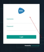
@cwLoginBackgroundColor |
The background color of the login dialogue that appears on the login page |
|
|
@cwLoginTextColor |
The color of the text on the login dialogue that appears on the login page | |
|
@cwLoginSubmitButtonTextColor |
|
|
|
@cwLoginSubmitButtonBackgroundColor |
|
Diagrams
|
LESS Variable |
Evolve Page Element(s) |
Example |
|
@cwDiagramBreadCrumbBackgroundColor |
The color of the area surrounding the breadcrumbs |
|
|
@cwDiagramBreadCrumbBoxBackgroundColor |
The background color of the breadcrumbs themselves | |
|
@cwDiagramBreadCrumbBoxTextColor |
The color of the text that appears on the breadcrumbs | |
|
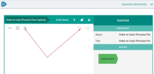
@cwDiagramEditorIconColor |
The color of the editor icons within eModeler |
|
|
@cwDiagramEditorMenuBackgroundColor |
The background color of the eModeler menu |
|
|
@cwDiagramEditorMenuMainHeaderBackgroundColor |
The background color of the eModeler menu's main header | |
|
@cwDiagramEditorMenuSubHeaderBackgroundColor |
The background color of the eModeler menu's subheaders | |
|
@cwDiagramTileNameBackground |
The background color of a tile im eModeler |
|
|
@cwDiagramTileNameBackgroundHover |
The background color of a tile in eModeler when you hover over it | |
|
@cwDiagramTileNameTextColor |
The background color of a tile in eModeler |
Left-Hand-Side Menu
|
LESS Variable |
Evolve Page Element(s) |
Example |
|
@cwMenuLeftTabBackgroundColor |
This is the background color of the pop-out tab |
|
|
@cwMenuLeftTabTitleColor |
This is the color of the title that appears on the top of the pop-out tab | |
|
@cwMenuLeftTabSelectedViewBackgroundColor |
This is the background color of items that are selected in the pop-out tab | |
|
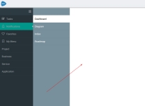
@cwMenuLeftMainNavigationBackgroundColor |
This is the background color of the main navigation menu |
|
|
@cwMenuLeftMainNavigationTextColor |
This is the color of the text in the main navigation menu | |
|
@cwMenuLeftMainNavigationBackgroundColorHover |
This is the background color of the menu item in the main navigation menu when the cursor is hovered over it | |
|
@cwMenuLeftMainNavigationTextColorHover |
This is the color of the text in the main navigation menu when the cursor is hovered over it | |
|
@cwMenuLeftMainNavigationTextColorActive |
This is the color of the text in the main navigation menu when the menu item or one of its sub-menus is active | |
|
@cwMenuLeftMainNavigationBackgroundColorActive |
This is the background colour of the menu item in the main navigation menu when the menu item or one of its sub-menus is active | |
|
@cwMenuLeftSubNavigationBackgroundColor |
This is the background color of the navigation sub-menu |
|
|
@cwMenuLeftSubNavigationTextColor |
This is the color of the text in the navigation sub-menu | |
|
@cwMenuLeftSubNavigationBackgroundColorHover |
This is the background color of the menu item in the navigation sub-menu when the cursor is hovered over it. | |
|
@cwMenuLeftSubNavigationTextColorHover |
This is the color of the text in the navigation sub-menu when the cursor is hovered over it. |
Drop-down Notifications
|
LESS Variable |
Evolve Page Element(s) |
Example |
|
@cwNotificationMessageBackgroundColor |
The background colour for notifications |
|
|
@cwNotificationMessageTextColor |
The text colour for notifications | |
|
@cwNotificationErrorBackgroundColor |
The background colour for Error notifications |
|
|
@cwNotificationErrorTextColor |
The text colour for Error notifications |
List Boxes
|
LESS Variable |
Evolve Page Element(s) |
Example |
|
@cwListBoxPropertyHeaderBackgroundColor |
The background color of the list box header |
|
|
@cwListBoxPropertyHeaderTextColor |
The color of the list box header text | |
|
@cwListBoxPropertyValueBorderColor |
The color of the border surrounding the list box's content |
Properties Group
|
LESS Variable |
Evolve Page Element(s) |
Example |
|
|
@cwPropertiesTableHeaderBackgroundColor |
The background color of the header on the Properties table |
||
|
@cwPropertiesTableHeaderTextColor |
The color of the text on the header on the Properties table | ||
|
@cwPropertiesContainerBorderColor |
The color of the Properties table's border | ||
|
@cwEditPropertiesValueHoverBackgroundColor |
The color of a data row in the properties table when the cursor is hovered over it | ||
|
@cwEditPropertiesValueHoverTextColor |
The color of text in a data row in the properties table when the cursor is hovered over it |
|
Buttons
|
LESS Variable |
Evolve Page Element(s) |
Example |
|
@cwButtonSubmitBackgroundColor |
The background color of the submit button. |
|
|
@cwButtonSubmitTextColor |
The color of the text on the submit button. | |
|
@cwButtonSubmitBorderColor |
The color of the submit button's border | |
|
@cwButtonTextColor |
This isn't often used as the text on the buttons is hidden |
|
|
@cwButtonBackgroundColor |
The colour of the background for icons that appear in the top-right of the Evolve page | |
|
@cwButtonIconColor |
The colour of icons that appear in the top-right of the Evolve page | |
|
@cwButtonBorderColor |
The colour of the border for icons that appear in the top-right of the Evolve page |
Accordions
|
LESS Variable |
Evolve Page Element(s) |
Example |
|
@cwAccordionHeaderBackgroundColor |
The background colour of accordion menu headers |
|
|
@cwAccordionHeaderTextColor |
The colour of the text on accordion menu headers | |
|
@cwAccordionHeaderHoverBackgroundColor |
The background colour of accordion menu headers when a cursor hovers over it | |
|
@cwAccordionHeaderHoverTextColor |
The colour of the text on accordion menu headers when a cursor hovers over it |
Discussions
|
LESS Variable |
Evolve Page Element(s) |
Example |
|
@cwDiscussionsBackgroundColor |
The background color of the Discussions panel header |
|
|
@cwDiscussionsTextColor |
The text color of the Discussions panel header |
World Map
|
LESS Variable |
Evolve Page Element(s) |
Example |
|
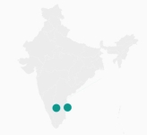
@cwJVectorMapCircleBackgroundColor |
The background color of circles that appear on vector maps |
|
|
@cwJVectorMapCircleBorderColor |
The border color of circles that appear on vector maps | |
|
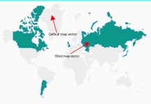
@cwJVectorMapPathDefaultBackgroundColor |
The default background color of a map vector |
|
|
@cwJVectorMapPathDefaultBorderColor |
The default border color of a map vector | |
|
@cwJVectorMapPathFilledBackgroundColor |
The default background color of a filled map vector | |
|
@cwJVectorMapPathFilledBorderColor |
The default border color of a filled map vector | |
|
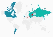
@cwJVectorMapLabelTextColor |
The color of the text on the map labels |
|
|
@cwJVectorMapLabelBackgroundColor |
The background color of the map labels | |
|
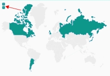
@cwJVectorMapIconLinesColor |
The color of the + and - signs in the zoom icons |
|
|
@cwJVectorMapIconBackgroundColor |
The background color of the zoom icons |
User Zone
|
LESS Variable |
Evolve Page Element(s) |
Example |
|
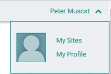
@cwProfileTextColor |
The color of the text in the user-area |
Pop-ups
|
LESS Variable |
Evolve Page Element(s) |
Example |
|
@cwPopupBackgroundColor |
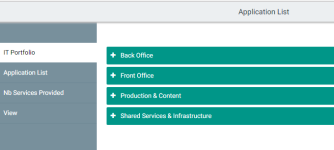
The background color of the left-hand-side pop-out menu |
|
|
@cwPopupTitleBackgroundColor |
The background color of the title on the left-hand-side pop-out menu | |
|
@cwPopupTitleTextColor |
The color of the title text on the left-hand-side pop-out menu |
Badges
|
LESS Variable |
Evolve Page Element(s) |
Example |
|
@cwBadgeBackgroundColor |
The background color of Badges |
|
|
@cwBadgeTextColor |
The color of the text that appears on Badges |
Tasks & Notifications
|
LESS Variable |
Evolve Page Element(s) |
Example |
|
@cwWorkflowTaskListTaskActionsColor |
The background color of the action panel associated with pending tasks |
|
|
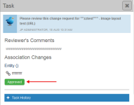
@cwWorkflowTaskApprovalApproved |
The color of the task's approved tag |
|
|
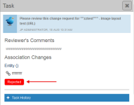
@cwWorkflowTaskApprovalRejected |
The color of the task's rejected tag |
|
|
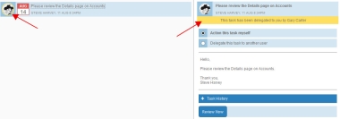
@cwWorkflowDelegatedTaskColor |
The color that highlights a task to signify that it has been delegated to you |
|
|
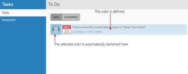
@cwWorflowTaskBackgroundColor |
The background color of a task |
|
|
@cwWorflowTaskTextColor |
The text color of a task | |
|
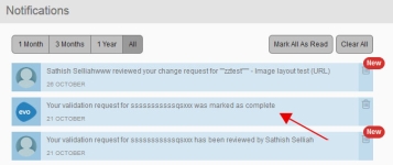
@cwWorflowNotificationBackgroundColor |
The background color of workflow notifications |
|
|
@cwWorflowNotificationTextColor |
The text color of workflow notifications | |
|
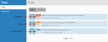
@cwWorflowDueDateCalendarBackgroundColor |
The background colour for calendars that appear next to tasks |
|
|
@cwWorflowDueDateCalendarOverdueMonthTextColor |
The colour of the month that appears on the calendar for tasks that are overdue | |
|
@cwWorflowDueDateCalendarDueBackgroundColor |
The background colour on the calendar for tasks that are due | |
|
@cwWorflowDueDateCalendarOverdueBackgroundColor |
The background colour on the calendar for tasks that are overdue |
Global Search
|
LESS Variable |
Evolve Page Element(s) |
Example |
|
@cwGlobalSearchFocusColor |
The color of the text in the global search input field when the cursor is focused on it |
|
|
@cwGlobalSearchTextColor |
The color of the text in the global search input field |
|
|
@cwGlobalSearchBackgroundColor |
The background color of the global search input field |
|
|
@cwGlobalSearchResultsTextColor |
The color of the search results text |
|
|
@cwGlobalSearchResultsBackgroundColor |
The background color of the search results | |
|
@cwGlobalSearchResultShadowColor |
The color of the shadow on the search results box |
Top Bar
|
LESS Variable |
Evolve Page Element(s) |
Example |
|
@cwTopBarHeight |
The height of the top bar |
|
|
@cwTopBarBackgroundColor |
The background color of the top bar | |
|
@cwTopBarProfileLinkColor |
The color of the profile links within the top bar | |
|
@cwTopBarProfileLinkHoverColor |
The color of the profile links within the top bar when you hover over it |
Home Page
|
LESS Variable |
Evolve Page Element(s) |
Example |
|
@cwHomePageFavoriteIconBackgroundColor |
The color of the favorite icons on the home page. Note that a 'lighten' filter is applied to each row of icons so it is recommended to choose a slightly darker color to begin with. |
|
|
@cwHomePageFavoriteTextColor |
The color of the text that appears on the favorite icons. | |
|
@cwHomePageRoleIconBackgroundColorHover |
The color of the icon that appears on the favorite icons. |
Side Menu
|
LESS Variable |
Evolve Page Element(s) |
Example |
|
@cwMenuLeftSubNavigationBackgroundColorHover |
The background color a sub-menu menu item when the cursor is hovered over it |
|
|
@cwMenuLeftTabSelectedViewTextColor |
The text color of a selected menu item |
|
|
@cwMenuLeftTabSelectedViewTabSelectedTextColor |
The text color of a selected tabmenu item |
|
|
@cwMenuLeftTabSelectedViewTabSelectedBackgroundColor |
The background color of a selected tab menu item |
|
|
@cwMenuLeftTabSelectedViewTabTextColorHover |
The text color of a selected tab menu item when the cursor is hovered over it |
|
|
@cwMenuLeftTabSelectedViewTabBackgroundColorHover |
The background color of a selected menu item when the cursor is hovered over it |
|
|
@cwMenuLeftBorderColor |
The color of the border that separates menu items on the left hand menu |
|
|
@cwMenuLeftTabBorderColor |
The background color of the left-hand menu pop-out tab |
|
|
@cwMenuLeftToggleZoneBackgroundColor |
The background color of the 'hamburger' menu-toggle icon |
|
|
@cwSocialRatingStarBackgroundAndBorder |
The background & border color of the Social Ratings section |
Grids
|
LESS Variable |
Evolve Page Element(s) |
Example |
|
@cwGridButtonsColor |
The color of the grid buttons |
|
|
@cwGridPaginationBackgroundColor |
The background color of the pagination section of the grid |
|
|
@cwGridColumnHeaderText |
The color of the text in the grid header |
|
|
@cwGridColumnHeaderBackground |
The color of the grid header's background |
Miscellaneous
|
LESS Variable |
Evolve Page Element(s) |
Example |
|
@cwSiteSelectionTextColor |
The color of the text that displays the site name |
|
|
@cwButtonSelectedBackgroundColor |
|
|
|
@cwButtonBoxShadowColor |
The color of the shadow on the rounded buttons |
|
|
@cwAccordionHeaderTextColor |
The color of the title text on accordion menus |
|
|
@cwDiscussionsBackgroundColorHover |
The background color of the discussions icon when you hover the cursor over it |
Use Custom Site Logos
To make your Evolve Sites match your own corporate branding, you can change the default Evolve logos.
You can change the logos at a global level, so affecting the top-level Evolve Site which you see if you have Dynamic Sites, as well as the logos used on individual Sites you publish.
In addition, you can override the global setting on an individual Site basis to create custom logos for one or many of your Sites.
On the top-level Evolve Site, the logo is displayed on the login dialog and then in the top-left of the Site. A second, smaller logo is displayed in the top-left for smaller screen sizes, such as mobile devices.
On your own Sites, the logo is only displayed in the top-left of each page, with a smaller version when the site is viewed on a mobile device.
Create new logos
To replace either the global logos or create custom logos for your own Sites, you have to create two new images. These images must have the following details:
|
| ||||||||||||
There are different processes for changing the global logos and adding custom logos to an individual Site.
What do you want to do?
Change the global Evolve Site logos
To replace the logo on the top-level Site:
1. On the Evolve server machine, in Windows Explorer, navigate to:
<your-evolve-install-path>\Site\bin\webDesigner\images\logos
2. Replace logo.png and logo-m.png with your new images.
|
|
Next time you Publish one of your Sites, the logos will be changed. You may need to delete your browser cache in order to see the change reflected. Alternatively, if you do not want to wait until you Publish one of your Sites, you can copy the logo.png and logo-m.png files to the following location which will cause them to be changed immediately: |
<your-evolve-install-path>\Data\Common\images\logos
Use a custom logo on an individual Site
To use a custom logo on an individual Site:
1. On the Evolve server machine, in Windows Explorer, navigate to:
<your-evolve-install-path>\Site\bin\webDesigner\custom
2. If you do not already use a custom folder for your Site, create one here and name it as you wish
If you already use custom content with your Site, open the folder you already use
3. In your custom folder, create an 'images' folder, then create a 'logos' folder within it
You should now have the following structure:
<your-custom-directory>\images\logos
4. Copy your custom logo.png and logo-m.png files to the 'logos' folder
5. Create a CSS file named 'main.css' and place it in
<your-custom-directory>\css
|
|
If you already have a main.css file, do not create a new one, instead add the code detailed in the next step. |
6. Copy the following code and paste it directly into main.css
|
/* Change the logo on evolve site */ .logo { background: transparent url('../images/logos/logo.png') center no-repeat; }
/* Change the logo on the login page */ #cw-authentication-zone .cw-authentication-top { background: transparent url('../images/logos/logo.png') center no-repeat; }
/* Change the logo for smartphone and tablet devices */ @media screen and (min-width: 240px) and (max-width: 1023px){ .logo { background: transparent url('../images/logos/logo-m.png') center no-repeat; } } |
7. Open your Site in Evolve Designer
8. On the Deployments > [server name] > [model] node, choose your new custom folder in the Deploy Custom Site drop-down
9. Save and Publish the site by using the Dynamic Site or Static Site button on the Home menu.
If instead you use the Save & Deploy Site function, you must click Theme & Pictures first.
Use Custom Site Images on the Multi-Sites Page
Use Custom Site Images on the Multi-Sites Page
If you publish Dynamic Sites, you can use the top-level Multi-Sites page which lists all the Model Sites you have access to.
By default, these Sites are shown with an Evolve logo, but you can change it to an image of your choice.
To use your own custom image for a Site on the Multi-Sites page:
1. Create a new PNG image file
Ideally the dimensions should be 200 x 130 pixels, however if the image is larger, it will be scaled down automatically in the page
2. Name the image file with the same name as the Site URL Name used for your Site
You can find this value on the Deployments > [server-name] > [model] node in Evolve Designer
For example: m48yxeuv.png
3. Place the image at the following location on your Evolve web server machine
<evolve-install-path>\Data\Common\images\sites
Usually <evolve-install-path> is: C:\Casewise\Evolve\
4. Publish your Site, ensuring you choose the Theme & Pictures option if you do not do a full Dynamic Site generation.
You may need to clear your browser cache in order to see the new image immediately.


