The term dashboard in Foglight® denotes a container that includes a pre-set collection of visual data, but does not necessarily require any user interaction to complete the picture. Technically, a dashboard cannot have any required context inputs, although it can have additional context entries. A dashboard presents an overall view of the health of a monitored system through the use of colored buttons, tabular data, various icons representing system alerts, and other graphical components. It supports a drilldown mechanism to show Web pages containing more detailed information about a selected item.
User actions that cause the view to update will be covered in a subsequent tutorial.
|
• |
|
• |
Views are assembled from View Components whose properties are listed in the Web Component Reference, which is accessible from the Help tab on the action panel. |
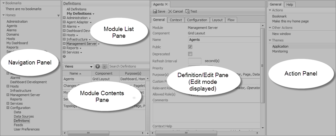
The starting place for working with View Components is to choose, from the left panel, in the Dashboards group, Configuration > Definitions. Make this selection to follow along with the tutorial. (Your user module is labeled My Definitions.)
The Configuration > Definitions page contains all the functionality needed to create new customized views, as well as allowing anyone with proper user permissions to edit existing modules. The Module List pane at the upper left side of the window lists all the modules for which definitions exist.
In this tutorial, we start off by configuring a user query in your user module My Definitions. First, select this module, and then focus your attention on the Module Contents pane. At the top of the pane on the left there is an Add button. You will use this button to add your new query. Above the Add button there is a drop-down list. The first two items are Views and Queries. We will be working with these items in this part of the tutorial.
We are going to start by defining a query, so ensure that the Queries choice is selected. When it is, the Module Definition pane on the right side of the window will be used to configure the query.
|
1 |
|
2 |
|
3 |
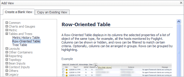
Click the triangle icon at the right of Tutorial 1. |
|
4 |
Choose Edit from the menu that appears. |
|
5 |
|
6 |
|
7 |
|
8 |
Optional. Refresh the browser interface. |
Web Component Reference queries are similar to SQL queries and perform a similar function. They are used to select a subset of the information in a data source. Foglight® agents collect a vast amount of data, so Web Component Reference queries are used to access specific items. The Web Component Reference building blocks are used to present this information in a readily understandable way.
|
1 |
|
2 |
In the Add Query dialog box, on the Create a Blank Query tab, in the Name column, click Host (with Monitoring in the Namespace column). |
|
3 |
|
4 |
|
5 |
|
• |
Selecting the UI Query check box causes the query to appear as a node in the Data area. This is only useful if you want users to be able to explore the data objects returned by this query. |
|
6 |
Ensure that the Deprecated check box is clear. |
|
7 |
|
8 |
|
9 |
Click the Root Reference box and choose Data Sources > Monitoring (Default Instance) from the list that appears. |
|
10 |
|
11 |
Select the Ignore Reference Objects check box. This limits the size of the returned host objects to those sub-objects and properties that are strictly contained by a host. |
|
12 |
|
14 |
Click Test. This button appears at the top of the tab. |
|
15 |
|
16 |
After completing the task in Configuring a Query, you have a query that returns a list of hosts. The next step is to use the query to populate the rows of a table.
|
1 |
|
2 |
|
3 |
|
4 |
Click OK. |
|
5 |
|
6 |
|
7 |
|
8 |
Set the Preferred Width and Preferred Height values. You can edit these values later when you have seen the table displayed, so you can choose any values you want. For now, set Preferred Width to 300 and Preferred Height to 150. |
|
9 |
Leave the Refresh Interval box blank. |
|
10 |
 ). In the dwell that appears, select Pagelet, and leave all the other check boxes cleared. Since the table will be placed on a dashboard, we need to ensure that view has the Pagelet purpose
|
12 |
|
13 |
Complete the Comments and Context Help boxes with any descriptive text, as required. In a production environment, comments should contain information for other developers and context help should contain information for end users. It becomes part of the context sensitive help for the component. |

 .
. .
.