LESS variables are used to change the properties of various elements within Evolve easily and simultaneously. By changing the value of a single LESS variable, you can alter the appearance of multiple HTML elements within the Evolve webpage. This enables simple customization through only a small subset of variables.
The following sections detail what to be aware of when using LESS variables, particularly when upgrading between product versions. The Appendix also covers an overview of the key variables and what they impact.
Upgrading Custom Themes with LESS variables
Since Evolve 2016.2.1 the Themes (LESS variables) are automatically upgraded when performing an 'Update Meta Model & Themes' within Evolve Designer. However, if you find that the variables have not updated correctly, the following instructions will help you to diagnose the issues.
Should a theme still be incompatible with the installed version of Evolve, the following error can appear in Evolve Designer when you Deploy Dynamic/Static site:
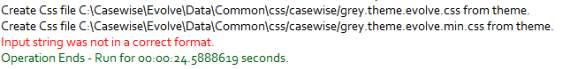
To upgrade the theme to be compatible with the installed version, follow these steps.
Ensure you know which default theme your custom theme was based on
e.g. Evolve7, Grey, Blue
Locate a copy of this theme in the new version of Evolve
nb: This can be found in <Evolve-Install-Location>\Casewise\Evolve\Site\bin\webDesigner\themes\
Using a comparison tool (e.g. WinMerge) compare your custom theme with the theme located in step 2
This will highlight the new variables which have been added since your custom theme was created.
Each new variable will contain a comment (e.g. //v4.0.2) showing in which version it was added.
Copy over the new variables so that the custom theme contains the same number of variables as the default theme.
5. Restart Evolve Designer and Deploy Dynamic/Static Site
Theme File Labelling Convention
Evolve’s LESS variables are named using camelCase whereby the first letter of each word is capitalized – except for the first letter of the whole string. Evolve version numbers are commented out next to any variables that relate to specific Evolve versions. I.e: //v4.0
Appendix - LESS: Global Variables
Click the groups below to see the LESS variables that are available and the elements that they will affect. Note that for the sake of brevity, not all available variables are listed below - only the main variables that alter colors and fonts have been included.
Primary Colors
|
LESS Variable |
Evolve Page Element(s) |
Example |
|---|---|---|
|
@cwColor1Shade |
The primary color used for borders and shading. |
- |
|
@cwColor1 |
The primary color used for various backgrounds |
- |
|
@cwColor1Tint |
The primary color used as a highlight |
- |
|
@cwColor2Shade |
The secondary color used for borders and shading. |
- |
|
@cwColor2 |
The secondary color used for various backgrounds |
- |
|
@cwColor2Tint |
The secondary color used as a highlight |
- |
|
@cwShadowColor |
The color used to add a shadow to elements |
- |
Global Variables
|
LESS Variable |
Evolve Page Element(s) |
Example |
|---|---|---|
|
@cwFont |
The font family used by a majority of text elements in Evolve |
p, span, li, a |
|
@cwFontTitle |
The font family used by various titles in Evolve |
h1, h2, h3, h4, h5, h6 |
|
@cwFontTextColor |
The color used by a majority of text elements in Evolve |
|
|
@cwGlobalLinkTextColor |
The color of text links in Evolve | |
|
@cwPageTitleColor |
The color of various titles in Evolve |
|
|
@cwPageTitleBackGroundColor |
The background color of the page title at the top of the screen. | |
|
@cwBodyBackgroundColor |
The background color of the main content area |
|
|
@cwLoginBackgroundColor |
The background color of the login dialogue that appears on the login page |
|
|
@cwLoginTextColor |
The color of the text on the login dialogue that appears on the login page | |
|
@cwLoginSubmitButtonTextColor |
|
|
|
@cwLoginSubmitButtonBackgroundColor |
|
Diagrams
|
LESS Variable |
Evolve Page Element(s) |
Example |
|---|---|---|
|
@cwDiagramBreadCrumbBackgroundColor |
The color of the area surrounding the breadcrumbs |
|
|
@cwDiagramBreadCrumbBoxBackgroundColor |
The background color of the breadcrumbs themselves | |
|
@cwDiagramBreadCrumbBoxTextColor |
The color of the text that appears on the breadcrumbs | |
|
@cwDiagramEditorIconColor |
The color of the editor icons within eModeler |
|
|
@cwDiagramEditorMenuBackgroundColor |
The background color of the eModeler menu |
|
|
@cwDiagramEditorMenuMainHeaderBackgroundColor |
The background color of the eModeler menu's main header | |
|
@cwDiagramEditorMenuSubHeaderBackgroundColor |
The background color of the eModeler menu's subheaders | |
|
@cwDiagramTileNameBackground |
The background color of a tile in eModeler |
|
|
@cwDiagramTileNameBackgroundHover |
The background color of a tile in eModeler when you hover over it | |
|
@cwDiagramTileNameTextColor |
The background color of a tile in eModeler |
Left-Hand-Side Menu
|
LESS Variable |
Evolve Page Element(s) |
Example |
|---|---|---|
|
@cwMenuLeftTabBackgroundColor |
This is the background color of the pop-out tab |
|
|
@cwMenuLeftTabTitleColor |
This is the color of the title that appears on the top of the pop-out tab | |
|
@cwMenuLeftTabSelectedViewBackgroundColor |
This is the background color of items that are selected in the pop-out tab | |
|
@cwMenuLeftMainNavigationBackgroundColor |
This is the background color of the main navigation menu |
|
|
@cwMenuLeftMainNavigationTextColor |
This is the color of the text in the main navigation menu | |
|
@cwMenuLeftMainNavigationBackgroundColorHover |
This is the background color of the menu item in the main navigation menu when the cursor is hovered over it | |
|
@cwMenuLeftMainNavigationTextColorHover |
This is the color of the text in the main navigation menu when the cursor is hovered over it | |
|
@cwMenuLeftMainNavigationTextColorActive |
This is the color of the text in the main navigation menu when the menu item or one of its sub-menus is active | |
|
@cwMenuLeftMainNavigationBackgroundColorActive |
This is the background colour of the menu item in the main navigation menu when the menu item or one of its sub-menus is active | |
|
@cwMenuLeftSubNavigationBackgroundColor |
This is the background color of the navigation sub-menu |
|
|
@cwMenuLeftSubNavigationTextColor |
This is the color of the text in the navigation sub-menu | |
|
@cwMenuLeftSubNavigationBackgroundColorHover |
This is the background color of the menu item in the navigation sub-menu when the cursor is hovered over it. | |
|
@cwMenuLeftSubNavigationTextColorHover |
This is the color of the text in the navigation sub-menu when the cursor is hovered over it. |
Drop-down Notifications
|
LESS Variable |
Evolve Page Element(s) |
Example |
|---|---|---|
|
@cwNotificationMessageBackgroundColor |
The background colour for notifications |
|
|
@cwNotificationMessageTextColor |
The text colour for notifications | |
|
@cwNotificationErrorBackgroundColor |
The background colour for Error notifications |
|
|
@cwNotificationErrorTextColor |
The text colour for Error notifications |
List Boxes
|
LESS Variable |
Evolve Page Element(s) |
Example |
|---|---|---|
|
@cwListBoxPropertyHeaderBackgroundColor |
The background color of the list box header |
|
|
@cwListBoxPropertyHeaderTextColor |
The color of the list box header text | |
|
@cwListBoxPropertyValueBorderColor |
The color of the border surrounding the list box's content |
Properties Group
|
LESS Variable |
Evolve Page Element(s) |
Example |
|---|---|---|
|
@cwPropertiesTableHeaderBackgroundColor |
The background color of the header on the Properties table |
|
|
@cwPropertiesTableHeaderTextColor |
The color of the text on the header on the Properties table | |
|
@cwPropertiesContainerBorderColor |
The color of the Properties table's border | |
|
@cwEditPropertiesValueHoverBackgroundColor |
The color of a data row in the properties table when the cursor is hovered over it | |
|
@cwEditPropertiesValueHoverTextColor |
The color of text in a data row in the properties table when the cursor is hovered over it |
Buttons
|
LESS Variable |
Evolve Page Element(s) |
Example |
|---|---|---|
|
@cwButtonSubmitBackgroundColor |
The background color of the submit button. |
|
|
@cwButtonSubmitTextColor |
The color of the text on the submit button. | |
|
@cwButtonSubmitBorderColor |
The color of the submit button's border | |
|
@cwButtonTextColor |
This isn't often used as the text on the buttons is hidden |
|
|
@cwButtonBackgroundColor |
The colour of the background for icons that appear in the top-right of the Evolve page | |
|
@cwButtonIconColor |
The colour of icons that appear in the top-right of the Evolve page | |
|
@cwButtonBorderColor |
The colour of the border for icons that appear in the top-right of the Evolve page |
Accordions
|
LESS Variable |
Evolve Page Element(s) |
Example |
|---|---|---|
|
@cwAccordionHeaderBackgroundColor |
The background colour of accordion menu headers |
|
|
@cwAccordionHeaderTextColor |
The colour of the text on accordion menu headers | |
|
@cwAccordionHeaderHoverBackgroundColor |
The background colour of accordion menu headers when a cursor hovers over it | |
|
@cwAccordionHeaderHoverTextColor |
The colour of the text on accordion menu headers when a cursor hovers over it |
Discussions
|
LESS Variable |
Evolve Page Element(s) |
Example |
|---|---|---|
|
@cwDiscussionsBackgroundColor |
The background color of the Discussions panel header |
|
|
@cwDiscussionsTextColor |
The text color of the Discussions panel header |
World Map
|
LESS Variable |
Evolve Page Element(s) |
Example |
|---|---|---|
|
@cwJVectorMapCircleBackgroundColor |
The background color of circles that appear on vector maps |
|
|
@cwJVectorMapCircleBorderColor |
The border color of circles that appear on vector maps | |
|
@cwJVectorMapPathDefaultBackgroundColor |
The default background color of a map vector |
|
|
@cwJVectorMapPathDefaultBorderColor |
The default border color of a map vector | |
|
@cwJVectorMapPathFilledBackgroundColor |
The default background color of a filled map vector | |
|
@cwJVectorMapPathFilledBorderColor |
The default border color of a filled map vector | |
|
@cwJVectorMapLabelTextColor |
The color of the text on the map labels |
|
|
@cwJVectorMapLabelBackgroundColor |
The background color of the map labels | |
|
@cwJVectorMapIconLinesColor |
The color of the + and - signs in the zoom icons |
|
|
@cwJVectorMapIconBackgroundColor |
The background color of the zoom icons |
User Zone
|
LESS Variable |
Evolve Page Element(s) |
Example |
|---|---|---|
|
@cwProfileTextColor |
The color of the text in the user-area |
Pop-ups
|
LESS Variable |
Evolve Page Element(s) |
Example |
|---|---|---|
|
@cwPopupBackgroundColor |
The background color of the left-hand-side pop-out menu |
|
|
@cwPopupTitleBackgroundColor |
The background color of the title on the left-hand-side pop-out menu | |
|
@cwPopupTitleTextColor |
The color of the title text on the left-hand-side pop-out menu |
Badges
|
LESS Variable |
Evolve Page Element(s) |
Example |
|---|---|---|
|
@cwBadgeBackgroundColor |
The background color of Badges |
|
|
@cwBadgeTextColor |
The color of the text that appears on Badges |
Tasks & Notifications
|
LESS Variable |
Evolve Page Element(s) |
Example |
|---|---|---|
|
@cwWorkflowTaskListTaskActionsColor |
The background color of the action panel associated with pending tasks |
|
|
@cwWorkflowTaskApprovalApproved |
The color of the task's approved tag |
|
|
@cwWorkflowTaskApprovalRejected |
The color of the task's rejected tag |
|
|
@cwWorkflowDelegatedTaskColor |
The color that highlights a task to signify that it has been delegated to you |
|
|
@cwWorflowTaskBackgroundColor |
The background color of a task |
|
|
@cwWorflowTaskTextColor |
The text color of a task | |
|
@cwWorflowNotificationBackgroundColor |
The background color of workflow notifications |
|
|
@cwWorflowNotificationTextColor |
The text color of workflow notifications | |
|
@cwWorflowDueDateCalendarBackgroundColor |
The background colour for calendars that appear next to tasks |
|
|
@cwWorflowDueDateCalendarOverdueMonthTextColor |
The colour of the month that appears on the calendar for tasks that are overdue | |
|
@cwWorflowDueDateCalendarDueBackgroundColor |
The background colour on the calendar for tasks that are due | |
|
@cwWorflowDueDateCalendarOverdueBackgroundColor |
The background colour on the calendar for tasks that are overdue |
Global Search
|
LESS Variable |
Evolve Page Element(s) |
Example |
|---|---|---|
|
@cwGlobalSearchFocusColor |
The color of the text in the global search input field when the cursor is focused on it |
|
|
@cwGlobalSearchTextColor |
The color of the text in the global search input field |
|
|
@cwGlobalSearchBackgroundColor |
The background color of the global search input field |
|
|
@cwGlobalSearchResultsTextColor |
The color of the search results text |
|
|
@cwGlobalSearchResultsBackgroundColor |
The background color of the search results | |
|
@cwGlobalSearchResultShadowColor |
The color of the shadow on the search results box |
Top Bar
|
LESS Variable |
Evolve Page Element(s) |
Example |
|---|---|---|
|
@cwTopBarHeight |
The height of the top bar |
|
|
@cwTopBarBackgroundColor |
The background color of the top bar | |
|
@cwTopBarProfileLinkColor |
The color of the profile links within the top bar | |
|
@cwTopBarProfileLinkHoverColor |
The color of the profile links within the top bar when you hover over it |
Home Page
Side Menu
|
LESS Variable |
Evolve Page Element(s) |
Example |
|---|---|---|
|
@cwMenuLeftSubNavigationBackgroundColorHover |
The background color a sub-menu menu item when the cursor is hovered over it |
|
|
@cwMenuLeftTabSelectedViewTextColor |
The text color of a selected menu item |
|
|
@cwMenuLeftTabSelectedViewTabSelectedTextColor |
The text color of a selected tabmenu item |
|
|
@cwMenuLeftTabSelectedViewTabSelectedBackgroundColor |
The background color of a selected tab menu item |
|
|
@cwMenuLeftTabSelectedViewTabTextColorHover |
The text color of a selected tab menu item when the cursor is hovered over it |
|
|
@cwMenuLeftTabSelectedViewTabBackgroundColorHover |
The background color of a selected menu item when the cursor is hovered over it |
|
|
@cwMenuLeftBorderColor |
The color of the border that separates menu items on the left hand menu |
|
|
@cwMenuLeftTabBorderColor |
The background color of the left-hand menu pop-out tab |
|
|
@cwMenuLeftToggleZoneBackgroundColor |
The background color of the 'hamburger' menu-toggle icon |
|
|
@cwSocialRatingStarBackgroundAndBorder |
The background & border color of the Social Ratings section |
Grids
|
LESS Variable |
Evolve Page Element(s) |
Example |
|---|---|---|
|
@cwGridButtonsColor |
The color of the grid buttons |
|
|
@cwGridPaginationBackgroundColor |
The background color of the pagination section of the grid |
|
|
@cwGridColumnHeaderText |
The color of the text in the grid header |
|
|
@cwGridColumnHeaderBackground |
The color of the grid header's background |
Miscellaneous
|
LESS Variable |
Evolve Page Element(s) |
Example |
|---|---|---|
|
@cwSiteSelectionTextColor |
The color of the text that displays the site name |
|
|
@cwButtonSelectedBackgroundColor |
|
|
|
@cwButtonBoxShadowColor |
The color of the shadow on the rounded buttons |
|
|
@cwAccordionHeaderTextColor |
The color of the title text on accordion menus |
|
|
@cwDiscussionsBackgroundColorHover |
The background color of the discussions icon when you hover the cursor over it |


