
Edit Page Layout
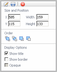
If you chose the Fixed position Layout option when creating a custom dashboard, you can use the settings in the Edit Page Layout dialog box to select a fixed position. A fixed position means that your view appears exactly where you want it.
|
• |
Size and Position—resizes the co-ordinates of the view such as apply a width and height. |
|
• |
Order—controls the stacking order such as bring the image to front, to back, forward, or backward. |
|
• |
Display options—specify if you want to show title, show border, or make the display opaque. |
Editing views
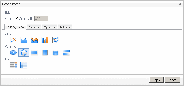
After you have set the initial settings based on “Creating a Custom Dashboard” in the Foglight® User Help and selected the layout position as fixed position, you can configure the portlet for additional views such as the display type of views, select metric labels, configure view settings, and choose the action when a user selects or dwells over a metric.
|
2 |
In the view that you want to edit, in the top-right corner, click Options  , and choose Edit Properties from the menu that appears. , and choose Edit Properties from the menu that appears. |
|
• |
Title—rename the view. |
|
• |
Height—set the height for all views or this view by selecting the check box and specifying a value. |
|
• |
|
• |
|
• |
|
• |
Actions—Set what happens when a user interacts with the view. For more information, see Actions tab . |
|
4 |
Click Apply when you are finished editing your dashboard. |
The Display type tab contains options for selecting the visual layout according to a chart type, gauge type, or list type. For more information on the display types available and their settings, see Options tab .

The settings that you can change are described in the following table.
The options that appear here depend on the view type you are working with.
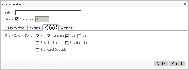
The following tables lists the options available depending on the view type:
|
• |
|
• |
|
• |
|
Show Average Line: Indicates whether to show average values in the chart. | |||||||||||||||
|
Line width: Specifies the thickness of lines in all charts or this chart. Values available for selection:
| ||||||||||||||
|
Metric value: Controls the type of value that is displayed for one metric or all metrics in a chart. Values available for selection:
| |||||||||||||||
|
Show one chart per metric: Indicate if you only want to display one chart per metric. | |||||||||||||||
|
Only show axis of selected metric (different charts will line up): Select this check box if only one axis is used in the chart, regardless of how many metrics are displayed. (For examples, see “Grouping Metrics with Many Parent Hosts” in the Foglight User Help.) Clear the check box to display the label for all metrics in the legend. | |||||||||||||||
|
Show thresholds for selected metric: If a metric has a threshold, it is displayed. You can choose to show thresholds only for the selected metric. | |||||||||||||||
|
Honor Bounds: Sets the chart axis so that it does not go out of chart boundaries. This check box is selected by default. | |||||||||||||||
|
Show Overall: Displays the overall value for the set time range as a dashed line. Values available for selection:
| |||||||||||||||
|
Show Min/Max As: Displays the minimum and maximum per interval. Values available for selection:
| |||||||||||||||
|
Show Baseline Min/Max As: Displays the baseline minimum and maximum. Values available for selection:
| |||||||||||||||
|
Show Standard Deviation As: Similar to the Min/Max setting; lets you highlight a range per interval. Values available for selection:
| |||||||||||||||
|
Standard deviation multiplier: Determine the high and low values by setting the deviation from the average. The default value is 1, but the unit of deviation depends on the metric. |
 : Emphasizes the highest and lowest values.
 : Draws each series as connected points of data, filled below the points)
 : Draws each series as a bar in a cluster)
|
Indicator Size: Useful for highlighting a fluctuating value in your real-time application in a visually meaningful way. Values available for selection:
| |||||||||
|
|||||||||
|
Bar Thickness: Sets the thickness of the bar in the chart. Values available for selection:
| ||||||||
|
|||||||||
|
Show Sparkline: Indicates whether to show a sparkline. | ||||||||
|
Sparkline displays: Indicates the type of values displayed by the sparkline. Values available for selection:
| |||||||||
|
Flow Direction: Indicates the horizontal direction of the flow: left or right. Values available for selection:
| |||||||||
|
Prominence: Specifies the thickness of the sparkline. Values available for selection:
|
 : Represents data using a rotating wheel.
 : Horizontal bar, Vertical bar, and Cylinder give you flexibility to present data in terms of a graduated scale.
 : Communication between host server components are represented by animated data flow that indicate the direction of the communication.
|
Show Sparkline: Indicates whether to show a sparkline. | ||||||||||
|
Show Column For: Indicates which columns to display in the table. Values available for selection:
|
 : Shows a list of metrics and their values.
  : Shows a list of metrics and their values.
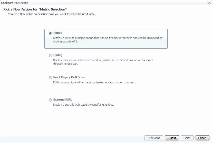
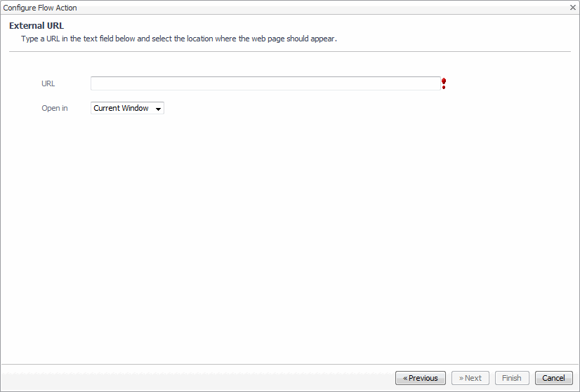
 For charts and metrics that you have added to the dashboard you are creating, you can set the flow action to control what happens when a user selects a metric or dwells over it. For example, you can use the Actions tab to configure a popup, dwell, or a drill-down behavior, either to views that already exist in your system or other dashboards your have created.
|
2 |
In the view that you want to edit, in the top-right corner, click Options , and choose Edit Properties from the menu that appears. |
|
3 |

|
4 |
On the Actions tab, select the check box for the action(s) you want to set. |
 ) is enabled.
 |
5 |
|
7 |
Click Next. |
|
• |

|
8 |
Click Next to continue with configuring the display of the selected views. |
Sharing the view
 from the menu that appears.
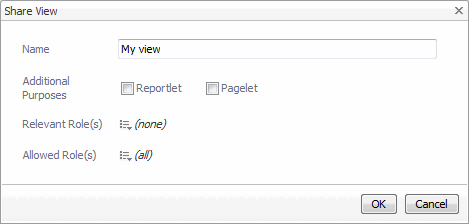
|
• |
Name: The name of the view. |
|
• |
Additional Purposes: Use these options if you want this dashboard to appear in another view such as: |
|
4 |
Click OK to save changes. |
Removing the view

|
3 |