
Creating a report
Creating a simple report
The following steps show how to create a simple report. Review the Tips and Techniques to learn about advanced reporting concepts.
- Create a New Report
- Create an SQL statement
- Creating Groups
- Right-click in the Detail section of the report design surface, select Insert > Insert Group Header/Footer. This will insert a new group header/footer section into your report around the existing detail section.
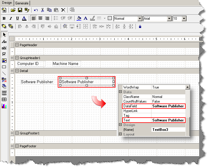
- Set the group by field in the Properties window for the group header. Change the DataField property to the field on which the data is to be grouped.
- Change the name of the group header to reflect the data that is being grouped. For example, "ghMachineName" could be the name of the group header with the DataField property of "MachineName".
- Adding data to the report
- Generate the Report
- Save Report
 on the Menu bar to complete and save the report. If the report has not been previously saved in the User Defined report repository, provide a name for the report when prompted. The report will be saved to the User Defined report repository. Reports can not be saved to the Pre-Defined report repository.
Report Design Interface
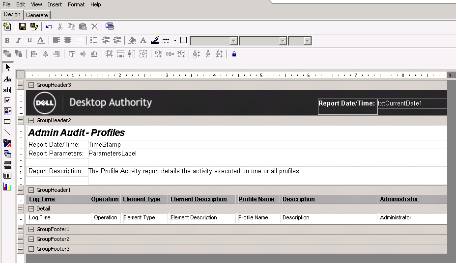
The report design surface is made up of a Report Header, Page Header, Detail, Page Footer and Report Footer. Report Headers/Footers and Page Headers/Footers are optional sections of a report. All reports must contain (at the minimum), a single detail section. A Group Header/Footer combination can also be optionally added.
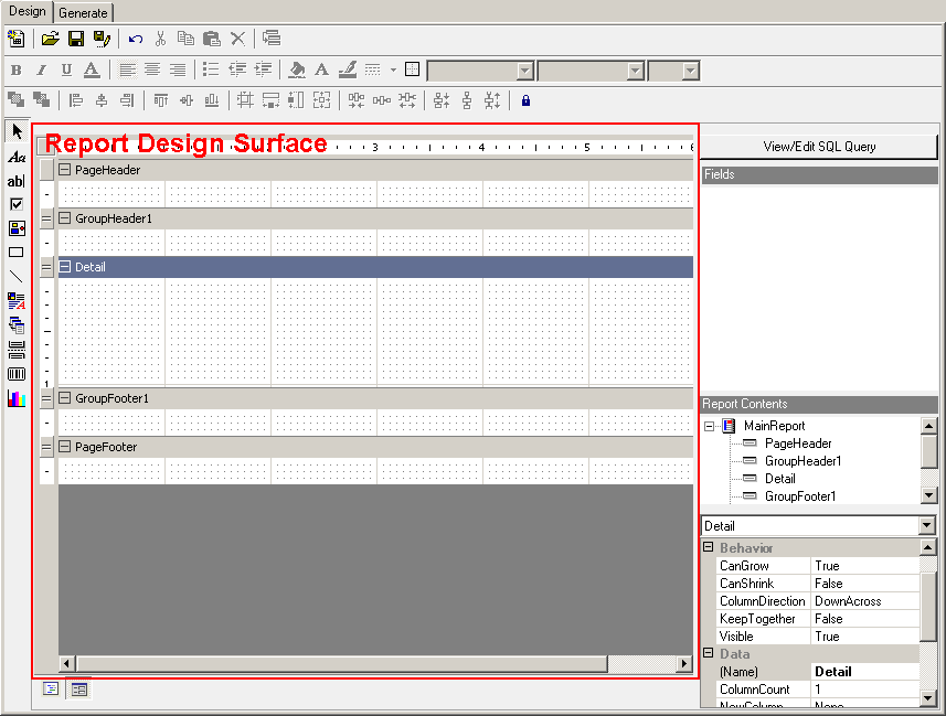
Report sections
- Report Header
- Page Header
- Details
- Report Footer
- Page Footer
- Group Header/Footer
Modifying section layout
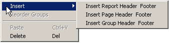
Insert
To add or remove report sections, simply right-click anywhere in the report design surface and select Insert from the shortcut menu. From the submenu select either Insert Report Header/Footer, Insert Page Header/Footer, or Insert Group Header/Footer.
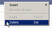
Delete
To remove a report section right-click in the header or any empty area of the section to be deleted and select Delete from the shortcut menu.
Reorder
When one or more Group Header/Footer sections are part of a report the groups may be reordered after they have been added to the report. Right-click on any header or any empty area of a section and select Reorder from the shortcut menu. The Group Order dialog will be displayed.
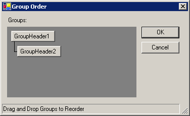
Simply drag a group and drop it on the group that it will be evaluated before.
Section properties
When selecting a report section from the Report Contents toolbox (or from the report design surface), the Properties toolbox will automatically display the available properties for that section.
Refer to the Properties Toolbox for details on all properties available.
Controls
Controls are data placeholders which can hold the value of a data field, manually entered text, pictures, and charts, among several other items.
Types of controls
The Reporting tool makes use of several different types of controls. The available controls consist of Label, Textbox, Checkbox, Picture, Shape, Line, Rich Textbox, Subreport, Page Break, Barcode, and Chart. All controls are available for placement on the report from the Toolbox toolbar. For a description of each control type, refer to the Toolbox toolbar topic.
Adding controls to report
All controls types are available for placement on the report from the Toolbox toolbar. Simply click on a control type in the Toolbox. Move the cursor into the Report Design Surface. The cursor will turn into a crosshair (+) cursor. Click in the report section where the control will be placed. Drag the mouse to size the new control.
Control properties
When selecting a control on the report design surface, the Properties toolbox will automatically display the available properties for that section.
Refer to the Properties Toolbox for details on all properties available for each control
Moving controls
Controls may be moved within the report section that it currently exists in. To move a control, simply click on and drag the control to the new area within the same section. To move a control to another section, it must be cut from the existing section and then pasted into the new section.
Reorder controls
Controls placed on the report design surface may be layered (placed on top of each other) to produce a specific effect. For example, a textbox may be placed on top of a picture control or shape control as a label on the image or shape. There may be times when the layering order of controls must be changed. This is possible using the Bring to Front and Send to Back menu selections.
To reorder a control, right-click on a control and select either Bring to Front or Send to Back menu item from the shortcut menu.
Bring to front
Brings the selected control in front of all other controls within the report section. If there are no layered controls, this menu selection will have no visible effect on the controls in the report section.
Send to back
Sends the selected control to the back of all other controls within the report section. If there are no layered controls, this menu selection will have no visible effect on the controls in the report section.
Control border
Controls placed on the report design surface may have a border painted around the outside of the control. Right-click on the control and select the Format Border menu items from the shortcut menu. The Format Border dialog will be displayed.

Presets
Select the border type you want to use by clicking on an icon in the Presets section of the dialog. The selected setting is previewed in the preview section of the dialog.
|
|
No border is applied. |
|
|
Applies a border to the bottom of the selected item. |
|
|
Applies a left border to the top of the selected item. |
|
|
Applies a right border to the top of the selected item. |
|
|
Applies a top border to the top of the selected item. |
|
|
Applies a border around the outside of the selected item. |
|
|
Applies a double border to the bottom of the selected item. |
|
|
Applies a thick border to the bottom of the selected item. |
|
|
Applies a border to the top and bottom of the selected item. |
|
|
Applies a border to the top and a double border to the bottom of the selected item. |
|
|
Applies a border to the top and a thick border to the bottom of the selected item. |
|
|
Applies a thick border around the outside of the selected item. |


Line styles
Select the border style. Select from None, Solid, Dash, Dot, DashDot, Double, ThickSolid, ThickDash, ThickDot, ThickDashDot, ThickDashDotDot, ThickDouble, and ExtraThickSolid. The selected border is previewed on the right.
Color
Select the border color. Click to select a standard color or click the color box to select another color. The selected color is previewed on the right.
Preview
Displays the selected border.
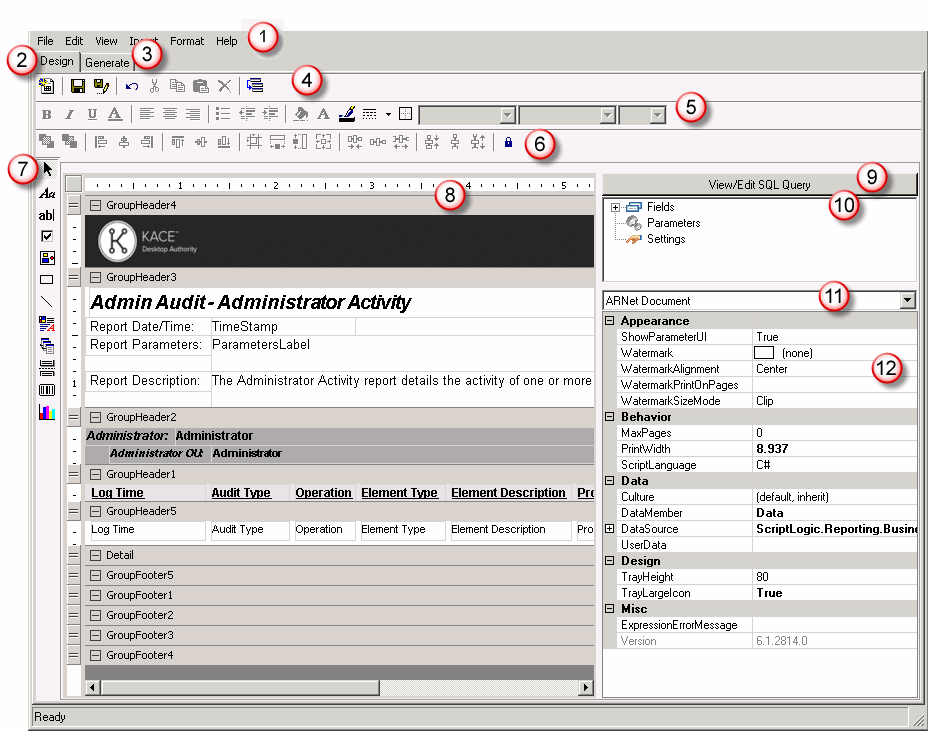
Report Design Environment
|
The menu bar provides pull-down menus that open, save and print reports, add controls and report sections, format controls, and several options to customize the report design area. Most of these menu items are also available in their respective part of the report design area. Some selections on the menu bar may be unavailable (disabled) depending on the currently selected report section or control in the report design area. | ||
|
The design tab is where most of the work is done when creating a report. The design tab provides access to all design elements including toolbars and toolboxes. | ||
| The Generate tab is where the report is run against data. If the report uses parameters, the user will be prompted for the parameters when the Generate tab is selected. | ||
|
The Standard Toolbar contains buttons for commonly used operations from the File and Edit menus. This includes buttons for New Report, Open Report, Save Report, Save As Report, Undo, Cut, Copy, Paste, Delete, Reorder Groups. | ||
|
The Format Toolbar contains buttons for commonly used operations to change the appearance of the selected controls. Commonly used Format options include, Bold, Italics, Underline, Font Settings, Align Left, Align Center, Align Right, Bullets, Decrease Indent, Increase Indent, Background Color, Foreground Color, Line Color, Line Style, Format Border, Font Style, Font Typeface and Font Size. | ||
|
The Alignment Toolbar contains buttons for commonly used operations from the Format menu. This includes Bring to Front, Send to Back, Align Lefts, Align Centers, Align Rights, Align Tops, Align Middles, Align Bottoms, Align to Grid, Same Size Width, Same Size Height, Same Size Height and Width, Decrease Horizontal Space, Set Horizontal Space Equal, Increase Horizontal Space, Decrease Vertical Space, Set Vertical Space Equal, Increase Vertical Space and Lock. | ||
|
|
The Toolbox Toolbar contains buttons for the controls that can be used to display information on the report. The controls can also be selected from the Insert menu. The control types include: Pointer, Label, Textbox, Checkbox, Picture, Shape, Line, Rich Textbox, Subreport, Page Break, Barcode and Chart. | |
|
The Design interface is where most of the work is done when creating a report. The design area designates the various sections of the report and displays the fields that are contained within each section. | ||
|
The SQL Interface is where pre-defined SQL statements can be selected and/or modified. SQL statements can be created or modified by pressing the SQL button. | ||
|
The Field Explorer Toolbox shows the database fields available for use in the reporting interface. The list of fields is built based on the SQL statement defined in the report. | ||
|
This Report Explorer Toolbox is a helpful tool which provides easy navigation through the report's elements. This includes each report band and all of its controls. It also provides a simple way to modify each report element's properties in the Properties Toolbox. | ||
|
The Properties Toolbox is used to change the properties of all report elements, including bands and controls. |


Generate Report
When a report is executed, the Generate tab within the Report Design Interface is selected. If the report contains runtime parameters, the user will be asked to enter values for the parameters. Once the parameter values are entered, click OK and the results of the report are presented.
Toolbar
The toolbar on the Generate tab allows the user to view the generated report's pages.
|
Icon |
Description |
|---|---|
|
|
Contents View displaying Table of Contents or Thumbnail View |
|
|
Print Report |
|
|
Copy current page to clipboard |
|
|
Find text |
|
|
Single Page view |
|
|
Multiple Page view |
|
|
Zoom Out |
|
|
Zoom In |
|
|
Zoom Percentage |
|
|
Page Up |
|
|
Page Down |
|
|
Current Page/Total Pages |
|
|
Jump back to last page viewed |
|
|
Jump forward to last page viewed |


