Many of the charts allow you to hover on segments and drill down to get more detail. For example, for the Top Mail Recipients widget, selecting a bar and clicking View Data will give you additional data on the widget, including department, and messages received in the past 7 and 30 days.
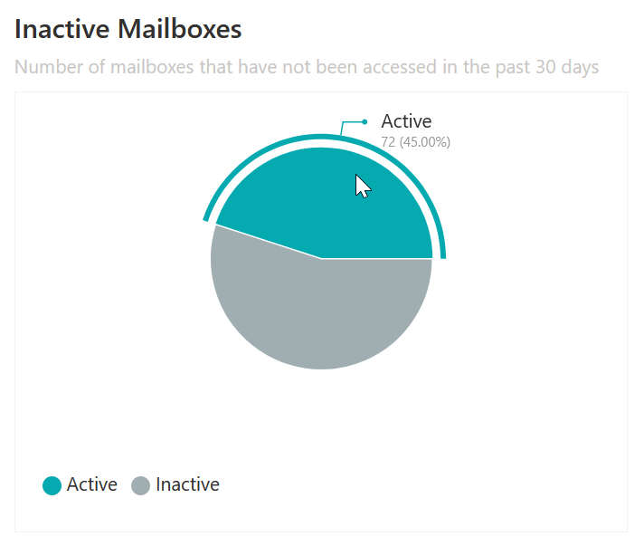
For a pie chart, hovering over a section will give you specific data also. For example, the Inactive Mailboxes widget will show the number and percentage of active and inactive mailboxes, as seen below.
Dashboards can be edited and customized to meet your needs. You can change the title of the dashboard, move widgets around, remove widgets that are not needed, and add new widgets by clicking on them.
Change the title of the Dashboard
You can change the title of the dashboard so it reflects the data within it. To do this:
1.From the dashboard, click Edit in the top right hand corner.
2.Click on the title box and input the your desired title.
3.Once done, click Save.
Configuring, cloning and/or removing widgets
Depending on the widget on the dashboard, you have options to:
·Configure the widget: this is where you can change widgets that you created or cloned.
|
|
NOTE: You can not configure any pre-built widget without cloning them first. |
·Clone the widget: you can clone some widgets, and then configure that cloned widget to suit your needs.
|
|
NOTE: Not all dashboard widgets can be cloned. These include widgets for Delegation and Policy Control (DPC), as well as the Inactive Mailboxes and Active Users by Workload widgets. However, most pre-configured widgets and well as all configurable widgets and cards can be cloned. |
·Remove the widget: Any widget can be removed from the dashboard.
To configure, clone or remove a widget:
1.On the dashboard, click Edit on the top right hand of the screen.
2.Click the Spanner icon on any widget, and choose your desired option.
3.Click Save.
Move and Resize Widgets
You can move and resize widgets across your dashboard.
To move a widget:
1.On the dashboard, click Edit on the top right hand corner.
2.Click and hold the widget you would like to move, and drag to the location you would like it to be.
3.Click Save.
To resize a widget:
1.On the dashboard, click Edit on the top right hand corner.
2.Click and hold the arrow on the bottom right of the widget. You can resize it to your standards; the red preview box will show you how large the widget will be once its resized.
3.Click Save.
There are several pre-existing widgets that you can add to your dashboard straight away. These depend on your role, below are five examples dashboard widgets that can be used by users with a 'Radar Classic' role.
·Active Users by Workload: A stacked bar chart showing the number of active and inactive users using each workload in the past 30 days.
·Inactive Mailboxes: A pie chart showing the number of mailboxes that have and have not been accessed in the past 30 days.
·Largest Mailboxes: This bar chart shows the users with the largest mailboxes by GB.
·Top OneDrive Users: A bar chart showing the top five users who have viewed or edited OneDrive files the most in the past 30 days.
·Top SharePoint Users: A bar chart showing the top five users who have viewed or edited SharePoint files the most in the past 30 days.
To add widgets to the dashboard:
1.From the dashboard, click Edit, the Add Widgets.
2.Click on the widget you would like to add to the dashboard.
3.Click Save.
Creating a Custom Chart Widget
Adding a custom chart widget to your dashboard follows similar steps as creating a chart or pivot graph section in a report, which will be covered in the Quest Nova User Guide. This wdiget will appear on your dashboard, which you can customize to your needs. To do that:
1.On the dashboard, click Edit in the top right hand of the screen.
2.Click Add widgets, then Configurable Chart Widget.
3.Enter a Widget title and a Widget sub-title if appropriate.
4.Optionally, you can link your widget out to a report within the Report Center. To do this:
a.open the report you would like to link to from within the Report Center.
b.Copy the browser URL address, omitting the domain name and entering the path name only, as highlighted in bold: https://nova.quadro.tech/report-center/report/8334b9ed-1b66-9660-b955-00754df30f87
5.Select a data source from the drop down list.
6.Optionally, select an organization and organization group, if applicable to your environment. These help to narrow down the scope of your reports.
7.Select a chart type. You can read more about chart types in the Quest Nova User Guide.
|
|
NOTE: Only charts and pivots can be created for use in the dashboard. To create a report using any type of data presentation, use the Report Center. |
8.Once you have selected your chart, choose an Operator. Operators are:
a.Average: This is calculated by dividing the total of all of the values by the number of values.
b.Count: The quantity of values in a data set.
c.Sum: The result of adding together the values in a data set.
d.Min: The smallest value.
e.Max: The largest value.
9.Select an Applied to data field. This is your Y axis. You can use the search boxes to find the exact data field you need, or filter by data type or data source.
10.Choose a Series name data field. This is your X axis. You can search for this the same way as the step above.
11.Optionally, choose a category. You can search for this the same way as step 8.
12.Add a filter group, if desired. Filtering allows you to narrow down the scope of your report. For example, you may only want to view users within a certain department or geographical location.
13.You can sort your data, if needed. Similar to step 8, you can search for a data field you would like to sort by ascending or descending order.
14.Set an offset. This is the starting record of your widget.
15.Set a limit. This is the maximum number of records returned within your widget.
|
|
NOTE: When downloading a section, this limit is ignored. |
15. Select or deselect Overflow. This gathers data outside of your limit into one section of a chart.
16.Choose your drill down fields.
17.Click OK, and your widget should appear in the dashboard. Click Save in the top right hand corner to finish the section.
Adding a Card to the Dashboard
If you would like to see a card presented on your dashboard, follow these steps:
1.From the dashboard, click Edit in the top right hand of your screen.
2.Click Add Widgets and select Card Widget.
3.Name your widget, and give it a sub-title if necessary.
4.Create your card as you would with the steps as described in Creating a Custom Chart Widget, and click OK.
Your card should now appear within the dashboard. If you have set analytics on your card, your card should display the color or the icon affiliated with the analytic you inserted.
|
|
NOTE: You are able to move your card in the dashboard to a place of your convenience. Also, you are able to resize the widget to your standards. For more on Nova dashboards, click here. |
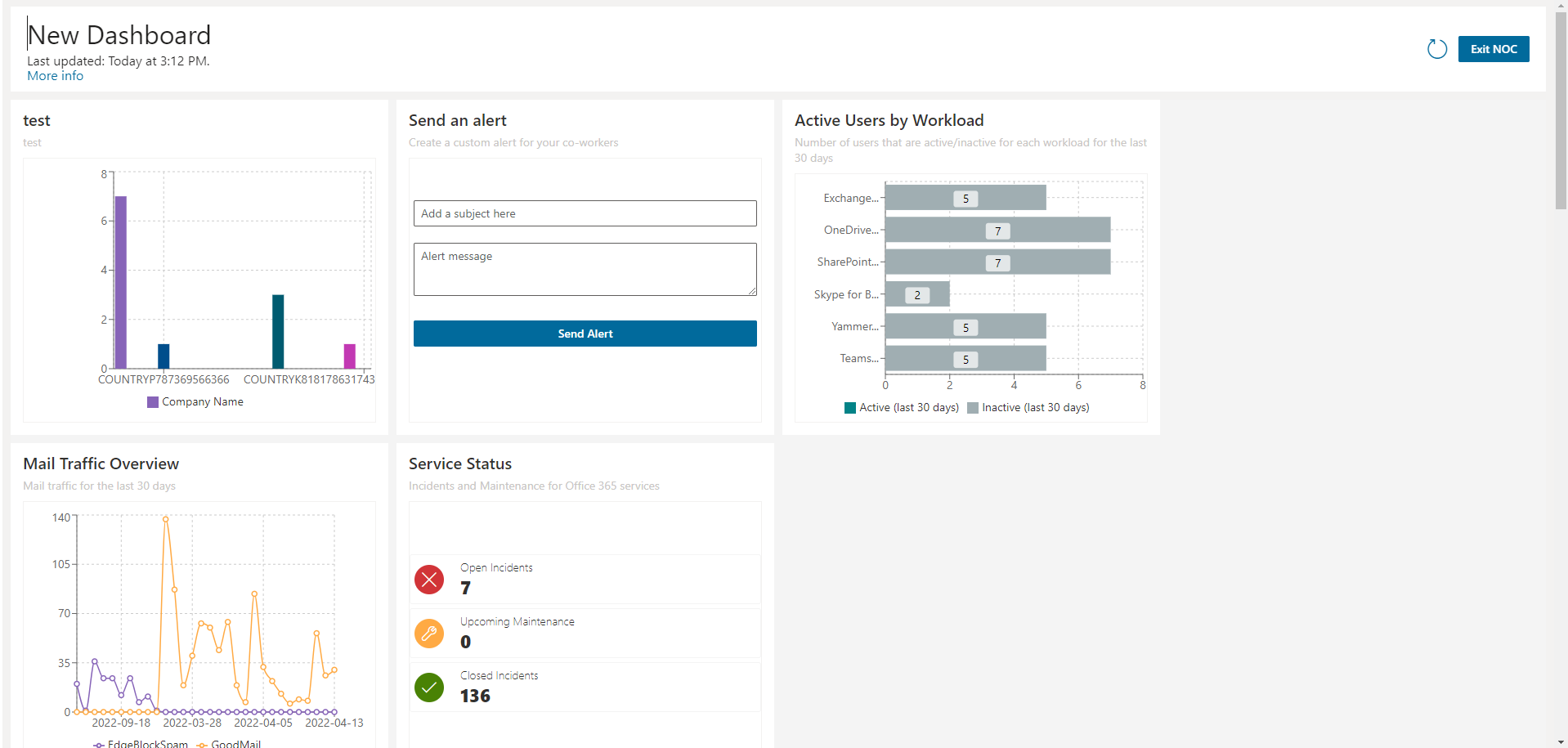
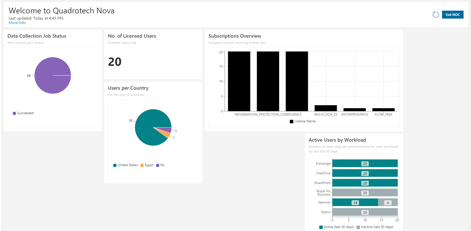
Network Operation Center mode (or NOC mode) clears the screen of all Nova user interface elements, leaving the chosen dashboard. The interface goes from this:
To this:
It is an overview for call center, network operations, or help desk employees.
To enter NOC Mode, from the Dashboard, click NOC Mode on the top right hand corner.
To exit, click Exit NOC.