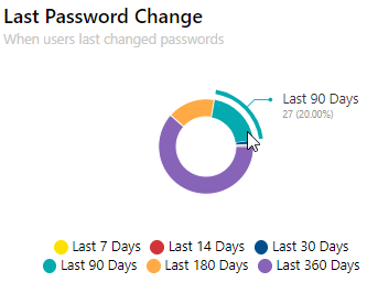
Many of the charts allow you to hover on segments and drill down to get more detail. For example, where we see the number of users who changed their password within a certain period of time, you can hover on that and you will see the precise amount of users who changed their password. Some other charts have a View Data button, which takes you to additional detail, which you can also download into a CSV file if required.
Dashboards can be edited and customized to meet your needs. You can change the title of the dashboard, move chart widgets around, remove widgets that are not needed, and add new widgets by dragging and dropping them from the list onto the page.
Change the title of a dashboard
You can change the title of a dashboard so it reflects the data within it. For example, if you have a dashboard that only reflects your environment's OneDrive data, you can change the title so the dashboard represents that. To do this:
1.From the dashboard, click Edit in the top right hand corner.
2.Click on the title box and input the your desired title.
3.Once done, click Save.
Configuring, cloning and/or removing widgets
Depending on the type of widget on the dashboard (public, private or system), you have configuration options for each widget. These are:
·Configure widget: this is where you can change widgets that you created using the configurable chart widget. You can not configure any pre-built widget without cloning them first.
·Close widget: you can clone system widgets, and then configure that cloned widget to suit your needs.
·Remove widget: Any widget can be removed from the dashboard.
To configure, clone or remove a widget:
1.On the dashboard, click Edit on the top right hand of the screen.
2.Click the Spanner icon on any widget, and choose your desired option.
3.Click Save.
Move and re-size widgets
You can move and resize widgets across your dashboard.
To move a widget:
1.On the dashboard, click Edit on the top right hand corner.
2.Click and hold the widget you would like to move, and drag to the location you would like it to be.
3.Click Save.
To resize a widget:
1.On the dashboard, click Edit on the top right hand corner.
2.Click and hold the arrow on the bottom right of the widget. You can resize it to your standards; the red preview box will show you how large the widget will be once its resized.
3.Cick Save.
Refreshing the dashboard
On the top right hand of the dashboard, you will see a circular arrow icon. This button refreshes your dashboard and gives you real time results. Under the title, you will see when the dashboard was last updated.
NOC mode
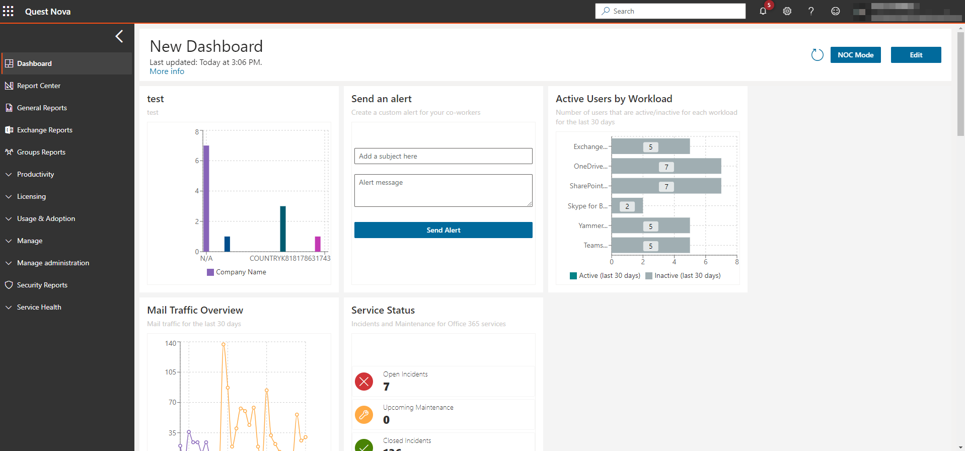
Network Operation Center mode (or NOC mode) clears the screen of all Nova user interface elements, leaving the chosen dashboard. The interface goes from this:
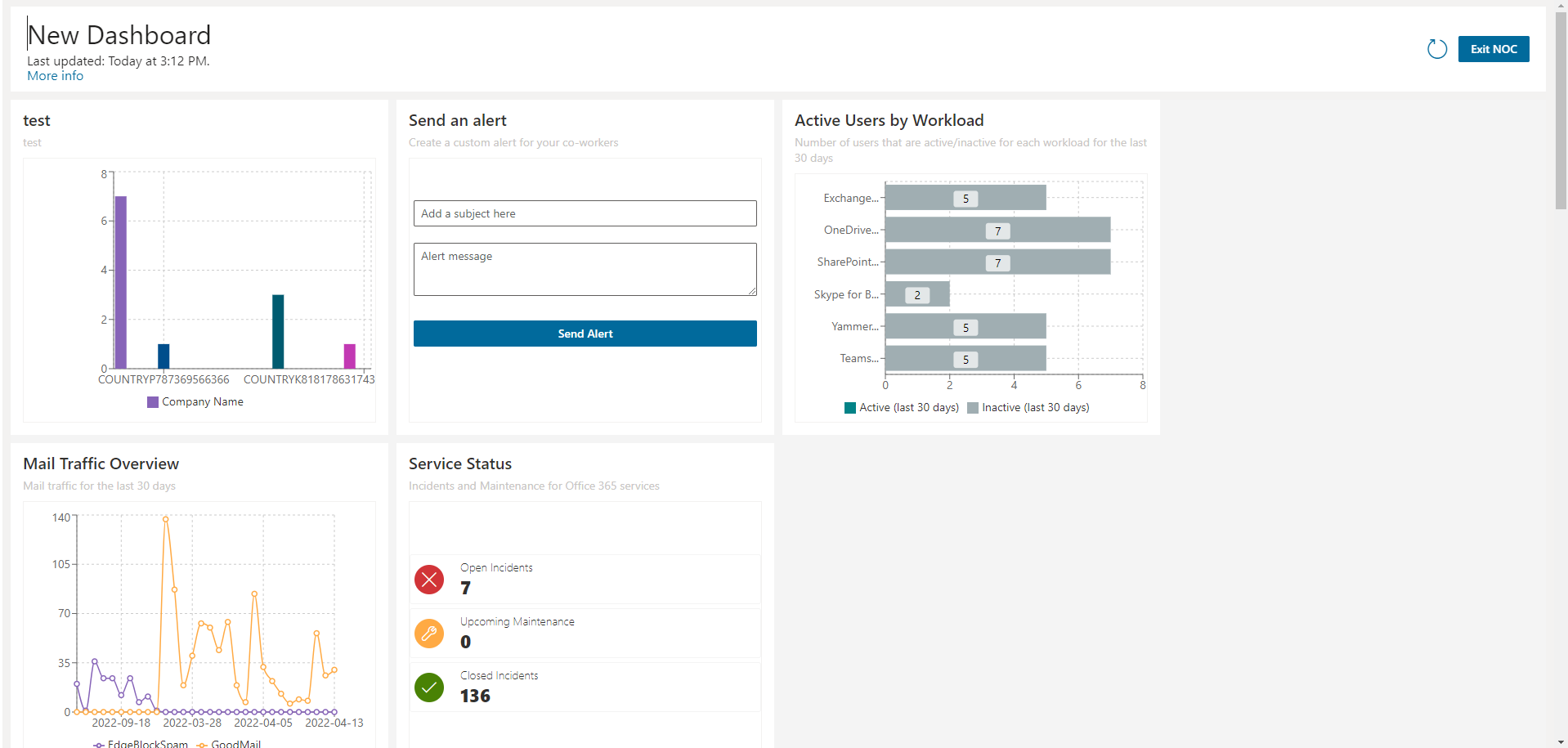
To this:
It is a perfect overview for call center, network operations, or help desk employees.
Adding a custom chart widget to your dashboard follows similar steps as creating a section of a chart and pivot report, which will be covered later. This section will appear on your dashboard, which you can customize to your needs. To do that:
1.On the dashboard, click Edit in the top right hand of the screen.
2.Click Add widgets, then Configurable Chart Widget.
3.Enter a Widget title and a Widget sub-title if appropriate. Optionally, you can link your widget out to a report from within the Report Center.
4.Select a data source from the drop down list.
5.Select an organization and organization group, if applicable to your environment. These help to narrow down the scope of your reports.
6.Select a chart type. You can read more about chart types in the Quest Nova Reporting Guide.
|
|
NOTE: Only charts and pivots can be created for use in the dashboard. To create a report using any type of data presentation, use the Report Center. |
7.Once you have selected your chart, choose an Operator. Operators are:
a.Average: This is calculated by dividing the total of all of the values by the number of values.
b.Count: The quantity of values in a data set.
c.Sum: The result of adding together the values in a data set.
d.Min: The smallest value.
e.Max: The largest value.
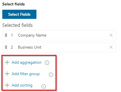
8.Select an Applied to data field. This is your Y axis. You can use the search boxes to find the exact data field you need, or filter by data type or data source.
9.Choose a Series name data field. This is your X axis. You can search for this the same way as the step above.
10.Optionally, choose a category. You can search for this the same way as step 8.
11. Add a filter group, if desired. Filtering allows you to narrow down the scope of your report. For example, you may only want to view users within a certain department or geographical location.
12.You can sort your data, if needed. Similar to step 8, you can search for a data field you would like to sort by ascending or descending order.
13.Set an offset. This is the starting record of your widget.
14.Set a limit. This is the maximum number of records returned within your widget.
|
|
NOTE: When downloading a section, this limit is ignored. |
15. Select or deselect Overflow. This gathers data outside your limit into one section of a chart.
16.Choose your drill down fields.
17.Click OK, and your widget should appear in the dashboard. Click Save in the top right hand corner to finish the section.
If you would like to see a card presented on your dashboard, follow these steps:
1.From the dashboard, click Edit in the top right hand of your screen.
2.Click Add Widgets and select Card Widget.
3.Name your widget, and give it a title if necessary.
4.Create your card as you would with the steps above, and click OK.
Your card should now appear within the dashboard. If you have set analytics on your card, your card should display the color affiliated with the analytic you inserted.
|
|
NOTE: You are able to move your card in the dashboard to a place of your convenience. Also, you are able to resize the widget to your standards. For more on Nova dashboards, click here. |
Microsoft has several different interfaces for tools used to perform Microsoft 365 management, reporting, and auditing tasks. In contrast, Nova users perform that work in a single user interface.
To achieve this, Nova gathers reporting and auditing data from Microsoft 365. Reporting data is collected about every 24 hours and auditing data is received from Microsoft when it becomes available. This data is stored in Nova for as long as the organization remains a subscriber, which is much longer than Microsoft typically stores this data in Microsoft 365.
The flexibility and power of the Nova Report Center is ideal for organizations with custom reporting needs that can not be fulfilled by the standard reports available in Nova. To create a report with the Report Center, you specify:
1.How you want the report to look. You decide what sections the report contains. Will it have charts, graphs, maps, or tables that will display the information?
2.The types of data the report will display. These are called data sources.
3.Any filters you want to apply against the data sources. For example, your data source might be a list of Microsoft Entra ID users. You might want to filter that list, so your report only shows users in North America or a certain department.
Just like other Nova reports, the reports created using Report Center can be saved, scheduled, and shared. If you do not want to build an entirely new report, you could even clone an existing report and customize it to meet your new needs.
Here is more about the steps to set up a custom report:
Step 1: How will the report look?
Give a custom report structure by adding sections to control how it looks.
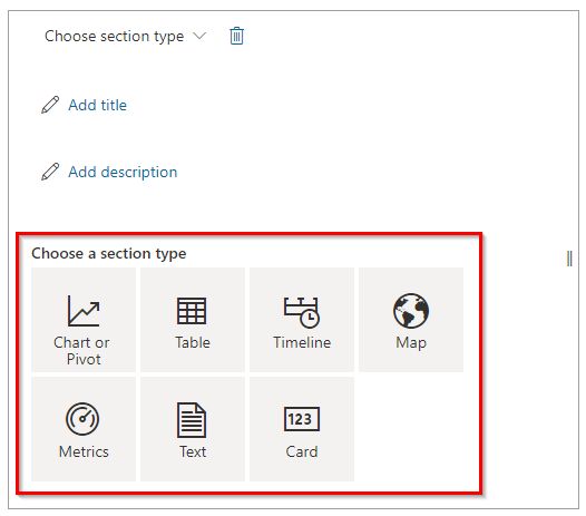
Here is where you select what section you will add to your report:
As sections are added to a report, you are asked to define the data source information you want to display in that section. The sections control how a custom report looks and the data sources give the report substance.
You can make sections display larger or smaller on the report, or you might drag and drop a section to another location on the report.
Step 2: What is the data source?
Reports created using Report Center are just templates, or shells. The service needs data for the shell to become a useful report. Nova gathers data from a variety of services, as described earlier in this section. Then, that data is collated, filtered, and displayed in the report.
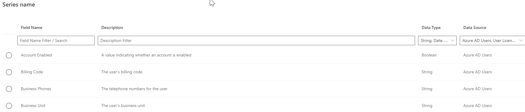
After a data source is selected, you are asked to choose which fields related to the data source will display in the report. The report's data sources control what fields display and how they interact with other data sources on the report. Here is an example of a screen where you select the fields that display in a section:
For more about data sources, go to this section.
Step 3: Do you want to filter or sort information displayed in a section?
You might add a filter to a section to show only a subset of data source information. For example, you could add a filter based on geography, so only users from a certain location display. You could add a filter that results in displaying a list of users from a specific department. Or, you could add a filter based on dates, so records older than X are filtered off the report. These are just a few examples. An organization can customize these to their specific needs.
You can also apply a sort order to a section. This is especially useful for table sections that show a list of information. For example, you can sort a list of users last name in ascending order, or you can sort that same list of users by who they report to.
These filters and sorts are saved as part of the report definition, so you will only have to configure them once.
To filter by date, check out this section.